The processes required to complete a media product.
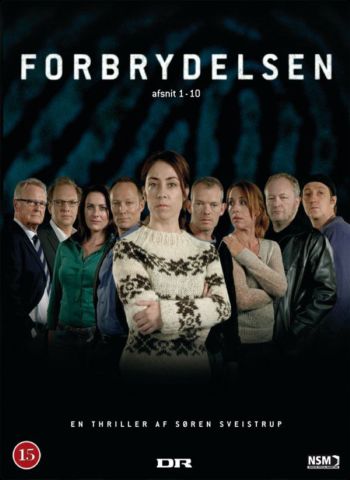
Birger Larsen directed three seasons with 40 episodes overall of Søren Sveistrup’s creation that fits into the Serial, Drama, Mystery, Thriller, Crime film, Adventure, Crime Fiction, Action/Adventure, Police procedural, Action fiction genres. Birger filmed the series in Copenhagen with production from Dr and co-production from ZDF.
EXHIBITION
The retail branch of a media form to sell and achieve interaction with targeted audiences
DISTRIBUTION
The act of promoting content to different audiences through multiple media forms.
The killing or Forbrydelsen can be found on Hulu, Amazon and Netflix with some DVD being created.
Propp was a structuralist and believed that there are 7 base characters that are in all forms of media. Not all types will be in all medias but at least one will be and can take on more than one part of the media.
The protagonist. the thing the action revolves around
The antagonist. opposes the hero
The dispatcher. sends the hero on a quest
The helper. aids the hero
The donor. gives the hero advice
The princess. motivation or reward for the hero
The false hero. helper who turns on the hero
Tzvetan Todorov
Todorov believes that there is 5 parts to every story.
Equilibrium. the story is at rest or normal
Disruption. of the norm by an event
Recognition. noticing that the disruption has occurred
Repair. Attempt to fix the problem
Resolution. of problem and a new Equilibrium
And recognized that you can use non chronological narratives
I Believe both pieces use gender to sexualise the product and to appeal to the heterosexual white middle class. Both media pieces select precise signs and combined them to make complex paradigms and syntagm and I will identify them and decode them to their most simple semiotic groups. Furthermore I will look at the context and reason for choices to represent gender in certain ways, adhering to and breaking the dominant ideology. Although they are different media forms they have many similarities in signs and in language but there are distinct differences making them identifiable as there own media forms. Finally I will address the impact not only of the obvious dominant ideology but also the historical, social and political contexts of media.
In Men’s Health they select black and blue on a white background, black and blue both being stereotypically male colours and add to this being a reactionary text, and use a semantic field of aggressive and destructive words, blast, demolish, slay and burn, which creates a paradigm of empowerment for the male reader. These two paradigms are the main way the magazine displays its intent of having a male audience, excluding the title of Men’s Health.This is furthered by the shining muscular man on the front cover. Through the plain grey shirt a shine from sweat and/or oil shows he has just finished working which focuses it appeal to the average middle aged middle to low class as they can relate and connect to the character. Through the use of the depiction of the stereotypical male it finishes off the representation males and the way males are marketed to.
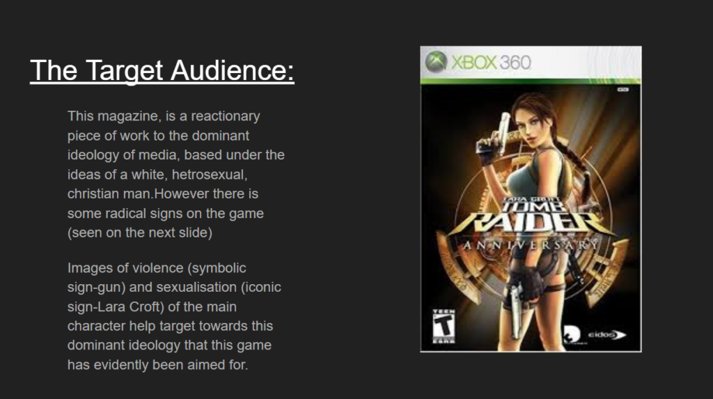
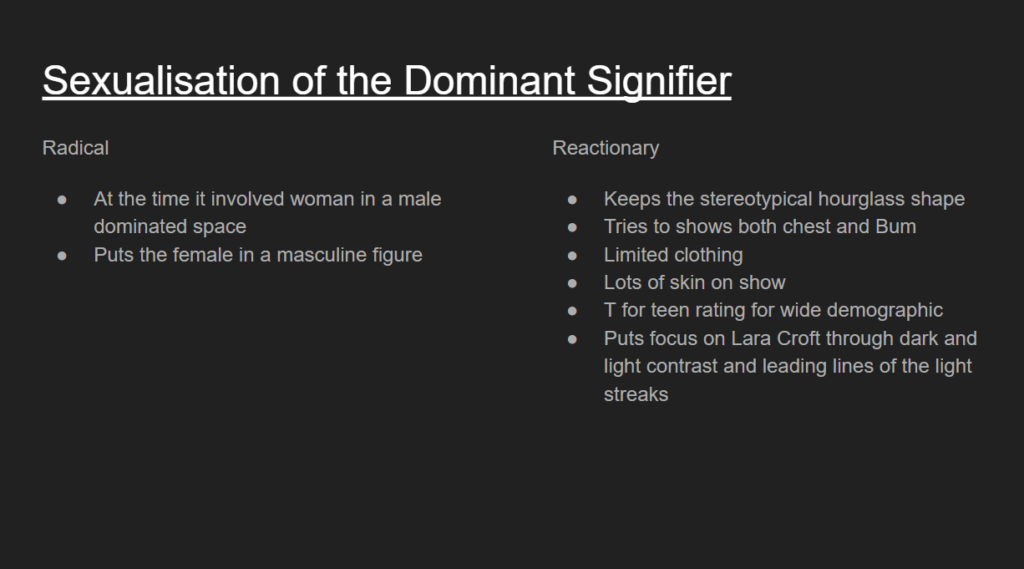
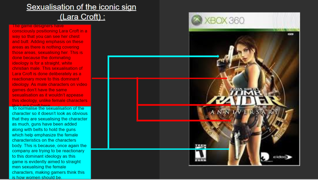
The Tomb Raider cover has similarities to Men’s health as it is marketed towards males again but depicts a female on the front cover where she has perfect skin and make-up and sexualised body parts. This is a juxtaposition to the depiction of Vin diesel as she is the perfect ideal woman in the eyes of the dominant ideology and the majority of the male population. This is done to sexualise her and use her as a hook into the game, not because of the content or relatability but because of sexual attraction. The clear objectification is attempted to be covered by supposed empowerment by shoe horning a female into a male dominated role rather than creating a new role for a female. The empowerment is well achieved through the iconic signs of guns and adventure gear showing that she is brave and strong, this only creates a flimsy vale for a female recreation of similar male character, Indiana Jones, rather than a new engaging role or character. The sexualisation is furthered more subtly with the streaks of light highlighting both the breasts and rear creating an exaggerated curvy character.
Overall both pieces are set towards the stereotypical male audience
Businesses take into consideration more aspects of the audience would be assumed. With a special emphasis on children from before being born up to 18 years old as they are easily manipulated, after years of psychological research put into how to have an effect on them physically, mentally and sensory. Also the targeting of children is used to have them use their “pester power”, when a child affects brand preferences and purchases of there parents as the parents are more susceptible to the views of their children, to increase their amount of customers through the conversion of their parents to the brand that is favored by the child. Furthermore by securing a child into brand loyalty which can be achieved earliest at three years old but can consistently be achieved at five years old will most likely lock them into life long purchases with that brand.
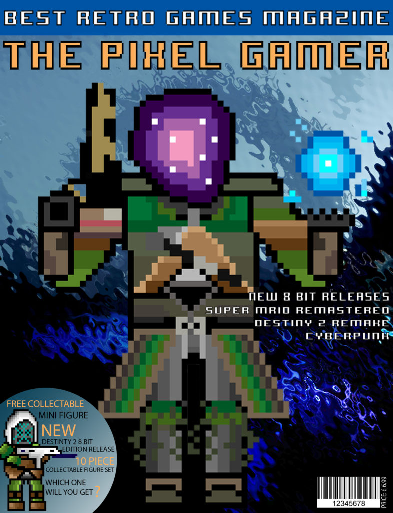
My target demographic is 15 year old boys as emergent service workers as they are socially and culturally active so understanding the re-emergence of retro and 8-bit games and having middle economic capital being able to afford the £6.99 price tag. They also fit into the photographic audiences the Explorer as they are seeking out the up and coming niche retro movement. Studies prove if a magazine has a free item people are more likely to buy it, using this i also highlighted key word, keeping the same color scheme as the title to contrast the blue, (Free collectible, New, 10 piece) to further entice purchase. I chose a light orange as it is opposite the blue background on the color wheel meaning it will stand prominently on the page. The main color of the magazine is a deep blue which connotes to a moody serious style matching the dominant ideology of 15 year olds moving to adult hood. This is created through the editing of the background image using the ripple effect and blur tool to merge all of the range of blues in the image. I made a 8-bit warlock to be my dominant signifier of the magazine ,as it is an iconic sign, and created a paradigm of 8-bit by using the style to create the main text pieces. My main character also gives anchorage to the paradigm of Destiny 2 linking to the other 8-bit destiny character and the background image. My piece is a reactionary text as it fits into classic magazine style with inspiration from PC Gamer and Tabletop Gamer, both aimed at mid to late teens. Also mimicking the placement of bar code and price vertically next to it to remove any interference of the signification of the other signs on the cover.
Second
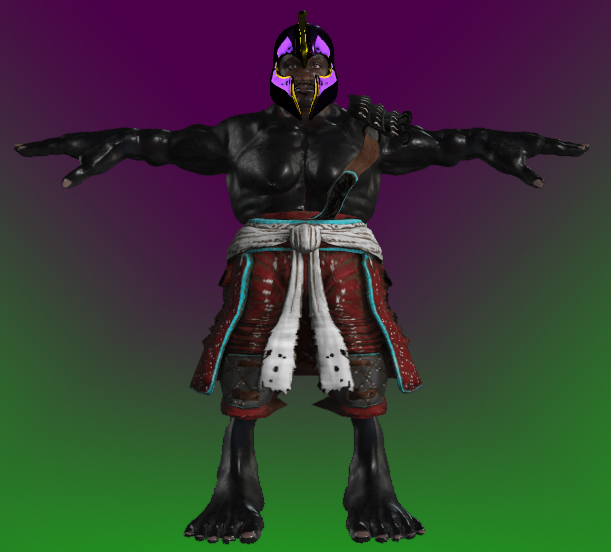
The clear representation of an action game through iconic signs of guns in the hands of both figures but continue their meaning through their nature as indexical signs and feeding ideas to the younger gamers without their knowledge of it. Furthermore the brown and green color scheme of there clothing connotes to the camouflage worn by army soldiers starts to create a paradigm of action and violence which targets younger game with easily understandable and simplistic signs of the dominant ideology. The more advanced editing of the piece by the dominate ideology is that the character has all sexual areas covered to reduce links to homosexuality which is being deterred by the upper class, straight, white, christian. male who create the dominant ideology of western culture. It evens go so far to add a long cloak around the hips to stop any angle of viewing from front and back.
Audience Theory
George Gerbners Cultivation theory
George Gerbners theory says that over time the mass media can reinforce the ideas already had by individuals and this is shown through my cover as the re ignition of retro games causing people who have liked them previously to be cultivated into liking them again positioning the genre back into popularity.
Stuart Halls Reception Theory
Stuart Hall believed that the audience were both the producers and the consumers of mass media and that in textual analysis there is a place for negotiation and opposition by the audience. This is a post gramscian view as it opposes the idea of maintained control in a hegemonic society.
Final
My magazine is based of reactionary ideas but is produced in a reactionary form to conform to traditional media to get the radical ideas into the main stream whilst making it accepted by rules set by the mass media.Through out my piece I use a paradigm of 8-bit characters and fonts to keep to the retro house style of the magazine. Specifically the dominant signifier of the Warlock on the main cover. I use clear iconic signs especially in my contents page to display popular 8-bit games (Mario and Donkey Kong) whilst keeping the influence of Destiny 2 with captures I have collected through the game. My demographic is late male teens because they are emergent service workers that are socially and culturally active and recognize the re-emergence of the retro gaming industry. Through selective representation I was able to target stereotypical “gamers”. Furthermore the predominant use of imagery is to reduce the reading weight to entertain the smaller attention span of the younger generation and create counter types to access a wider audience and sway people to the dominant reading of my magazine. I used two color schemes the cover using blue and orange the blue gradient background contrasts well with the dominant signifier and the light orange is the opposite color to the background it is on creating contrasting colors making it stand out on the page. Secondly the red and black scheme is typical of retro games and is connotated with formal informative magazines. For my double page spread I used images i captured through Destiny 2 and edited them to fit the style of the magazine and continue the myth of dark being evil. As I made all of the 8-bit images I was able to edit them to fit any game style i needed, the “Christmas Mario” to recreate a cliche idea of Mario and make a constructed reality for my magazine. The larger page size was inspired by more visual gaming magazines that promote and display the art side of gaming as the larger size offers more space for the images which allowed me to take a more artistic approach to my magazine and interest more than just gamers. A smaller aspect is the “Free collectable figure” which statistically is meant to improve sales as people are more likely to buy if they receive an additional item with there purchase.