

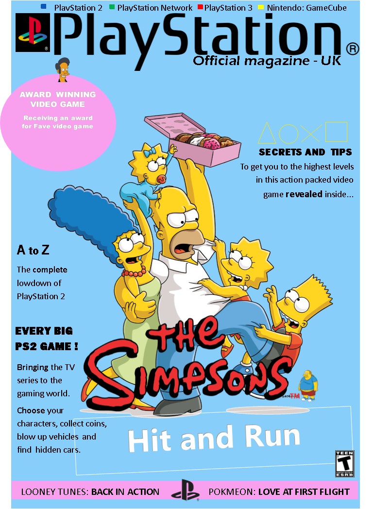
The reason I chose to do this specific magazine cover on the Simpsons game hit and run was because I used to play this as a child. This game was enjoyable and interactive and I thought that this would be a good game to promote to other children, even though it is an old game it was a hit in its time. It was an award winning game as I specified on my front cover.
Firstly I researched some magazine covers on the internet to see how they were structured and how they were formatted. I targeted PlayStation magazines as this was the main console for The Simpsons game to be played on. This is how I was able to get design ideas for my magazine cover. I went into Publisher as I thought this was the best place to create a front cover. I composed many drafts for the magazine cover. On my first draft I copied the front cover of the hit and run game with the PlayStation title and a blank background. I realized that this hadn’t the colour genre of the Simpsons, therefore I decided to do this completely different.
I moved onto my final draft which is the finished piece. This final piece is the best it can be in terms of colours and the boldness throughout. I immediately wrote PlayStation in big, bold letters to show the reader that it is best played on PlayStation, of course including the original PlayStation logo. As you can see above this, there are other names of consoles that it can be played on. I think this is a nice addition to it as I saw this on many other magazine covers. Moving onto the pink circle which is meant to be seen as a sticker, this shows the reader that this game has an award for being the “fave” game to play. This means that they are going to be persuaded into liking it more. To the far right of that, is the PlayStation controller shapes in bright yellow, this conveys to the reader that it is PlayStation based. Every magazine cover has gaming terminology to show what the game entails. Also it highlights the information on the inside for the reader to feel like they have to open it to find out more. I have executed both of these things, trying to give them hints to open the magazine. This in turn will lead them on (with the use of ellipses) as to what will be revealed inside.
Finally, for the main feature, I have shown a picture of the Simpsons and the title below it. This shows the reader a fraction of what the game entails. I chose the picture as I wanted the whole of the Simpsons family in it as they are the main characters in the game. I also dotted some of the other characters that appear in the game. These were shown as small features to draw the reader in. The title is in a bold colour to show the reader the name of the game. The Simpsons logo is in bright red with the name “Hit and Run” in a white box encompassing it. This gives the effect that it was stamped on. This will appeal to the reader when they first
come to look at the cover. I chose a blue background as this is in reference to the Simpsons sky when you’re introduced into the game.
Media timeline
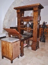
Printing press, 1450
Typewriter, 1500

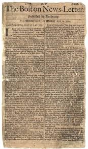
Sep 25 1694, very first newspaper
Film, 1894
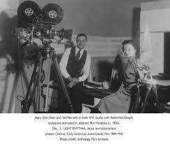
Radio, 1895
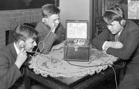
Computers, 1938

Video tape, 1958

Aug 1st 1967 digital production
Internet, 1990
Social media, 2000
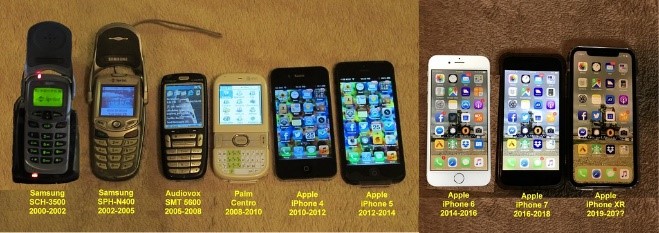
Phones evolving
What is the point of media?