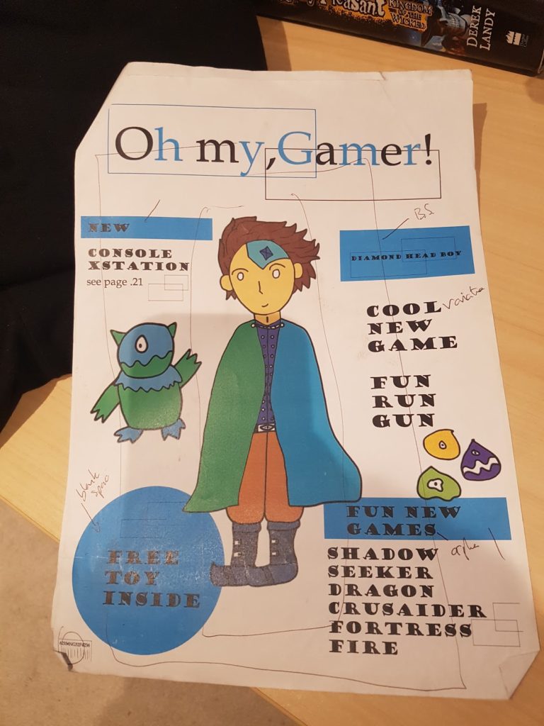
I redesigned my old gaming magazine to improve it so it was more appealing to my target demographic which are young kids ages around 3-6 and used Little player as my style model. Firstly I redesigned my Masthead to replicate my style model by making it is multicoloured and basic white with Broadway Font, I did it this way so it is more appealing to my target demographic which are kids so by me putting bold font and various colours will catch their eye. For my main image, I enlarged the image that I had created in Photoshop to scale it to be more similar to the model, to make it stand out more, and in order to do this, I had to remove the unnecessary Pieces to create negative space which was then filled when the image was made larger, I also had done this to the barcode which I made in Photoshop which I scaled to be similar to how the model is in the left third of the page. I then added a strapline saying the same thing as my model “video game magazine for kids” which was placed behind the main image just like the model so it makes the main image stand out even more as it needs to be the main attraction when you look at it to bring in potential consumers. The alignment of text was also replicated to be on the right third of the page and I used BrodWay Font with bright colours to make it stand out like how it does on the style model but yet doesn’t distract the consumer from the main image. For my Background colour, I used the gradient tool of blue and green which are the main colour themes that I used and gives the dominant signifier of “boys” as my magazine is mainly targeted and explores more “boyish” games.
Old Front Cover Design 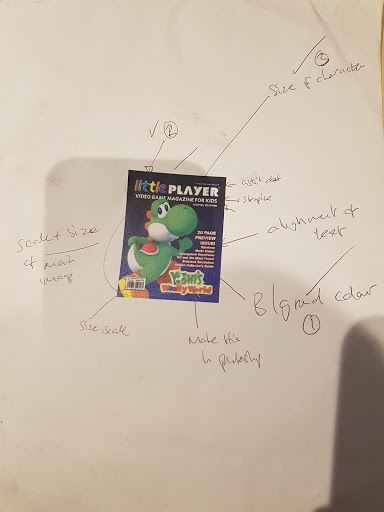
Style Model 
New Front Cover design
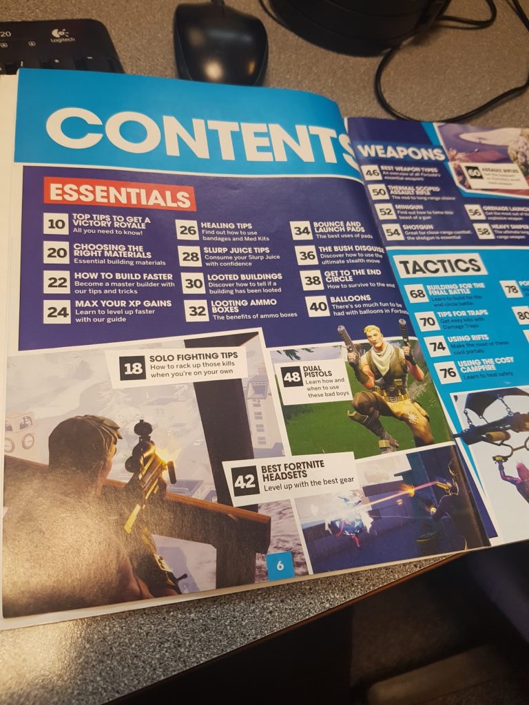
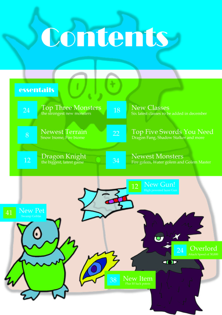
For my contents page I
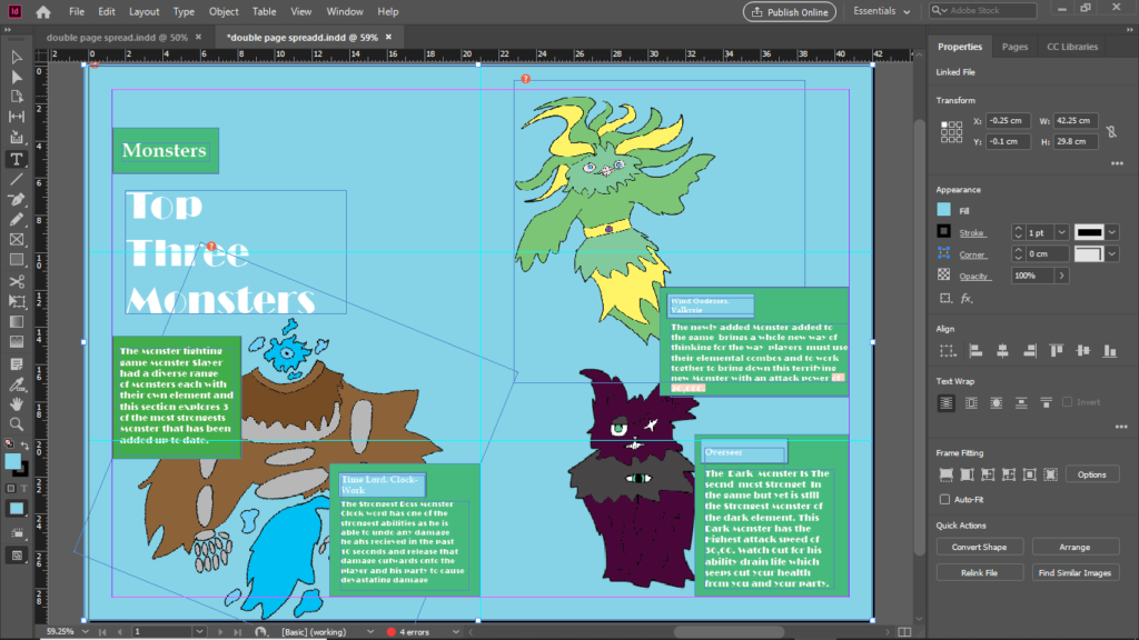
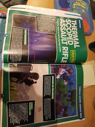
For my double page spread
Style Model