Theme: Adobe Fuse
What is it about?
- My DPS is going to be about how a majority of the popular games featured in my magazine are designed in Adobe Fuse.
- I will have an Adobe Fuse created character, one male and one female, in order to be inclusive and I will have the Fuse girl character have dark skin to be inclusive and give a good representation of my magazine as usually people only feature people who are lighter skinned.
- My magazine DPS will be radical as I will have a darker skinned woman posing in quite a masculine way in order to show that women and men are equal. My Fuse Character will not be doing something related with females, ie cooking as I want to challenge the dominant ideology and the expectation of females.
- I will follow the house style of my contents page and front page. What I mean by this is that I will use the same font and colouring as I did for the title of both my contents page and my magazine front cover and I will also have the title for my DPS the same font size as for the title I had used for my contents page.
Style Models
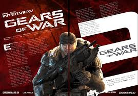
- I am going to design my DPS to look slightly like this “Gears of War 2” DPS. However, I do not like the tilted text, therefore, I am going to have the text straight.
- However, I am going to have the title of the DPS in the top left hand corner in order to follow the house style of my magazine.
- The coloring of the page will be fairly feminine colours (possibly a pale purple/pink) in order to appeal to my female target audience.
- I will put my text into columns in order to make it easier for the audience to read and to give it a clear appearance.
- I want to keep the title of my DPS quite simple so that it is easy to remember and effective to attract my audiences.