Statement of Intent:
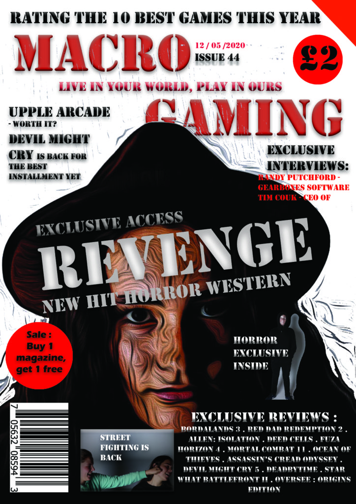
My working title is Macro Gamer and my target audience is primarily men aged between 16 to 25, which is why the colour pallet is mainly white with dark reds, browns and blacks. This is more of a horror gaming magazine as there are dark images which is more R rated then generic magazines. This portrays the paradigm of scary things meaning the magazine is not for younger readers. However my magazine also applies to other people such as women due to having a woman as one of the main characters on the front cover. The audience conforms to the emergent service workers due to being very young but high levels of cultural capital. Also, my target audience are part of the Explorers in Rubicam’s 4 C’s due to many games being covered in my magazine being a challenge. My magazine will cover reviews, exclusive interviews and a couple new emerging games. My cover is easy for people who are not fully cultured in the game industry due to using more informal language. Although my magazine reinforces the stereotype of the younger white male, it also challenges the dominant ideology of only men being interested in horror and more masculine magazines, with a female character on the cover as the dominant signifier.
Style Models:


