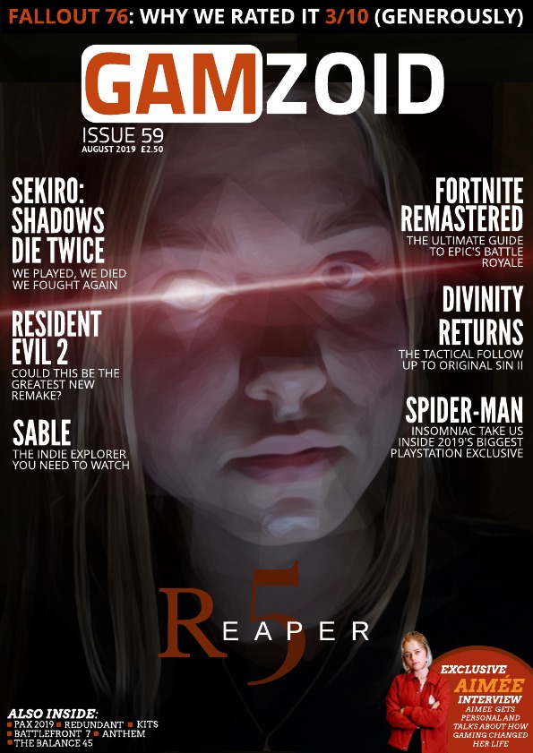
NRS – E, D, C2 as aim my audience to be 16-20+ so some may still be in school (further education = A Levels, Community College and University) without a job but still get pocket money, some may have a Saturday job or even a part time job earning minimum wage on a 9am-5/8pm shift. My magazine is priced at £2.50 as it will be a thick textured cover magazine, I feel like this is a realistic price range for a magazine like that and is a decent price for those in the E, D and C2 social grade range. Young and Rubicam’s 4 C’s – The Struggler, The Mainstream and The Aspirer as I feel that this sums up the majority of those in their late teens/early twenties 7 New Class Types – Precariat, traditional working class and technical working classThis was the first magazine front cover I had ever designed. I used an A4 size on this design as I found out that in industry, most magazines are actually around A4 size because if they were any bigger or smaller, the magazine would actually cost more to cut and print out so thinking in an industry point of view, A4 would be the most reasonable size. also the majority of the time, most backpacks and handbags that people usually carry around are about A4 sized or bigger, making A4 the most handy and easy size in a consumers view point and stance. I felt that the cover design was bland and boring and looked almost like an odd business magazine as gaming magazines tend to contain larger cover lines and more eye-catching images.For my second cover design (before I found out we had to solely use original images) I looked at even more examples of gaming magazines to get an idea of the themes and rules they followed. whilst researching, I found myself running into a basic “template” on how most gaming magazines are formatted. I decided to use a more vibrant image of an upcoming RPG. Again, I kept the A4 size for previous reasons stated in my first magazine post. I found the way I designed this cover odd and difficult to work with as I couldn’t decide with where each piece of text should go or how big and small the images should be ending up with a clash of colours that were unreadable and just generally an ugly design. Overall, as I was so unhappy with this design, I decided to scrap this idea.When starting my magazine, I looked at a range of gaming magazine covers that appealed to me and started on creating a basic front cover, just to get an idea of generic formatting for the chosen genre. Through more research I found out that most gaming magazines normally feature a main character in the center of the page, taking up a vast amount of space on the cover. The intention of this is to catch the eye of a passer-by and pique their interest. When creating my front cover, it took a few attempts as I wasn’t satisfied with what I created. As I wasn’t satisfied, I remembered that magazines are aimed at a large demographic so I decided to create a quiz containing questions such as “are you a gamer” or “what colours do you associate with gaming?” etc. You can find it here: https://forms.gle/65xxsvQM8L9GDQXu9. I found that creating this quiz benefitted me as it helped choose a front cover design that not only I like, but one that others would enjoy too. I had 46 people answer my quiz and out of that quiz, 30 males and 16 females had taken it. I found that with my “are you a gamer?” question, 30 people had chosen the “yes” answer and 16 people had chosen the “no” answer which aligned with the male to female ratio on the quiz so from those stats, I managed to figure out what audience I should be aiming at, although in hindsight, my assumptions were a little biased. For the third front cover I decided to display a made-up character from a game I decided to name “Reaper 5”. For my article titles, I decided to use bold white text, as I find that ‘less is more’. I attempted to match the colors of the background with the text, to create an aesthetically pleasing visual. This has the purpose of grabbing the attention of my targeted audience. In the right hand corner of my magazine, I’ve placed an image of a made-up famous gamer in the gaming industry, Aimée. As she is intended to be a famous gamer, I felt like it would attract more people to read my magazine. However, I feel like I could’ve have made her a more noticeable, but if I had, I would have taken away the focus from the main article displayed.