
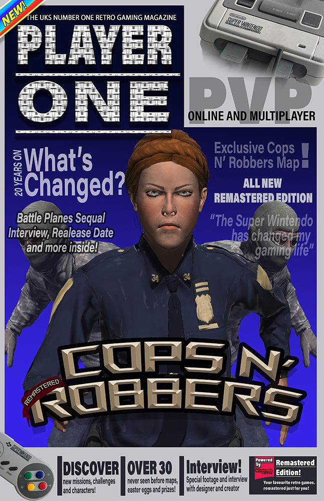
Front Cover –
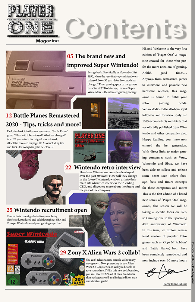
Contents Page –
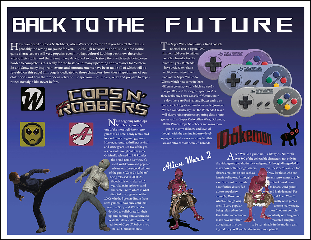
Double Page –
Ad 1 –
Ad 2 –
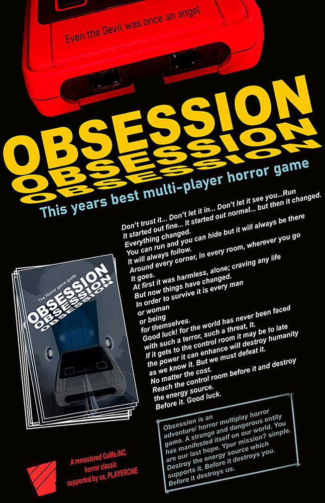
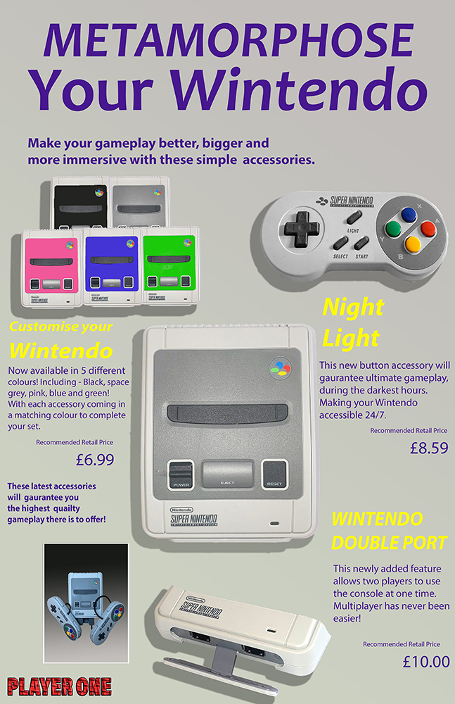
Ad 3 –

Statement of intent
For my NEA I will be completing the second brief; aiming to produce a front cover, double page spread, contents page and three adverts for the gaming genre. My ideas will be influenced by a selection of already-produced gaming magazines that share similar codes and conventions to the ones I wish to use to attract a certain demographic. My magazine is predominantly aimed at a younger audience of 12-15 years. I aim to produce a product that is attractive and inclusive of all genders as this would likely increase circulation of my product as well as profit; many gaming-based products are targeted at a male audience. Ideas proposed by theorists such as David Gauntlett; his theory on gender fluidity suggests that whilst in the past the media tend to convey singular, straightforward messages about ideal types of male and female identities, the media today offers us a more diverse range of icons and characters from whom we may influenced by, meaning that gender identity is less constricted, this is what I aim to achieve.
I aim to target this specific demographic as they are highly impressionable, as they are seen as ‘mainstreamers’ they are also more likely to follow popular trends, especially in areas such as gaming which allow for a form of escapism. As the form of gaming is presented in a physical, literacy-based form this product will also act as a device to reinforce and enhance their use of lexis and vocabulary. The style of language and register that I will use is a mix of colloquial and slightly more formal as I want the magazine to be professional and factual in relation to its contents. However, it should also be appealing to my target audience through the informal language; they would use in everyday life so that they can relate to it, using the magazine as a form of escapism, interlinking with the uses and gratification theory.
My product is also going to be highly influenced by ideas surrounding postmodernism – the idea that reality is not reflective in human understanding, but rather constructed by individuals based on their own collection of fragmented thoughts. Therefore, my product will reflect these ideas as it aims to influence the audience to construct their own opinions based on individual interpretation, also linking in with Habermas’s theory on the ‘Public Sphere’ whereby individuals can share individual thoughts and feelings globally without intervention from higher institutions such as government.
I will also use the san-serif font – ‘Acumin Variable Concept’ – an informal font would be more eye-catching to a younger audience who may want to rebel against formal customs that are dominant in more reactionary or ‘adult’ texts such as ‘The Daily Mail’. The font also act as anchorage for plugs as they will use similar styling. I also wanted to incorporate a retro theme to my magazine and used 8-bit characters and a tabloid size, similar to popular 80s magazines, with a width of – 27.94 CM and height of – 43.18 CM.
[Word Count = 500]