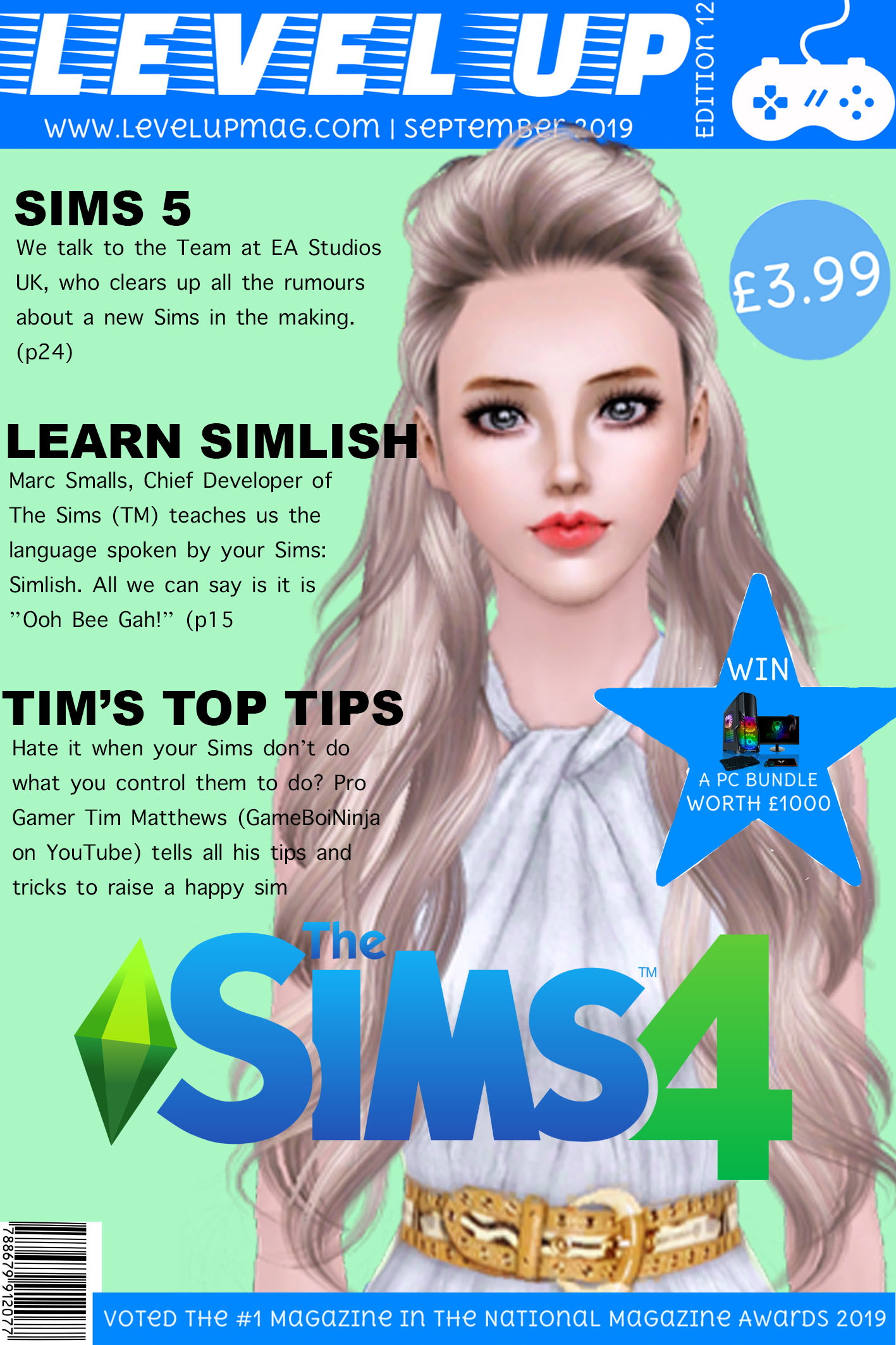
Sims Magazine Cover
This is my second attempt at creating a magazine cover for a gaming magazine. Before I started, I had a look at what I included in my previous magazine cover attempt and identified what I was missing and how I can improve. This magazine cover is based around “The Sims”. I have chosen to base mine on “The Sims” because it is one of the most popular games and it is also very famous, meaning people with instantly recognise the logo, hence why I have added it onto my magazine. I created my magazine cover in Photoshop and cut out bits of other magazines to use in my magazine. My magazine is based for Older Children and Teenagers (10-18years).
At the top is my Masthead, I have used the colours of the Sims branding (Blue and Green) as these colours look quite nice together and the bright blue stands out against my pale green background. On my masthead, I have also included the edition number and the date so people know when my magazine issue hits the shelves. I have also included the price, at (£3.99), which I think is quite reasonable as it entices children to buy it with what could be their own pocket money. I have decided to include a close up of a Sim as my main image, so from a distance people automatically realise this edition is based on “The Sims”. The Sim used as the central image is looking directly at the consumer as if they are trying to communicate with the customer. I feel the direct address makes the consumer feel included and more likely to buy the magazine as its as if they and the Sim are establishing a relationship.
I have chosen my cover articles carefully. I have chosen “Learn Simlish” (the language the Sims speak) as a bit of humour and to entice the reader to read on as I included a phrase of “Simlish” so they would want to find out the meaning. I also used alliteration with “Tim’s Top Tips” because at the age bracket my magazine is aimed at, kids want to succeed at a game, so I feel this article is suitable to out on my magazine cover. Lastly, I think the article about the Sims 5 is appropriate for the cover as it is an exclusive article. I also feel by mentioning the possibility of a new game, consumers are enticed to buy my magazine and to discover whether it is true or not. The “Sims 5” is a selling line of my magazine because if a new game is talked about, people are bound to buy the magazine to learn more about it. I have kept my cover lines quite vague to entice readers to buy the magazine and read on. Finally, I have a huge star shape with the word “Win”. I have made this quite large because I feel that promoting competitions with a prize worth loads of money will also entice consumers to buy the magazine.
