I have studied a variety of magazines already in the market place and have analysed and used the effective elements in my design, however adapting these conventions to enable mine to be unique having it’s own brand identity.
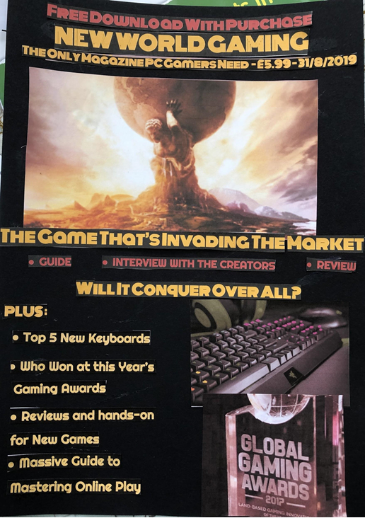
I decided to use a house style or brand guideline of three consistently used colours to make my magazine stand out amongst the competition. I chose to stick to three main colours of red, black and yellow, which is my house style to make my brand recognisable and to give the magazine a uniform and organised look. As the audience is generally male I have steered away from traditional female colours such as pink. I chose contrasting colours for the background and text to make the text easier to see and to also make the magazine attract the interest of the buyer.
In my research I found that gaming magazines are generally purchased by the 14-30 year old demographic, mainly male. I have therefore chosen colour schemes, text, images and enticing offers to appeal to this demographic. Therefore I aimed to advertise to a teen and young adult audience (14-30) and to attract this audience I used bright, contrasting colours and large, impactful fonts to catch attention to my magazine. I used large images to provide a visual representation of what the text I wrote was about (I used an image of a gaming keyboard next to the line on the cover about a list of the top 5 new keyboards. I also used an image of a gaming award next to the line about gaming award winners). I advertised a free download of a demo at the top of the magazine cover. These elements are present in many real magazines I analysed and they make the magazine more eye-catching to customers especially the free offer as it promises a bonus to buying the magazine that can sway a shopper slightly unwilling to buy.
The requirements outlined a cover image and two other small images, which I have provided on the cover of the magazine and have also wrote lines about the contents of the magazine, conveyed by the images. The 5 cover lines, one main hook line and 4 minor lines link to the articles inside the magazine. I chose a unique and eye-grabbing title/masthead, “New World Gaming” with connotations of discovery and exploration which fits well as the magazine informs the buyer about new games and their quality.
With the main cover image I created a hook to the double-page spread that referenced the game and the genre of the game (e.g. “Will it Conquer Over All?” and “Invading the Market” are references about how the game is about war and conquest).
My tagline is “The only magazine PC gamers need” which pinpoints how the magazine is about PC gaming and targets an audience of PC gamers. Standard industry practice is to include the price of the magazine and date of publishing near the masthead so I have analysed prices of gaming magazines and decided to set the price based on the prices of these magazines I researched. I believe that choosing this standard price will balance the cost of making the magazine and the revenue gained from selling it.
Iconic signs:
- Image of Keyboard
- Image of Award
- Image of Game
- Image of Game characters
Indexical signs:
- Image of Game
- Image of characters in the game
- Colours of text
- Colours of Background/images
- Magazine Title
Symbolic Signs:
- Titles
- Text
- Colours
- Date
- Price
- Tagline