Style models
statement of intent
I am following brief two and creating a gaming magazine and three print adverts. My magazine will be named ‘GAMEIN’, this title is an attempt at a play on words as it is a gaming magazine which is about all the inside information and insights into the gaming industry, ‘GAMEIN’ also sounds similar to the word gaming. My intended target audience for this magazine is british male teenagers in the age range 13-17.
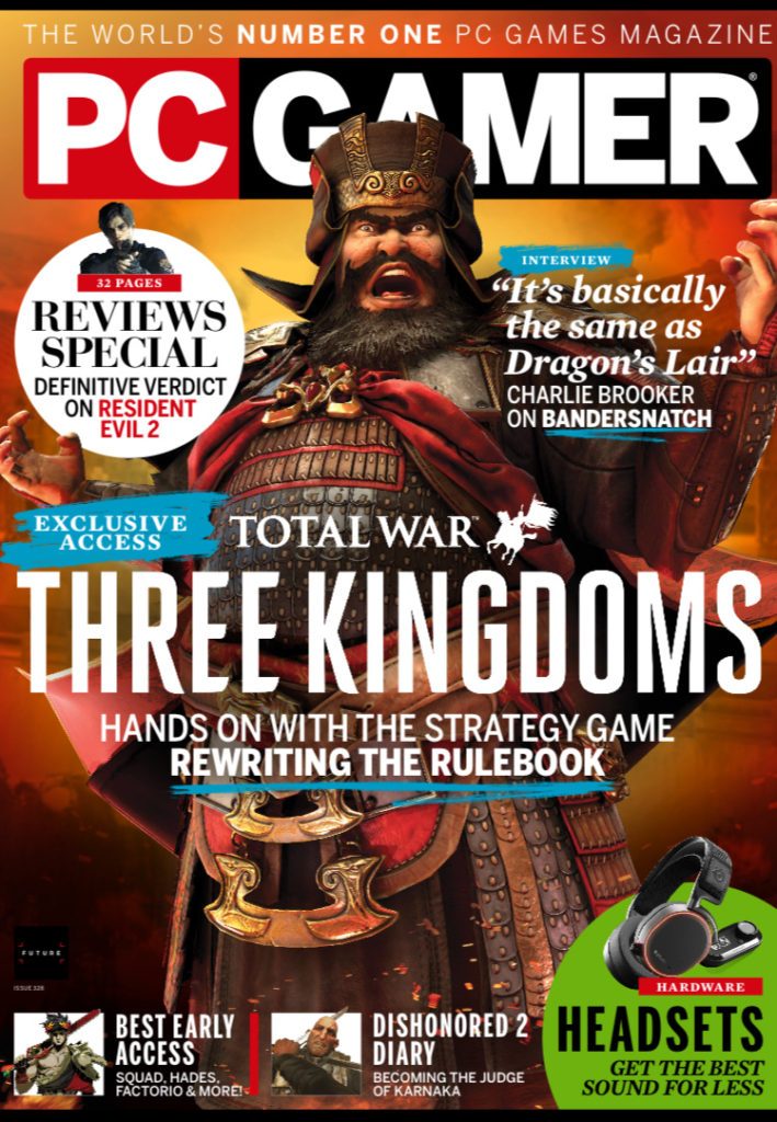
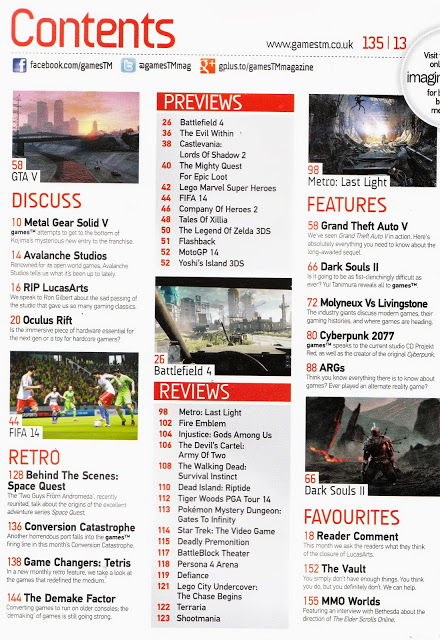
I have looked at style models from the magazines PC Gamer and Games™ and have taken inspiration from both of these magazines. I have also looked at adverts within these magazines and taken inspiration from them, my adverts will have simple designs that easily get the message of the advertisers across, I will advertise new games as well as a product that games can be played on. The games/products advertised will be targeted at the target audience.
The main font used for text throughout the magazine will be ‘Algerian’. My masthead will be in capital letters and in bold writing and a bold colour to ensure that it is eye-catching and stands out around other magazines.
I will include a clear house style to my magazine, all pages will be black with a red strapline across the top of each page. My masthead on the front cover will be in capital letters, bold and red.
I have used the colour black as the background / page colour for my magazine as black is associated with power, strength and rebellion, these connotations often relate to what my intended target audience is interested in and will make them more attracted to the magazine. I have also used the colour red as it is intense and it connotes symbols of blood, danger and war which is what is in a lot of games that teenage boys in the age range 13-17 are interested in so it draws them into the magazine and makes them interested.
All images, logos and copy is original, and I will create my magazine and print adverts on adobe photoshop. To create images for my magazine/print adverts I will use adobe fuse to create life-like cartoon characters to make them look as though they are actual characters from video games. I will also create 8-bit art to create vintage style games characters and icons.
I will use Blumler and Katz uses and gratifications theory and will create my magazine to be informative and educational about the gaming world. I also would like it to be entertaining. The main image is an iconic sign of a man in army style clothing. The code within the magazine will be through the use of colour. The codes will convey connotations of power, danger and violence. The magazine will be a reactionary text as it follows societies ideas of gaming and masculinity within it.

![Ed Sheeran - The A Team [Official Video] - YouTube](https://i.ytimg.com/vi/UAWcs5H-qgQ/maxresdefault.jpg)