My intention for my 3 adverts are to use the following theorists,Propp’s character functions, and Peirce’s Sign Theory, or Semiotics. I want at least 2 of my adverts to have some mention of the game i created on the front cover, “oakvally”. I plan to incorporate them in a sponsor ad or a game bundle advert.
For my first advert I planning to create a game bundle advert for 3 different games.
I plan to use out of the following 2 layouts as my display for this advert;
(competition layout of with a ^ formation of 3 games)
or
(page is split into 3 slashes showing action shots of the 3 games)
I think both of the layouts have their potential but the advert layout that’s divided into 3 might either be more eye catching to audiences or simply might fit correctly for an A4 and might work better as a landscape advert. But on the other hand the use of triangles to display the different games in the bundle could be another promising layout and will work with the A4 sizing.
For my second advert I want to do a sponsored advert of a console sponsoring my game oakvally. Examples of possible companies I could use to cross platform are, PS4 or twitch. These two companies would have different effects in sharing the game across audiences. Using PS4 would give the intention for audiences to buy the game and can give a good wide reach across different audiences for users who have a PS4. this is still very useful but it wouldn’t engage the audience as much as being sponsored by twitch as it would reach a wider range of audiences who enjoy indie games and would be streaming the game playthrough through the platform which then is more free promotion and engages the audiences and can mean there more likely to buy the game since there favourite streamers have played it. The target audience would be the same age range of young teens for oakvally and followers of PS4 or twitch.
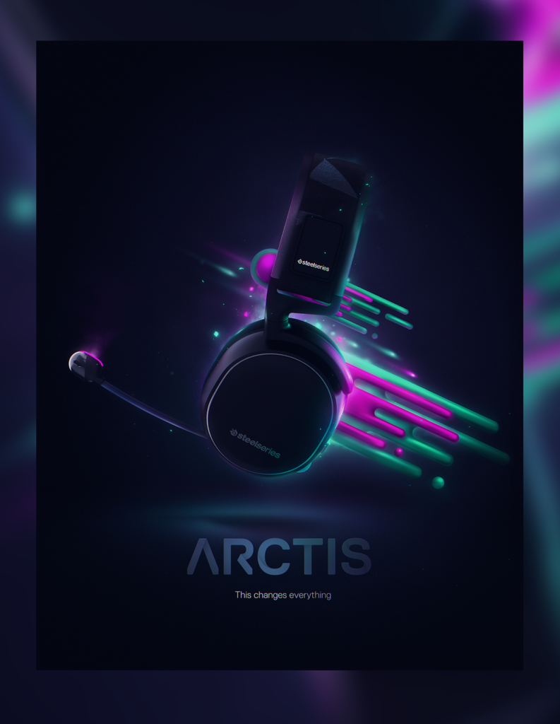
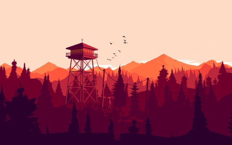
For my third advert I want to attempt to use silhouettes for a more simplistic but effective style for video game characters. This will be an advert for a separate game that would be coming out on PS4. I want to see how simplistic I can go with the advert but still have it look professional and realistic to what you would get in a video game magazine. I’ve seen this stype be used on PS4 covers and I think it displays a more subtle but effective show of strength and confidence of the character without having to physically show those emotions on their face. It’s a good way to make the audience, instead, focus on the body language of the character because, that is the only thing the designer has allowed them to see.

(the PS4 advert reference for advert 3)

front cover layout references

content page layout references

double page references


colour scheme references for part of 2d advert

3rd Advert References