statement of intent

Statement of intent: 

Music video: 

The music video I have produced follows themes of gender and identity representation and focuses on the idea of nonconformity in a conformative world. The main message of the music video as a whole is as follows: those who hold power will silence radical ideas of nonconformity, so it is up to you to find yourself and carve out an identity for yourself no matter what the world tells you. 

This product follows gender and representation theorists such as Judith Butler (who describes gender as a performance, as well as gender as a social construct). Furthermore, ideas of Jaques Lecain will be incorporated into this work. Lecain recognises that we never see ourselves, only a mirror image of ourselves. This can be argued that, if ideas that challenge the idea of gender roles are ignored, children are taught gender is a solid construct and internalise activities that do not fit their gender roles. 

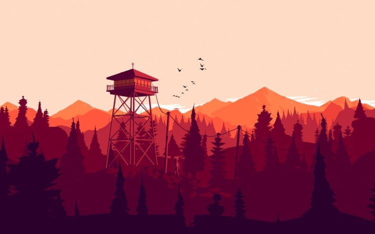
 The song (Magazine) was created by Editors and permission will be sought for the use of this song. Editors is an indie band, so the music video will follow an indie perspective. Style models used for this project include: Heart by Flor and High by Young Rising Sons. The style, as from an indie perspective, will include features such as the use of low saturation shots and extreme close-up shots. Due to the nature of the song being sponsored by a headphones company, several headphones shots will have to be used. These must be relatively consistent, in order to solidify the fact that this is a sponsorship. 

Magazine: 

The main focus of the magazine is to create a house style to represent the indie theme, focusing more on low contrasted, washed-out colours designed after the indie style. This will ensure that the appropriate (indie) audience can recognize that the magazine is designed for an indie audience and therefore the magazine will appeal to the correct target audience. pictures of the fictional band will also be used here, to create anchorage for the band discussed in the articles within the magazine. The content of the magazine will be varied including the required two page band interview, the advert and the front cover. The style model used is INDIE magazine.

NeA

I will title my magazine “Gamerz Alliance’ as I want to make it short and catchy. I thought this would appeal to my target audience of males between 28-30 and new affluent workers, who have a keen interest in gaming and the world of professional gaming industry. I am also aiming to appeal those with an interested in the art and graphics behind gaming and what goes into creating games, by using high quality graphics and a simplistic artist design.

When planning my approach to my magazine and was researching style models I found that the most compelling magazines included a main character in the centre of the magazine. I subsequently decided I will use a games character designed in fuse as the dominate signifier to represent the theme of my games magazine and create to include a high quality character which appeals to audiences interested in graphics and character designs. I have chosen to size my magazine at a width 11cm and a height of 17cm, I decided this as it would fit well into someones bag and would be a big enough size to read comfortably. For my contents page I want to make this clear and simple for readers to be able to refer to it quickly and am going to create a simple clean professional design which fits with the and Target audience of my magazine. When coming up with the design and target market I research popular gaming magazines on market and was inspired by the use of Signifiers in the magazines to make it clear what its about and use of bold headlines.My double page spread will also follow the theme of being sleek and professional and will be an artist feature. Inspired by Magazine titled ‘Art of gaming” I will create a double page spread which explain the process and artist goes through to design her characters. I will include image of her process and her creating her work.

I will also create 3 adverts, one of which will be for a new gamer realise using bold text looking as if it is on fire on a plain background with the logos of the game company include. this will make the advert striking much like the one I was inspired by for ‘doom’ released in 1994 which uses a bold title as anchorage to get readers attention. I will also do this when advertising a gamers tournament using typography skills to create bold interesting titles using graphic design elements like seen in published magazines, I plan to use Glitch text going with the them of computers and gamers.

media statement of intent

My intention for my 3 adverts are to use the following theorists,Propp’s character functions, and Peirce’s Sign Theory, or Semiotics. I want at least 2 of my adverts to have some mention of the game i created on the front cover, “oakvally”. I plan to incorporate them in a sponsor ad or a game bundle advert.

For my first advert I planning to create a game bundle advert for 3 different games. 

I plan to use out of the following 2 layouts as my display for this advert;

(competition layout of with a ^ formation of 3 games)

or

(page is split into 3 slashes showing action shots of the 3 games)

I think both of the layouts have their potential but the advert layout that’s divided into 3 might either be more eye catching to audiences or simply might fit correctly for an A4 and might work better as a landscape advert. But on the other hand the use of triangles to display the different games in the bundle could be another promising layout and will work with the A4 sizing. 

For my second advert I want to do a sponsored advert of a console sponsoring my game oakvally. Examples of possible companies I could use to cross platform are, PS4 or twitch. These two companies would have different effects in sharing the game across audiences. Using PS4 would give the intention for audiences to buy the game and can give a good wide reach across different audiences for users who have a PS4. this is still very useful but it wouldn’t engage the audience as much as being sponsored by twitch as it would reach a wider range of audiences who enjoy indie games and would be streaming the game playthrough through the platform which then is more free promotion and engages the audiences and can mean there more likely to buy the game since there favourite streamers have played it. The target audience would be the same age range of  young teens for oakvally and followers of PS4 or twitch.

For my third advert I want to attempt to use silhouettes for a more simplistic but effective style for video game characters. This will be an advert for a separate game that would be coming out on PS4. I want to see how simplistic I can go with the advert but still have it look professional and realistic to what you would get in a video game magazine. I’ve seen this stype be used on PS4 covers and I think it displays a more subtle but effective show of strength and confidence of the character without having to physically show those emotions on their face. It’s a good way to make the audience, instead, focus on the body language of the character because, that is the only thing the designer has allowed them to see.

(the PS4 advert reference for advert 3)

Ps4 Pro Super Charge Your Gaming Experience Ad in Delhi Times on 29th Dec -  Advert Gallery
2nd advert layout idea

front cover layout references

Subscribe To The New Pokemon Magazine! 3 Issues for 5 | GamesRadar+
Powerpuff Girls Magazine — Christine Moore

content page layout references

AusReprints - Garfield Cartoon Magazine (Egmont, 1994 series) November 1994

double page references

Pin on Magazines
Journey Article Magazine Spread by GirlNamedEd on DeviantArt
Video Game Magazines Revisited: Nintendo Power Issue 01 (July/August 1988)  | by Kyle Schruder | Medium
Pin on Magazine Design

colour scheme references for part of 2d advert

3rd Advert References

NEA Statement of Intent

I am doing the NEA 2 which is the games magazines and adverts. I will do this by creating a radical product using a man as the dominant signifier in a war themed video game. This is radical as it is stereotypical having a man character being represented as the protagonist in an action genre game. I will use a Fuse man gamer on the front page as it conveys the message that it is for a specific target audience, the person will be wearing a headset and holding a controller with stereotypically big arms. My contents, I will then include pictures of animated characters to advertise a new game and screenshots from this game. For the double page spread I will use one image of a fuse character that will take up a lot of space on the left side, this corresponds with Judith Butler’s theory of gender as performative. As the game is a cross between skating and war which are both typically male dominated. The style model I have used for this is:

For the three advert prints I will be advertising an online football event. To communicate this I will use a background of a football stadium with bold writing to show the date and time of the event. This could appeal to a niche audience that enjoys football games as well as action. This is playing on the assumption of what men in this target audience would enjoy and what else would appeal to them. My next print will be an advert for a new games controller with voice recognition, the colours are blue and white which mocks the stereotypical colours associated with the male gender. This would appeal to a gaming audience as it is a new technology that is easier than using headphones with a microphone. My 3rd advert is for a new game called ‘Action Adam’ which is a game that features a typical action figurine-looking solider, who is based in a city doing different tasks. This game/advert would appeal to the audience as it fits within the action genre and in terms of representation, the target audience could identify as ‘Adam’ and give a sense of secured masculinity. The background will show a landscape of buildings to give an understanding of the setting within the game and have the avatar ‘Adam’ as the dominant signifier.