Print Advert style models

Advert 1

The Game

The game will be of a group of female cartoon characters trying to complete courses of worlds. The game play is trying to get the characters to the end of the courses. There are many worlds and obstacles which could make them loose. There are many features of the game such as single mode, team mode and also puzzles to complete.

Layout

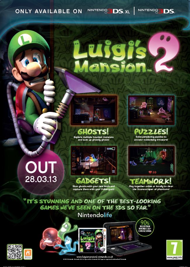
This advert is an idea of what one of my adverts to look like. I really like the look of the game play in the 4 boxes, which I think will look good for my magazine when advertising one of my games. I think i will also include the date of the release so readers know when the game will be released.

Colour Scheme

The colors of this advert will be white with pink features such as the borders round the 4 boxes with photos of the game play of the game. The advert will be bright and bold, so it will stand out

Features

This advert will be advertising a new game which will be releasing soon. I will create some characters to be the main images and will create scenes of game play, to include in the 4 boxes. The advert will include the price of the game and a quote of what experts have said about the game. There will also be a rating feature of what age this game is for. I will also include the main symbol of my magazine which is point up arrows which will be around the game play boxes

Advert 2

The Game

The game will be a sliding tiled game where you need to match up the two colors to win points. More tiles will show up when u match more colors and if you can match anymore then the game is over. With these points you win coins and with these coins you can buy boosters and buy new colors tiles.

Layout

For this advert, the background will be a checkered pattern of two different colors. It will have a retro kind of looking title and will include quotes from gaming professionals showing their opinions on the game play, which will be in bold and understand the title.

Colour Scheme

The color scheme will include white and pink which are the two main colors of the magazine. The title will be bold and in black so it stands out from the checkered background. Other features of text will also be in black, so it doesn’t sink in with the background.

Features

I will create a checkered background to symbolize the game play of the game and I will create “coins” which players can will when they gain a certain amount of points, these coins will be dotted around the advert page. I might also create an tablet with the screen of the game play.

Advert 3
The Game

The game will be consist of females characters trying to fight and go through obstacles to try and find the prize of money. The characters will use guns and have weapons to use when trying to get past an obstacle. The game play will go through different scenes and worlds to try complete and find the prize.

Layout

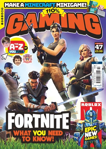
The layout will consist of having about 4 main female characters on the front of the advert doing different positions together. The title is be big and bold and behind the characters. The background will be of a sky and grass and will have a fade of the pink in the background like the image above

Colour Scheme

The color scheme will be all different colors but will interpret the main color of the magazine of pink. The characters will wear dark colors so the background stands out even more of blue, green and pink.

Features

Features will include some weapons, the female characters some obstacles and maybe even some game play at the bottom of the magazine. There will be the price and the rank of the game this year and quotes which a girl gamer have described the game as.

Music Video Manifesto

Todorovs narrative theory

Idea – Jordan drummer artist, going about life and practicing, doing a performance in first chorus, mid scene get in car crash which makes unable to play, end follows scenes of empty drum set with switches to drummer recovering. Song = Magic tricks by Whalers – free royalty free music

Shots: First scene driving to practice, shot of turn up radio, shot of reversing possibly. 30. follow into studio, quick scene of drumming. 45. then scene of editing comp in room with headphones on. 56. Next driving home, shot of window view passing by. 1.10. Scene going into drumming shed, shot putting on beats headphones then drumming. 1.35. Shot of lying down into bed, then rising next morning. 1.38. Open fridge grabbing food, then cut to shot turning on car with keys. 1.50. Speed shots of arrive studio, play drum, edit music, Drive home. 2.0. Speed shots of arrive studio, play drum, edit music, Drive home. 2.10 – quick cuts of close zooms on road, hands, radio etc. 2.20 message on phone then cut speed with car crash to black. 2.45. Hits slower verse in song, opening up 2.50 (black) looking at sky, 2.58. cut to black again. Shot of empty drum set 3.05 (black) empty edit room 3.10. (black) empty shed 3.15. (black) open to lying in bed 3.20, repeat bed quick multiple times, 3.30. use window view driving scene. 3.35. End with shot of only hands picking up drumsticks, 3.50 go down to do first hit and cut film to black. 4m

Double- Page Spread Draft

Intent of Double-Page Spread

My intention is of a famous young gamer and is an interview of her success and her story throughout the years and experience of the gaming industry and how hard it is to succeed. The interview is meant to be an inspirational double page spread to convince other females anyone can go into this industry as a job or even just for fun.

Images that will be used

I will use my own images of one of my friends gaming and just photos of her as she will interpret the famous female gamer. There will be one main image of her and then other smaller images of her gaming which will be placed around the text of the interview, they will be wrapped around the text.

The Text

The text will be shaped around the images and will be in a magazine format of columns going down the page and across onto the other page. There will be some quotes which will be the main pieces of information and inspiration quotes and these quotes will be in bold.

Front Cover Style Models

Title and Master head

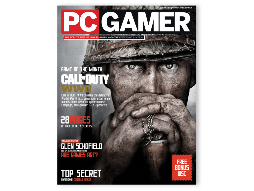
I will replicate the style of the PC Gamer master head with my magazine name of “high score”. I will section both these words out just like this magazine and section the two words with different colored backgrounds such as pink and white. I will make the text color a different color too so it stands out.

The titles and selling lines below the master head will be the same theme of the master head. For my selling lines, i will include a catchy and bold statement, which will draw readers in. Such as “the world’s best selling female gaming magazine”

Main Image

For the main image for my magazine it will be of a female gaming, with a headset and even a gaming controller too. The image will be in black and white so the pink background won’t take anyway the focus. The image will be under the master-head, so the image has a smooth effect.

Other Images

Other images will be images from other games which is advertised in the magazine, such as characters or images of game play. I will include arrows pointing up to symbolize a high score in a game which matches with the name of the magazine.

Cover Lines

My cover lines will be placed around my magazine, in a bold and white font which will give clear statements of what is in store inside the magazine. My cover lines will be clear and simple to give a strong effect to the readers, it also shows that it is an easy read for a magazine. My cover lines will include new games, top 10 games of the year, exclusive interviews etc. It will overall show an easy was the showing what is inside the magazine.

Other Features

My magazine will include other features such as a dateline which will be placed underneath the master head. It will include a price which will be low, showing anyone can buy it which will be placed also near the master head. The last feature which also will be included on the front page of my magazine will be the bar code, which will be placed at the bottom of the page.

Games in the magazine

Definitions: Postmodernism

Pastiche – Is a work of visual art, literature, theatre or music that imitates the style or character of the work of one or more other artists. Pastiche celebrates the work it imitates.

Parody – Is a joke or a play on work which is created to imitate or make fun of an originals work, the subject, artist, style or other targets are imitated ironically to create a satirical effect.

Bricolage – Is a collection or collage of different media texts which form into one text.

Intersexuality – Is a person whos reproductive or sexual anatomy doesn’t fit the boxes of “Male” or “Female”

Metanarrative – Is a narratives about narratives of historical meaning, experience or knowledge which offers a society legitimation through the anticipated completion of a master idea.

Hyperreality – Is the inability to distinguish reality from a simulation of reality, in Media a story can be presented that does not entirely reflect actual reality.

Simulacrum – Are copies of things that no longer have an original, Abstraction today is no longer that of the map, the double, the mirror or the concept. Simulation is no longer that of a territory, a referential being or a substance.

Consumerist Society – Is a societym in which people devote a great deal of time, energy, rescources and thought to consuming. The general view of life in a consumerist society is that consumption is good, and the more consumption the better.

Fragmentary identities – Refers to the loss of relatedness of ego parts, and a loss of aspects of ones identity.

Cultural appropriation – The unacknowledged or inappropriate adoption of the practices, customs, or aesthetics of one social or ethnic group by members of another (typically dominant) community or society.

Reflexivity – generally refers to the examination of one’s own beliefs, judgments and practices during the research process and how these may have influenced the research.

music video brief

Create a three minute music video to promote a
musical artist/band. The artist/band has record
company backing and already has a strong
social media following. The video aims to raise
the profile of the artist/band and help appeal to
a mainstream audience.
You may select the genre of music. The video
should feature the artist/band and use media
language choices that both reflect the codes
and conventions of the musical genre and act to
construct a clear brand identity for the
artist/band. The video is being released as part
of the promotion of the artist/band’s forthcoming
UK tour.
The artist/band has a sponsorship deal with a
headphone manufacturer and their product
should be featured in the video in some way.
• At least two filming locations
• A range of camera shots, angles and
movement, to establish the locations and
representations
• Appropriate framing of shots
• Appropriate choices of imagery to create
meaning
• Editing of the footage for meaning, including
continuity and/or visual effect
• Use of appropriate lighting and mise-enscène.

MAGAZINE COVER

You should create four pages from a music
magazine – specifically:
• a front cover featuring the artist/band
promoted in task one
• a two-page interview with the artist/band
• a single page advert for the artist/band’s tour.
The magazine targets a mainstream music
audience.
The front cover and interview can use some
images from the same photoshoot but other
original images that offer some visual variety
should also be used.
The interview should be used to promote the
tour and the music video. It should also
reinforce the brand image of the artist/band and
integrate some reference to the headphone
manufacturers who are sponsoring the
band/artist.
Front cover
• Title and masthead
• Selling line
• Cover price
• Dateline
• Main cover image and at least two further
smaller images related to the content of the
magazine
• At least five cover lines.
Internal pages
• Content that is appropriate to the conventions
of the genre of magazine being created
• Original copy (at least 400 words)
• Each page to use original images as
illustrations
• Internal pages should reflect the design
codes and conventions of the genre of
magazine being created.
All pages
• A clear house style should be used in the
presentation of all pages
• A minimum of seven original images should
be included in the submission
• All copy should be original and a minimum of
400 words should be submitted
• Work should be presented on pages that are
an appropriate size or in propo