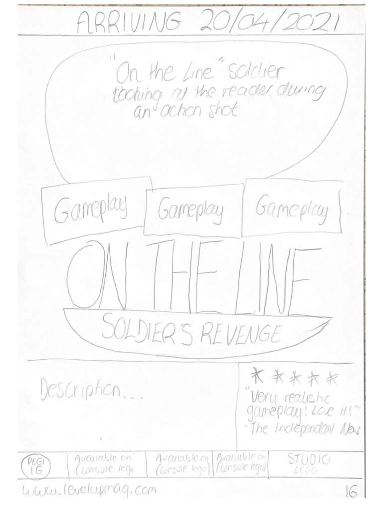
First ideas for style model


First ideas for style model
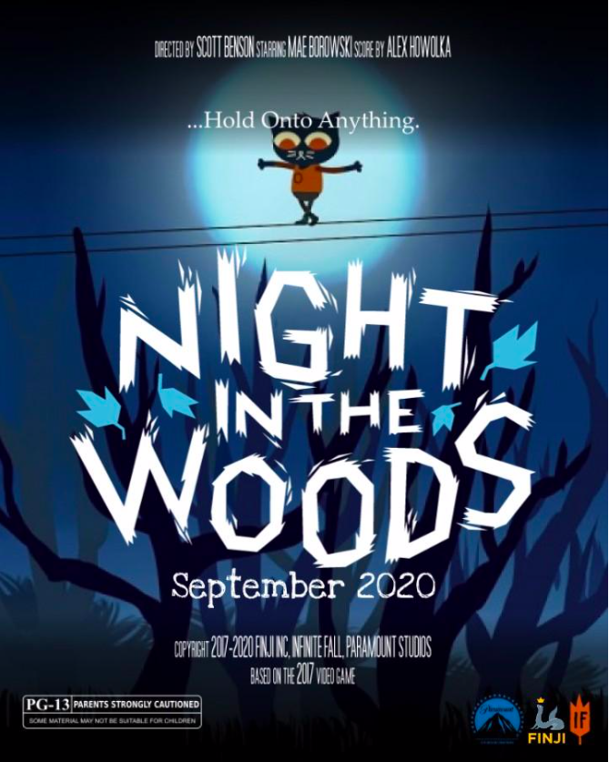

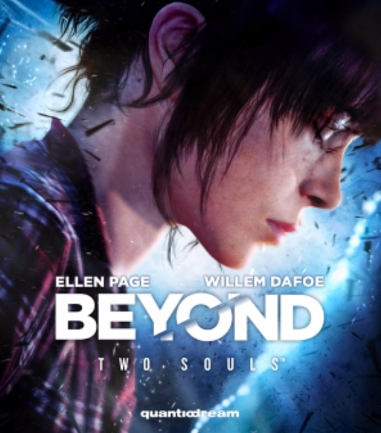
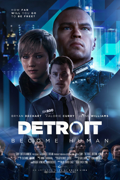
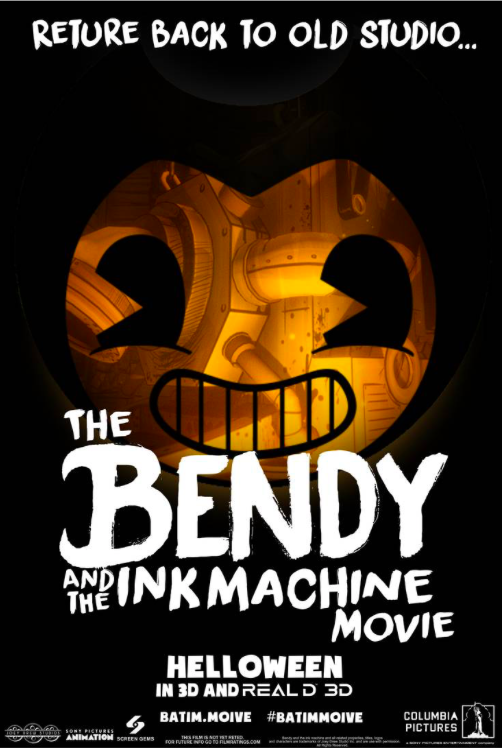

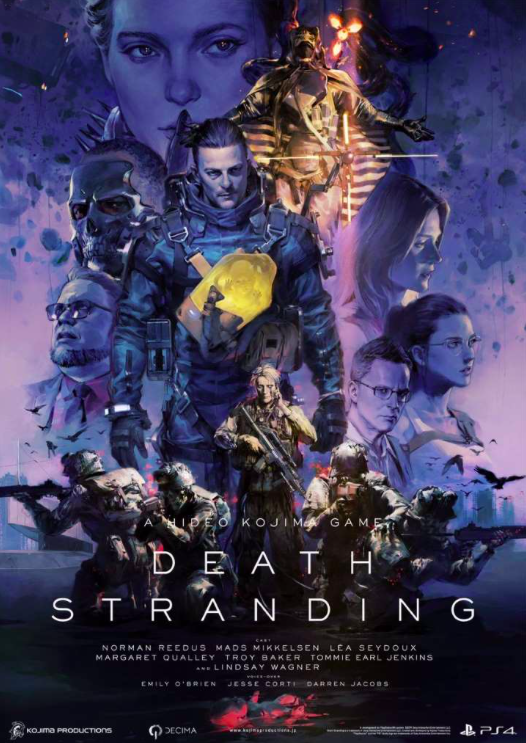

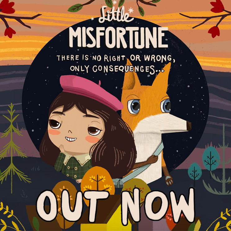

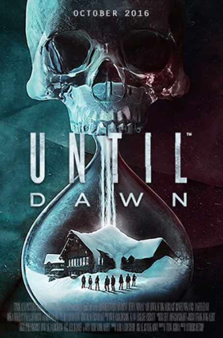
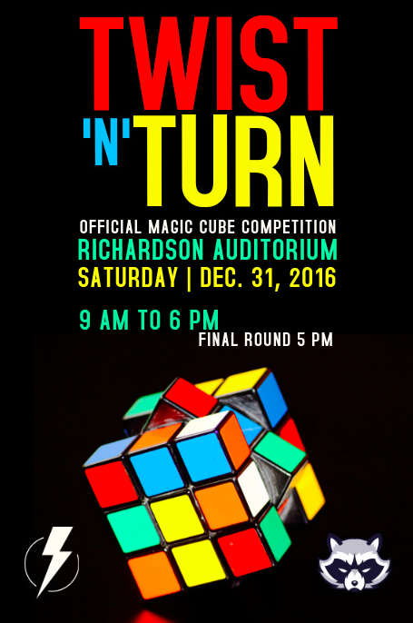

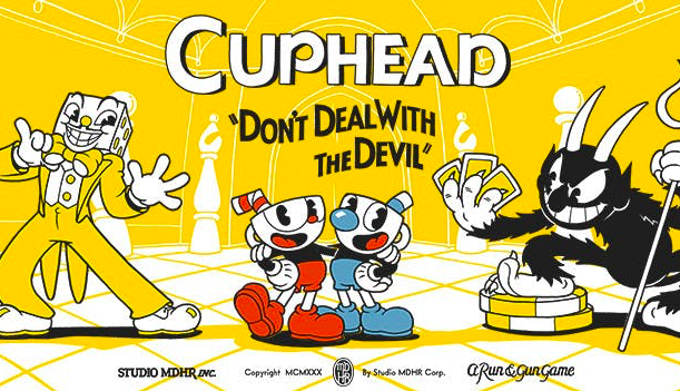


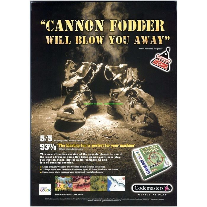

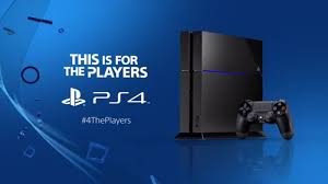
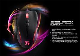
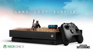
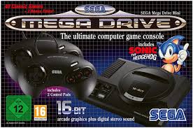
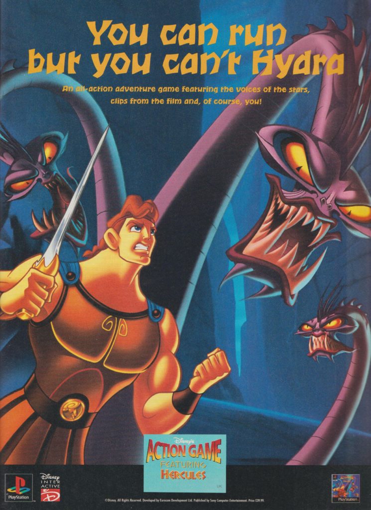

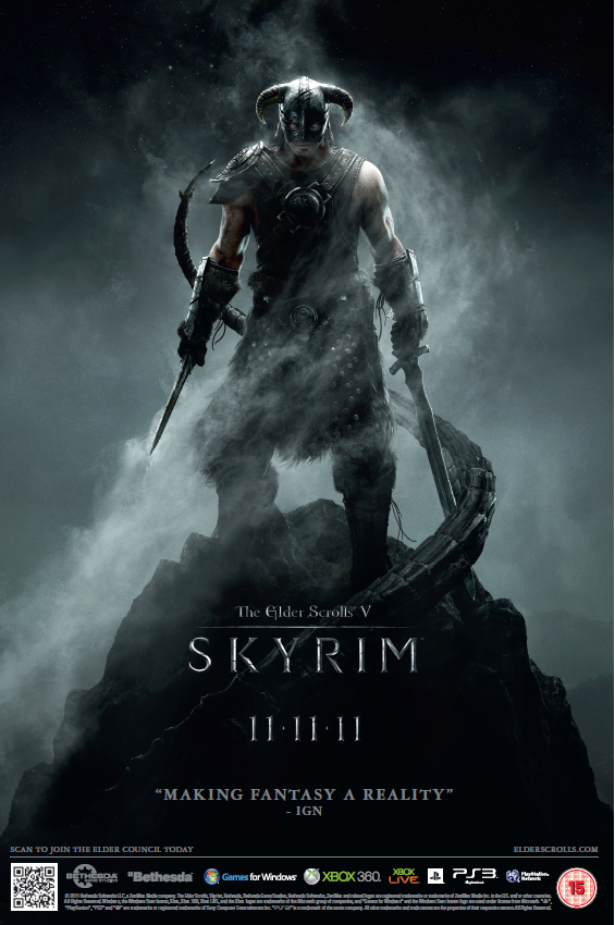
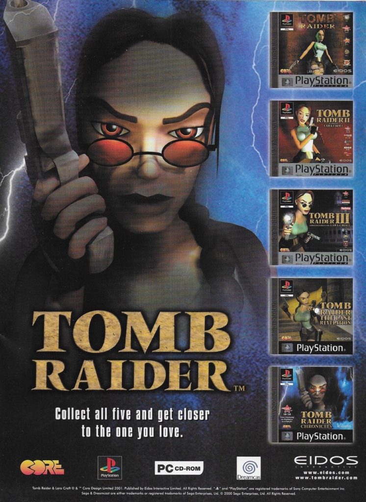
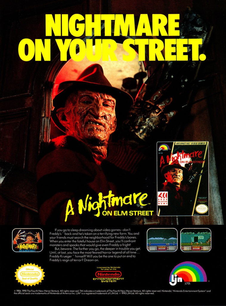
My Three adverts will all be related to games and gaming as the audience of a gaming magazine would most likely be interested by adverts about games, games consoles, and gaming peripherals like controllers or keyboards made for playing video games with.
My first advert will be for an upcoming video game, my second advert will be for a games console, and my third advert will be for a piece of gaming peripherals, e.g. a headset, mouse or keyboard designed for gaming.
My target audience is largely older, being adults or teenagers, and as such my adverts will be more subtle and sleek, as I feel that suits the magazine’s aesthetic more than over the top adverts with bright colours.
The style models I have chosen show that adverts usually have a large, attention-grabbing title and image along with much smaller text and images that go into more detail about the product that is being advertised. Therefore, I plan to make the adverts attention-grabbing while fitting generally with the aesthetics of the magazine using large images and titles using usually darker backgrounds contrasted by lighter colours. For example, my console advert will have the console dimly lighted but have the light of the console providing a clear point of interest in the main image, from which the reader would be interested to read the more specific text and images in the advert.


AD 1
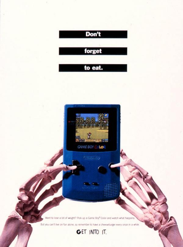
My idea for my first AD is a health company reminding gamers to not sit inside all day and only game, they need to take care of their well being and general health. I will have someone holding a glass of water being the focus of the AD.
This will advertise an online free drop in session where you can talk to health specialists and get unique advice and things to do specifically to you to maintain good health whilst gaming.
AD 2

My second AD will be a monitor cleaner/spray called ‘spray and pray’. I will have a picture of a monitor and the spray bottle, with descriptions around the image.
AD 3

My third AD will be a 2 in 1 controller and mouse where you can change it to become a mouse or controller with just a few simple steps. This takes up less space and is an affordable price for what it is. HELL RESCUE exclusive to be released before the game is released to promote the game and ensure that gamers have the best quality gaming experience.
Product


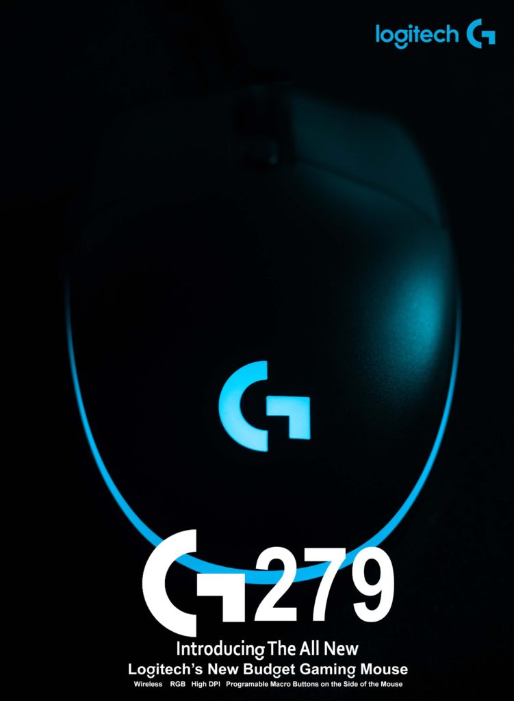
I took photos of my mouse to go in the magazine as an article for it but never actually made it. When we got told we had to make an advertisement page for our gaming magazine I thought this shot would work really well as it looks similar to a shot you would see for a mouse advertisement. I then found the style model (above) that was similar to how I imagined it to look. I then took logos from the internet and placed them in similar places as the style model. I then went on to find a name/number for it to show it is a new product as the mouse is actually a G203. All gaming products by Logitech are called G— ( – represents a number). I found the name/number G279 was not taken so to make the mouse different I photoshopped the wire out. On the text I changed the g to look like the g in the logo. I ended up using two o’s where I photoshopped half of one out so it can go underneath the other to look like a g.
Online Event


Phone Game

Source Used for the Pennywise Image: https://www.getsurrey.co.uk/news/surrey-news/terrifying-clown-emerges-woodland-sandhurst-17131276


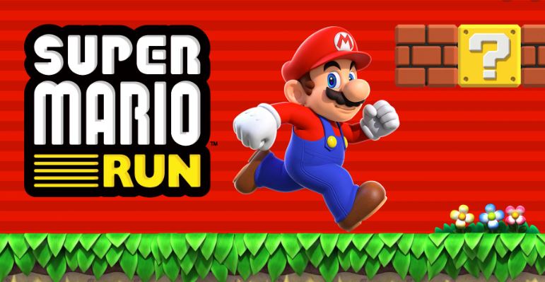
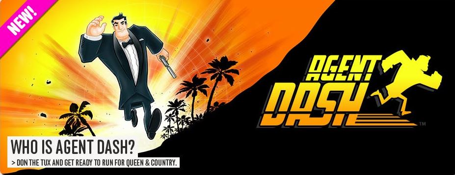
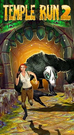
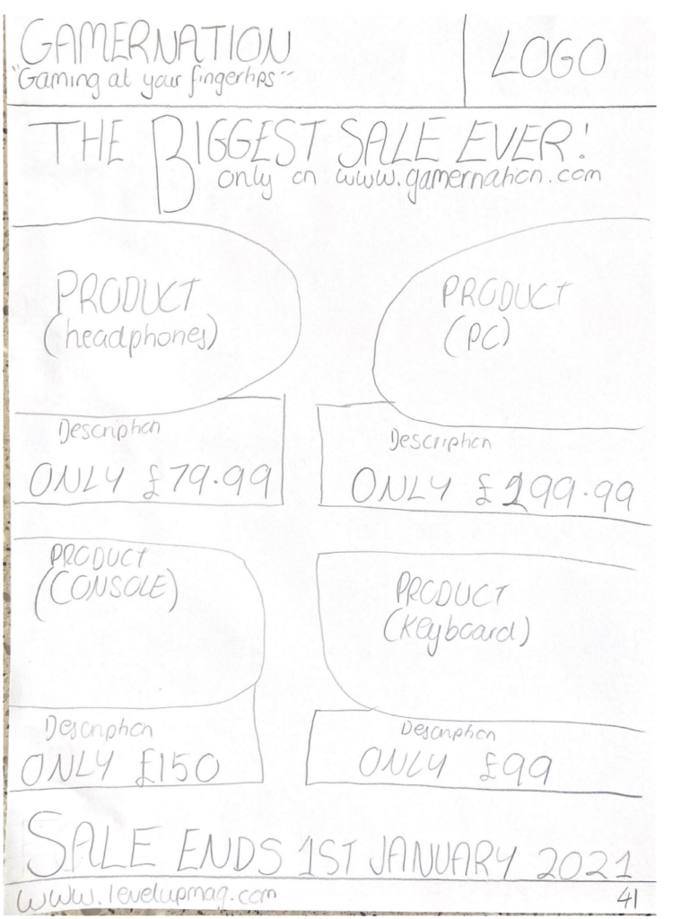
For my first print advert to go inside my gaming magazine I will create an ad for a new video game that follows the same genre of games that the magazine writes articles on. I will follow a style model of one of the above images to create a realistic and convincing ad.
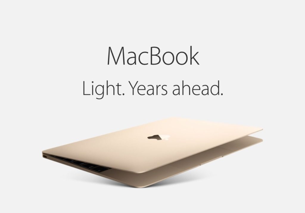


For my second ad to go in my magazine I will follow this style model to create a print ad for the latest gaming console or device that games mentioned in the magazine can be played on. The second image in the style model shows a gaming console and a game that can exclusively be played on it, I will incorporate this idea into my ad as it advertises two different products in one.

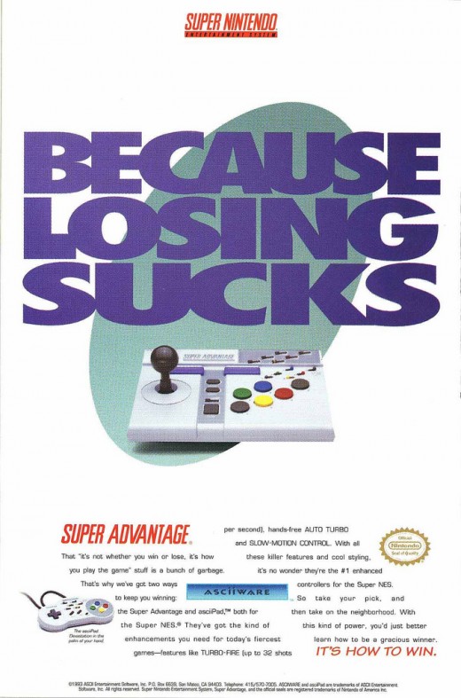
For my final ad I will create an ad in the style of a vintage gaming advert to link in with the theme of my double page interview about vintage games however the ad will be for a modern or new game or possibly a reboot of a vintage game so that the theme of the magazine still promotes the newest things going on in the gaming industry.
Advert 1
My first advert is going to be a remake of an old game. I’m choosing to include this as it will create the sense of nostalgia for my readership. I am most likely to create this advert about Mario or Pac-Man.
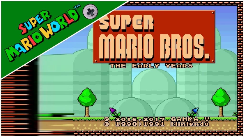
Advert 2
My second advert will be about a new Nintendo. This will relate to my 80s theme as it was popular then. I am also considering linking my first advert to this one by making the game for a Nintendo.

Advert 3
My third advert will not be to do with the theme as much and focuses more on gaming now. I am going to make an advert for a new gaming headset which provides high quality sound.

My 3rd NEA advert is going to be for a video game store, similar to GAME, GameStop or SeeDee Johns. However, I want to play with this advert and emphasise how the products being advertised are video games. I have used this advert by BestBuy because I think it is very engaging by the use of their bright brand colours.
However, I am going to use parts of this advert for FuncoLand, which will be the prices in the shapes because I think they will stand out.
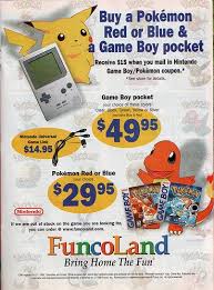
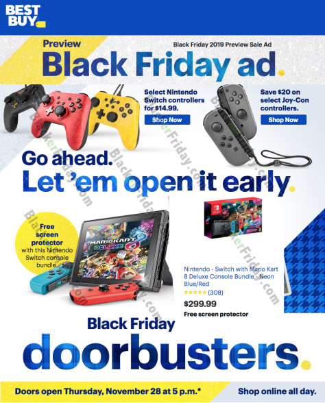
I wanted to think out the box as most student will be doing adverts for games, consoles and online media, such as streaming sites. I like this advert because it is advertising a store (mine will be a video game store), showing off all their products and the bright colours used will make it stand out, which means it’s most likely to grab the reader’s attention when flicking through the pages
My Plan
My second NEA advert is going to be for a new video game launching. I am using the below “Call of Duty” advert because when researching, I found this advert was engaging and can link to my front cover, which mentions the launch of a single player shooting game, similar to Call of Duty.
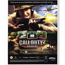
I want to use this as my main style model because I like the action shot and the direct address of the soldier, looking as if he is aiming at the audience. I feel this sets the nostalgic feeling to the video-game, especially as it is a war-type game. I also like the dark colours as it sets a sinister feeling.
I also like the central 3 images of the gameplay as it gives an insight towards the game and I feel it will engage my audience as they can see snapshots of gameplay they will experience playing the game.
My Plan
