Section A
CSP 1 – Tomb Raider

Front Cover –
- Lara Croft = Dominant Signifier
- Bold, Underlined text to emphasize title
- X Box symbol = Symbolic Sign
- Contrasting colours allow Lara Croft to stand out
- Rule of thirds also emphasizes her central positioning
- The iconic sign of a gun breaks female stereotypes
- The revealing clothing and stance supports the stereotype of objectifying women
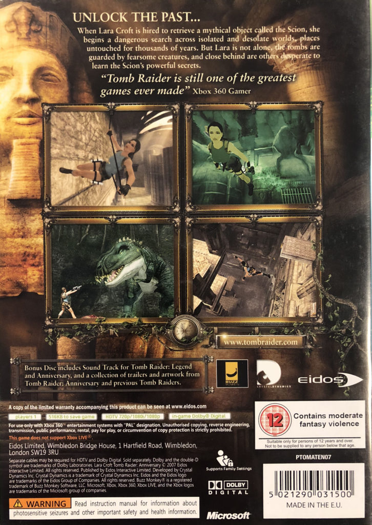
Back Cover –
- Different font sizes to highlight key information
- Use of boxes, boarders and gutters to separate illustrations and text
- Website link = anchorage (more info on website)
- Continuous colour scheme = neat, dark colours (black) = connotations of danger, bright colours (gold) = connotations of treasure/ fire
Context –
- She was one of the first female protagonists in a gaming industry filled with women in supporting roles.
- Lara’s combined independence, strength, intelligence make her a great role model. She can speak several languages. She knows how to use more weapons than most military personnel.
- Lara’s first iteration began in 1993.
- The plan was to make her a male character not dissimilar from Indiana Jones until someone requested a more original idea to avoid a lawsuit.
- Lara’s creator Toby Gard avoided hypersexualized and dumbed-down character traits. The goal was to keep her realistic in build and level headed in nature.
- The creator accidentally increased her breast size by 150 percent, the creative team insisted it was maintained.
- Males playing as female protagonists were mostly unheard of when Lara hit consoles and computers in a male-dominated market as women characters were mostly victims of some sort
- The parent company climbed out of a $2.6 million-dollar deficit to a $14.5 million-dollar profit within one year after TOMB RAIDER’s debut.
- Tomb Raider is an action-adventure video game developed by Crystal Dynamics and published by Square Enix.
- Crystal Dynamics Parent organization = Square Enix Europe
CSP 2 – Mens Health
The men’s health magazine uses a positive stereotype of men that has been used in order to convey the idea that the main subject is strong and independent, sexualisatione is limited. This appeals to the audience as it suggests they will be able to appear the same as the magazines dominant signifier for this issue, Vin Diesel, after purchase.
Print terms applied –
- Subheading
- Dateline
- Photography
- Sans/ Serif fonts
- Slogans
- Paragraphs
- Leading Lines
- Advertisement
- Font size
- Font type
Reactionary –
- Follows the dominant ideology of males and the gender stereotype where males are very muscular and regularly attend the gym
- Vin Diesel is standing in a pose which makes him appear quite tough, showing off his defined muscles
- Colours used that are stereo-typically more masculine = Blue/ Grey/ Black
Radical –
- Unlike many other fitness based magazines, Vin Diesel is wearing quite covering clothes rather than very revealing ones.
- Plural Identity represented – contains an athletic 69 year old and Mid-ages Vin Diesel
- The magazine isn’t 100% aimed at a male audience, it is for anyone who is interested in fitness.
Front Cover –
- “New Year, New Muscle”
- “103 shortcuts to t-shirt arms”
- “Lose 8kg fast!”
- “# Slay winter blues”
- Double your metabolism”
Short + snappy play on words, # can be seen as a more female related term/ icon.
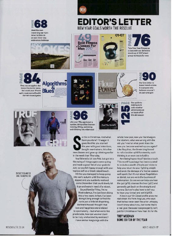
Contents Page –
- “Best fitness classes for men”
- Algorithms & Blues”
- “Flour power”
- “Style”
Targets peoples overall appearance and intelligence, seems to be targeted specifically at a male dominated audience.
Article Page –
- “The marathon man”
- “Your only limit is your self better”
- “Accomplishments”
All positives, supporting exercise and healthy regimes.
CSP 3 – That Boss Life Advert
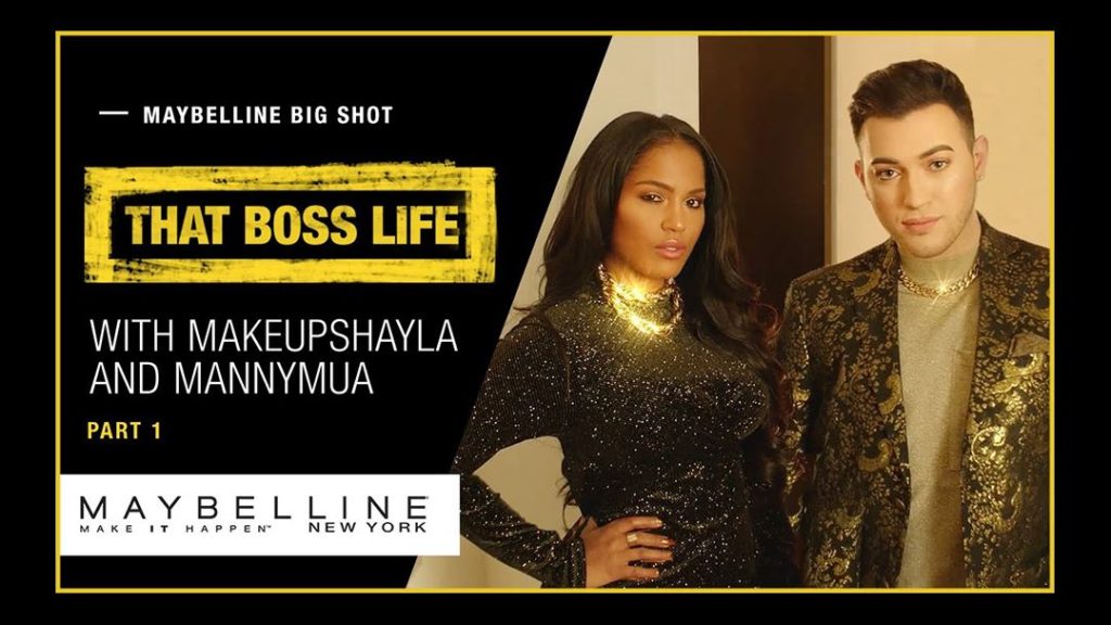
Icons/ Influencers – MakeupByShayla + Manny Mua
Setting: New York – This city is an aspirational way of living, sets up desire for the audience. Supports ideas of Wealth as NYC is very modern.
The Bell Boy – His narrative can be seen to be ‘on trend with gender politics’ as he represents someone from outside the beauty influencing community. But yet still has an interest in the product which opposes classic male stereotypes
Golden Suitcase – An inter-textual reference (anchorage) to other media products like slumdog millionaire. Indexial sign to the actual product (mascara) and wealth due to the connotations of the colour gold.
Throwing Mascara – Common idea of an abundance, most often paper money, the large quantity of the product adds on hyperbolic idea of luxury by comparing it to that of an abundance of cash.
Close-up – Against male gender stereotype, slow motion to emphasize product + transition (before/ after) buildup.
Colour – GOLD – After the product is applied everything becomes more glamorous, builds audience desire, even the peopled personalities change – now more confident, direct mode of address used by staring at the camera, breaking the fourth wall = builds relationship and trust.
Theorists to apply – David Gauntlett (Gender Fluidity)
Section B
CSP 4 – The Killing
Characters –
- The Detective = Sarah Lund = Has a natural instinct for law & order. Breaks stereotypes = Dominant/ intelligent female lead
- Second Detective = Jon Meyer = Frequently opposes the superior, female detective
- The Victim = Nanna Larsen = Young, female = vulnerable
Theorists to use –
- Propp’s theory of 8 stock character types
- Levi-Strauss theory of binary opposition
- Todorovs theory of narrative structure
Narrative –
- The first episode introduces many different characters, set the scene, gives some background information of relationships and friendships, introduces the disruption to the plot.
Themes –
- The use of binary opposition around familiar themes = family, community, law & order and justice
Representations –
- Reactionary representation of police, family, urban and rural areas and law & order. Female victim
- Radical representation of female lead and male inferior
Technical Codes –
- Language of moving image = Music/setting/props/lighting/camera use/editing
- Opening montage sequence that often foreshadows the rest of the episode/ series’s themes, locations, characters and events
Context –
- Genre = Crime, Mystery, Action, Drama (Steve Neale)
- Set = Copenhagen
- About = The killing is a Danish crime/ drama series which follows detective inspector ‘Sarah Lund’, investigating the murder of a young girl – ‘Nanna Larsen’.
- The production, distribution and exhibition of ‘The Killing’ shows how audiences can be reached on both a national and transnational scale, through different media technologies and platforms.
- The Killing acted as a catalyst for the increased distribution/ popularity of foreign languag TV through the UK and other countries.
- The Killing was first released in Denmark in 2007, only airing on UK television 4 years later in 2011.
- Production Company = DR = Danish Broadcasting Corporation
- DR sold the series to a number of other broadcasters worldwide some of which being the UK, Australia, Germany and Russia.
CSP 5 – Hidden Figures
- Hidden Figures is a co-production between independent production companies and a major Hollywood conglomerate through its film subdivision Fox 2000
- Hidden Figures was a low to medium budget film – $25 million dollars.
- These low to medium budget films have become increasingly known for their profit potential
The First Poster – All three of the female leads are seen striding towards the camera, confident and fearless, a NASA symbol underneath them – could be a metaphor for their intelligence/ them standing up against gender and racial stereotypes.
- Slogan = “Meet the women you don’t know, for the mission you do”
- Deals with US history and the idea of the contribution of particular groups being ‘hidden from history’ which is apparent in the marketing of the film.
- The subject matter also links to contemporary concerns and debates about race in the US
- The film is targeted at an audience often ignored by Hollywood due to age, gender and race and can thus be explored in the terms of social and cultural contexts in which it was produced.
- Hidden Figures grossed $169.6 million in the United States and Canada, and $66.3 million in other territories, for a worldwide gross of $236 million, against a production budget of $25 million. Domestically, Hidden Figures was the highest-grossing Best Picture nominee at the 89th Academy Awards.
CSP 6 – Letter to the Free
About Common –
- Common is an Oscar and Grammy award winning hip-hop rap artist who wrote Letter to the Free as a song for the soundtrack to the ‘The 13th’ – A documentary by Ava Duvernay named after the American 13th amendment
- His output is highly politicized, existing in the context of a variety of social and cultural movements aimed at raising awareness of racism and its effects on US society (Black Lives Matter)
- The product can also be considered in an economic context through the consideration of if and how music videos make money for example advertising on YouTube or cookies on a website.
- Common is a Def Jam recording artist
- Def Jam is a label associated with urban and hip hop music, starting as an independent company in the 80s, but is now owned by the conglomerate UMG which also owns Vevo.
- The song was part of the Netflix documentary – The 13th’s – soundtrack and is therefore an example of cross-media promotion and marketing.
- Common = Rapper, writer, actor and activist
- Net worth $45 million
- Emmy award for ‘Letter to the Free’
Music Video –
- Used to raise awareness for racism and its past and present effects on society
- It is in black and white, emphasizing how colour shouldn’t matter
- Symbolic sign = Black Shape that appears throughout the video
- It was directed by Bradford Young, who was the cinematographer of Selma
- Directed by Ava Dulvernay
The Song –
- From an album called ‘Black America’
- Low budget = meaning it may be less formal and more personal
- Genre = Rap/ Hip-hop
- Def Jam/ UMG/ Vevo
- Common felt the need to release the album due to the timing (American election year)
Vivendi = Mass media conglomerate in Paris, the company has activities in music, TV, Film and Video Games.
Vivendi Subsidiaries = UMG, Daily Motion
Section C
CSP 7 – Teen Vogue
Key Words –
- Demographic
- Brand Loyalty
- Target Audience
- Parent Magazine
- Conde Nast Organisation
- Diversified
- Cross-media
- Gender Fluidity (Gauntlett)
Industrial Context –
- Teen vogue is a magazine title owned and published by Conde Nast, an American media organisation that publishes over 20 magazines
- Conde Nast products started as print magazines, but have diversified into cross-media products, produced both online on websites, social media and video-hosting sites such as YouTube.
Audience –
- Conde Nast products target different demographics and offer different types of content
- Glamour and Vogue, for example, target women while GQ targets men
- Attracting a teen audience and generating brand loyalty could actively help increase the sales of Vogue as the Teen Vogue audience grow older.
- Traditionally only seen interesting to a female audience, fashion, beauty and style have become more gender-neutral
- It has diversified into presenting matters surrounding politics and political lifestyle and social content that would be interesting regardless of gender.
- TeenVogue.com provide commentary on gender issues such as gender fluidity as well as ecological issues such as global warming.
Vogue/ Teen Vogue –
- Teen Vogue is an offshoot of vogue, targeting a specific demographic
- Teen Vogue was first launched in America, 2003, aimed at targeting a youth audience who may not be attracted to the parent ‘Vogue’ magazine
- Teen Vogue was originally cheaper and smaller than it’s parent magazine, making it more accessible for its target audience
- Though its online product has become more popular due to its accessibility – diversified into online content
- Shut down the printed version, in order to converge to maintain and expand its audience.
Teen Vogue Income Sources –
Teen Vogue offers its audience different ways to access the product, such as on Facebook, Twitter, their Website and YouTube, so it has multiple income sources. An income will be generated by the sale of advertising space.
- Teen Vogues website encourages users to register with the website for updates which offers the audience access to exclusive, personalized content via cookies.
- This registration provide the company with important audience data that can be used to sell online advertising and generate sponsorship deals
- Advertising can therefore target individual readers of Teen Vogue based on browsing history, other Conde Nast products are also advertised
- Income from views on their YouTube videos.
- Twitter and Facebook encourage the audience to share Teen Vogue content which helps to expand the brands reach.
Media Language, genre and narrative –
- The website is successful as it is visually appealing and easy to navigate, importantly for Teen Vogues brand identity, the site has a distinctive and consistent visual style that makes the brand recognizable.
- The contents pages of the website are organised on a simple grid, information about these contents can be viewed via links to magazine sections at the top of the page, and via a menu on the left-hand side of the page.
- Every page contains the Teen Vogue logo = visual reference to its parent magazine by using the same serif font which has connotations of elegance. Logo communicates brand identity.
- Anchorage created with images for each article
- Stuart Hall’s reception theory = some readers may reject the less traditional content and layout, though others may fine the mix of genres appealing.
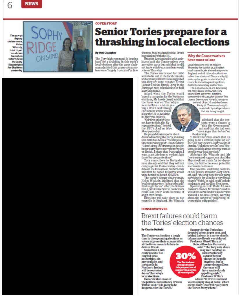
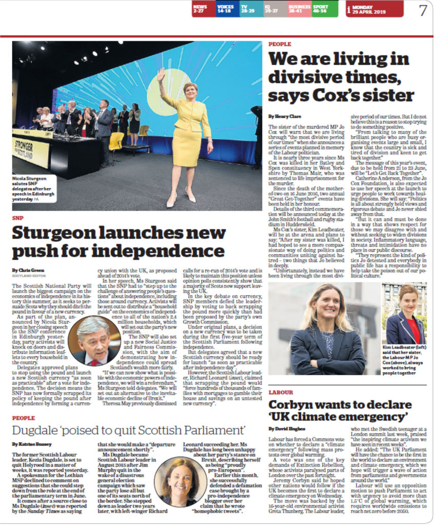
CSP 8 – The I Newspaper
Distribution –
- Large scale printing press
- Vehicle transport for product
- Display Cases
- Social Media Platforms
- Storage
- Platforms
- Target Audience
Consumption –
- Paper
- Digital Device – Wifi
- Target Audience
Noam Chomsky – Manufacturing Consent
- The media is a mechanism that is deliberately used by the rich and powerful as a way of ‘manufacturing consent’ – getting their own way.
- He proposes that the mass communication media of the U.S. “are effective and powerful ideological institutions that carry out a system-supportive propaganda function
Curran and Seaton
Curran and Seaton present the view that a free press relies on a free market where individual newspapers can compete through their political stances and points of view/ success.
- Curran – “Due to price increases of some PSB’s, some citizens are excluded by price”.
- “The UK regards press freedom as an absolute freedom” meaning the government leaves it to the market forces to decide which press products survive.
Free press –
Freedom of the Press or freedom of media is the principle that communication and expression through various media, including printed and electronic media, especially published materials, should be considered a right to be exercised freely
Free Market –
The free market is an economic system based on supply and demand with little or no government control… Free markets are characterized by a spontaneous and decentralized order of arrangements through which individuals make economic decisions.
CSP9 – War Of The Worlds
- Hybrid radio form, adapting the H.G Welles story using news and documentary conventions.
- It is an example of the mass media apparently having a direct effect on an audience’s behaviour.
I’ve always said you can’t understand the world without the media nor the media without the world
Professor Natalie Fenton, quoted in Fake news vs Media Studies
War of the worlds is a key example of fake news (propaganda)
- Narrated and directed by Orsen Welles, made it sound like a news program but it’s fiction (language)
- The radio broadcast was an adaption of H. G. Wells’s novel -‘The War of the Worlds’.
- It was a Halloween episode for a radio drama series “The Mercury Theatre on the Air.” – October 30th 1938
- The episode became famous for allegedly causing panic among its listening audience, though the scale of that panic is disputed, as the program had relatively few listeners.
- Described as an anti-warfare (representation)
- Hybrid Genre (Steve Neale)
- Broadcasted by CBS
- Plot = Normal Radio to stories about aliens which are metaphors for global matters

