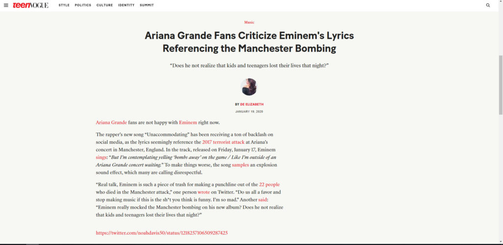
Social – Reactionary Text as it talks about pop music artists having disputes. This is quite reactionary as it focuses o issues that aren’t important at the current day compared to war, fired and death happening. This creates a more superficial problem.
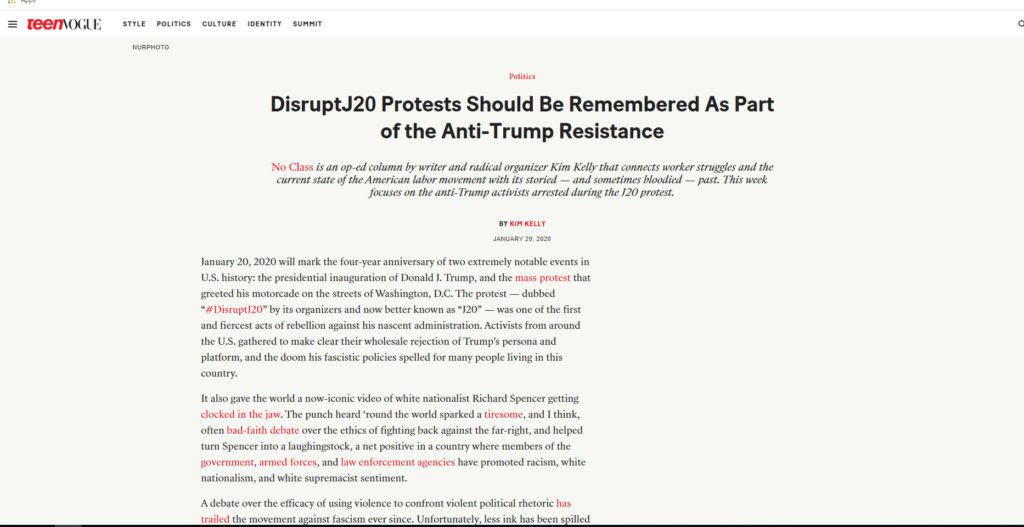
Political – Reactionary and Radical text as it supports the ideology that Trump is bad which is the dominant ideology in America. It also shows that women can be interested and a part of politics as these TeenVogue articles are popular, therefore being a radical text that tries to change the dominant ideology.
NEW TECHNOLOGY
Production
Distribution
Consumption
Digital audio recorders and cameras Photoshop Website Creating Microsoft Publisher
Teen Vogue is a former US print magazine and current online publication that was launched in 2003 as a sister publication to Vogue, who targeted their demographic at teenage girls. Teen Vogue like Vogue included stories about fashion and celebrities.
Editor: Elaine Welteroth
Contents: Fashion, politics, Sexuality
A mix of reactionary and radical, some things are normal and expected but some are random or quite unusual especially for young ages
Conglomerate: Conde Nast which is 108 years old media company which has more than 1 billion consumers in 32 different markets
Deutschland’83 – The detective who has a ‘natural’ instinct for law and order Basic characters of the Hero of Martin and Princess of Annett
Capital –
Capital – Petunia is a victim as she has a tumour
PROPP
NARRATIVE
Both end with a cliff hanger or mystery for what will follow.
Deutschland – The first episode often introduces a lot of different characters Being trapped in unfamiliar place at end of episode Family always separated
TODOROV
THEMES
The use of binary oppositions around familiar themes: family, community, law and order, justice. One person saving many of East Berlin
Capital – Has themes of family, unity and loss
LEVI-STRAUSS
REPRESENTATION
Reactionary representations of police, family, law and order, urban/rural
Different view of Communism as good
SEMIOTIC
TECHNICAL CODES / LANGUAGE OF MOVING IMAGE (music, setting, props, lighting, use of camera, editing etc)
Opening montage sequence that often gives clues as to the whole series – themes, locations, characters, events etc.
Question: ‘Explain how the social, political and cultural contexts of media influence how audiences may interpret the same media in different ways. Use Common’s Letter to the Free to support your answer‘
Know social, political and cultural contexts of media
Know how media influences audiences
Know how audiences interpret the same media in different ways
Cultivation theory is the long-term effects of television. “The primary proposition of cultivation theory states that the more time people spend ‘living’ in the television world, the more likely they are to believe social reality aligns with reality portrayed on television.” The theory is that the more you see things in the media, your perspective or the way you view things changes. Letter to the freedoms this by using the genre of hip hop to gain an audience as it is a popular genre to listen to. This is a way to persuade the world that their message is right. The music video is a part of a hegemonic struggle of black people in America and how they face racism and discrimination. This theory can be portrayed in Letter to the free because of the black lives matter message that it promotes.The fact that the song was also made in a music video format and used for a documentary
figures: letter to the free 2016
Common is an American musician and actor who has a net worth of $45 million
The music industry distributes their songs in different formats. For example the music video for letter to the free and the documentary. They do this to gain an audience.
The song letter to the free was used for a Netflix documentary on how America has private prisons which are required to be full. This caused especially black people to be put in prison for money. “Shot me with your ray-gun, And now you want to trump me, Prison is a business, America’s the company” are lyrics that refer to this. This also goes with the message that racism is still relevant today as there is more black people in prison today than there were slaves when America allowed slavery.
processes of production, distribution and circulation by organisations, groups and individuals in a global context
the relationship of recent technological change and media production, distribution and circulation (streaming services, piracy, etc)
the impact of ‘new’ digital technologies on media regulation, including the role of individual producers.
the significance of patterns of ownership and control, including conglomerate ownership, vertical integration and diversification
the significance of economic factors, including commercial and not-for-profit public funding, to media industries and their products
how media organisations maintain, varieties of audiences nationally and globally
the interrelationship between media technologies and patterns of consumption and response
How media producers target, attract, reach, address and potentially construct audiences
How media industries target audiences through the content and appeal of media products and through the ways in which they are marketed, distributed and circulated: widely distributed on video hosting sites aimed at a youth audience but also consumed by the audience for political documentary.
How audiences interpret the media, including how they may interpret the same media in different ways (Hall Theory of Preferred Reading)
Cultivation Theory
Uses and Gratifications Theory
how your knowledge of the institutional details of the text ie specifics facts, figures, names, dates etc about the text. At this point show your knowledge of the music industry and use key terms (see above)
Next, show how audiences may (theoretically) interpret media texts ie audience theory.
Follow this up with specific ideas that suggest how certain audiences may interpret this particular text (ie apply the theory to this CSP)
Finally, make some summative conclusions based on your knowledge and understanding that show the importance of culture in terms of engaging with issues of power and control. For this you could reference Gramsci & his concept of ‘hegemony’ and/or Habermas and his concept of ‘the public sphere’
Facts:
Common works under Def Jam, which is owned by Universal Music Group, which is owned by Vivendi (french conglomerate). Vivendi also owns Vevo.
letter to the free released 2016 for the documentary 13th. it got the NAACP Image Award for Outstanding Song – Contemporary
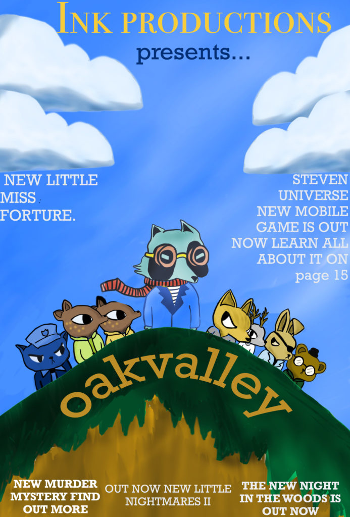
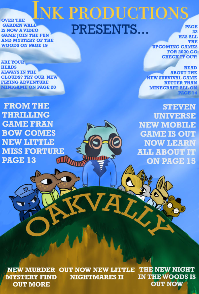
Describing what I have done for my layout is; firstly I created a dominant signifer of the title of the game and the master head at the top of the cover. I chose the layout of the subheadings and text to fit around the main image so it wouldn’t take away the focus of the main character. When consumers looked at my magazine I tried to put into consideration was how the front cover should feel to the consumer. My plan was to make it intrigue the viewer by give a sense of dramatic mystery.
Relating to “Applying Theory Of Audience”, my magazine would relate to the Struggler’s who have the need to escape from reality, which can be achieved in story arch video games. Since storyline video games help relate to gamers, and give a sense of joy playing.
I planned to layout my characters for “Oakvalley” in a “V” formation since I wanted to make the main character stand out the most, to show the importance of the character. I plan for the size of the magazine to be A4 since I don’t want to stretch my characters too much or have too much free space on the front cover. The advantages of keeping it A4 are; it is a suitable size to carry around, either by hand or in bags. Also if I planned to make the magazine anything bigger than A4, for example A3, it would be significantly heaver which is something I don’t want because I want my magazine to be a light weight and appealing magazine.
after creating the characters and background for my front cover I moved onto plugs and subheadings/titles. Now starting on titles I wanted to place the title in a “v” formation underneath the characters to keep the “v” formations of the characters in line with the title so they would both be matching.When choosing fonts for plugs I wanted a soft but sharp font to not convey more formal magazine but more fun “comicy”style that shouts out to kids to buy this magazine. I decided to use a different font for company title by making look more like the fonts used in story books which would usually read”Once Upon A Time…” I wanted the reader to understand maybe not right away but subliminally that the company is the narrator of the story or the company was the conglomerate who owned the magazine that supplied the adventure and mystery to the consumer.
after getting feedback on the front cover I changed my sizes and added more subheadings and plugs to entice more audiences to by the magazine since its widening the amount of contents that would relate or interest the consumer. On my original front cover I left to much space in the magazine so it made my proportions look uneven so by increasing the size of the main character in the middle of the page it evened out the proportions a lot better. after finishing over all I am very pleased with my work on these magazine pages and am proud about the time I’ve spent creating from scratch everything used in them so the magazine is 100% original.
Representation
Asking the question if my games cover is radical, or reactionary. Does my cover goes with the dominant ideology of video game covers, or if does go against them?
I would personally say my cover is radical. my reasoning behind my opinion is;
Firstly the layout, in usually gaming magazines would place their main character as their dominant signifier, on the front cover with no other side characters. (Unless they were important to the story AKA sidekick, or were other protagonists form other video games the magazine is covering). In my cover I have 8 characters in view, so who’s to say who the main character is? There is no big dominant signifier besides the positioning of one blue characters being at the front of the v formation.
references for layout and design for the front magazines
formation ideas charactersstyle ideas of charactersvideo games outfit ideas
back story for video game
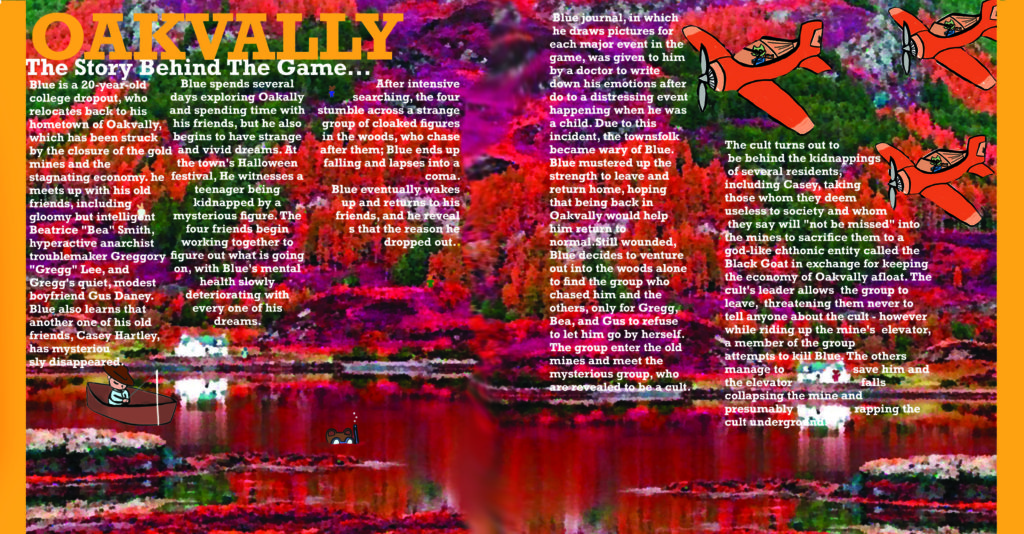
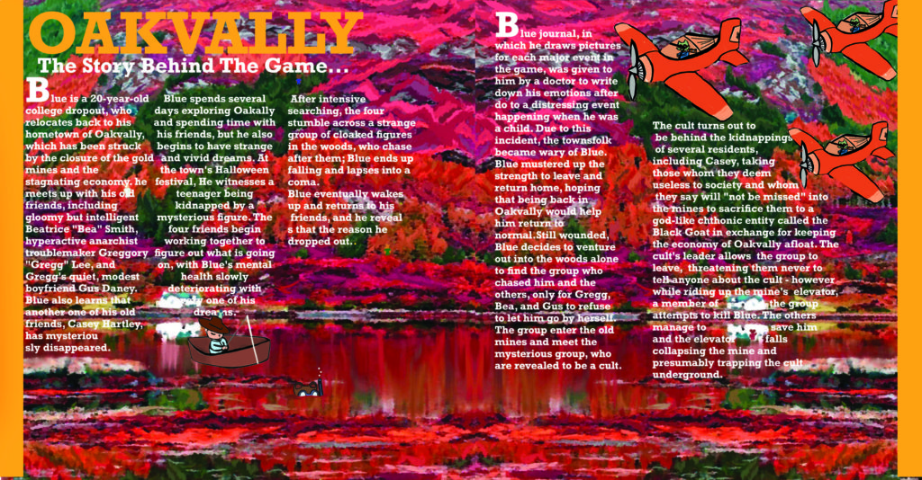
I changed my rough idea for my front cover to this new updated gaming cover about a game I created called “Oakvalley”. It’s a story driven, adventure mystery game. The lead character is College dropout blue who returns home to the crumbling former gold mining town of Oakvally seeking to resume his aimless former life and reconnect with the friends he left behind. But things aren’t the same. Home seems different now and his friends have grown and changed. Leaves are falling and the wind is growing colder. Strange things are happening as the light fades. And a town secret is about to be revealed.
Brief About Magazine
this magazine is going to be themed around mystery/adventure video games with hand drawn cartoons done by me
Next Step Forward
I am going to next upload my sketch to photoshop and use it as a background layer to draw on top. I will try to make a lot of different layers for the characters so I’m able to change scales of clothing or accessories
APPLYING THEORY: AUDIENCE
Looking at Maslows hierarchy of needs, my cover and game relates most to the loving belongs, and self-actualization levels in Maslow’s triangle. I think this because, when it comes to storyline games people can build real connections with the characters. So the way the characters are designed and written can give a sense of belonging or love. From the audience having a specific character that they can relate to and adore will help build up a loyalty of the audience. A story game could relate to the self-actualisation level since a certain games plot, could relate to someones home life on a basic or on a deeper level. It’s the same when an audience can relate to a certain character. It can make them feel more invested in the game, since it can help them feel less alone because the character might imitate the audiences feelings or emotions. So this all leads to a person having a subconscious connection to the game and make it more appealing.
double page spread
before feedback double page spreadupdated and finished double page spread
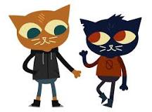
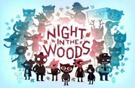
For my double page I want to theme it around the murder mystery games with using inspiration from video games like; bendy and the ink machine, little Misfortune, Fran bow, sally face. by inspiration I mean there art styles/ settings that I can use as backgrounds. I plan to use “Adobe photoshop” to create the double page spread of a landscape sensory that I have edited to give it a more cartoony style. I added my characters on top of the background so the page would have a better connection with the game instead of just being a landscape background. I drew plane with little “blue” characters in them to link to the main character and then scattered other side characters around the environment but placing them in place they would still be spotted and noticed. as a finishing touch on the double page I added orange boarders that were 1 cm each since I felt the page felt like it wasn’t fit for the frame but by adding the visual blocks the page looks a lot more together and fixed. If I was to improve my double page I would have chosen a different topic to talk about on the page, plus more subheadings about different topics in the game instead of just the backstory of the game. since I feel the long paragraphs make the page look less interesting to read and pay attention. unlike if it had shorter snap paragraphs about different sections of the game to keep the audiences attention.
after finishing my double page I am very pleased with how it turned out. this double page took a long time to finish from this whole page being original content that I drew from scratch, doing the background took the longest to draw from the never ending brush strokes needed to create the trees and the mountain sides. After getting my feedback on my original double page spread the things I improved on were the background changing it from a found image to a original by drawing my version of the scenery. since my magazines audience appeals to the younger generation having the enlarged starting letter which is a reference from most story book.
Contents Page
before feed backafter feedback
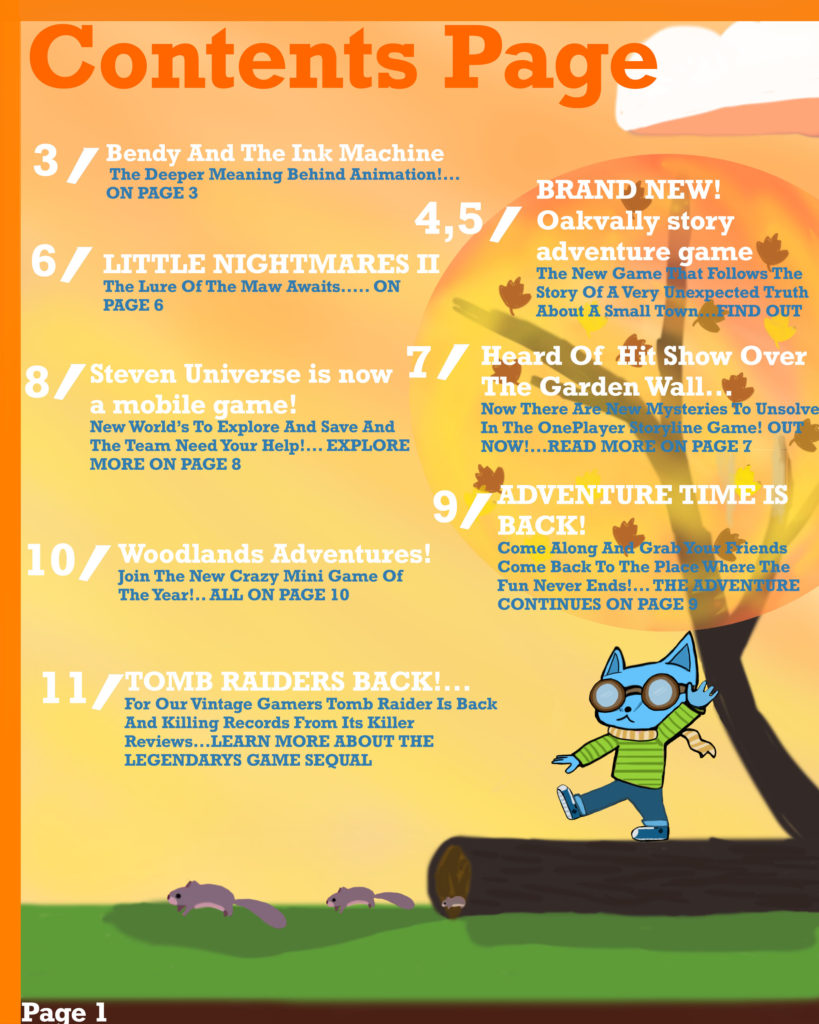
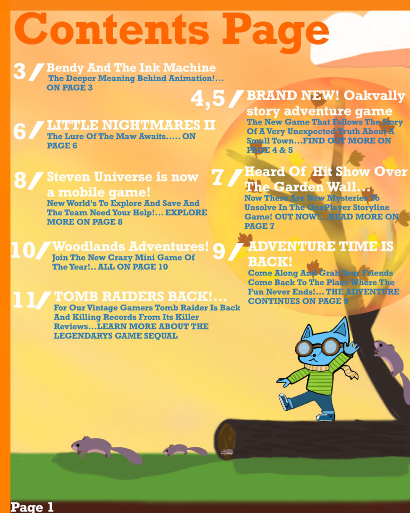
For my contents page I plan to use one of my references video game pages, for the layout designs. I personally liked the contents page that had the icons of the certain games linking to the page I thought it was a good technique to interest audiences more into buying the magazine as they can see small preview of what the magazine in-tales. I’m going to be using Photoshop to draw all the contents page images, possibly creating the icons to link with the reference content pages. background ideas for the page and I might use “Adobe indesign” for their text breaks and formal styles for their bios. I want the magazine to have the running theme of what age it’s directed to(audience theory). I want the pages text to be more round/soft but bold as well, giving a comic book vibe fitting with the gaming magazine.
I ended up creating my own little scene for the page linking to my video game “OakVally” from the from cover. I placed a character on the page in the same art style as the from cover so it was a noticeable linkage. as well by giving the character pilot goggles and a scarf like the main character has on the front cover. I referenced my colour palette to my double page by using much warmer colours like oranges, yellows and reds.
After getting the feed back I adjusted my format for the sections of content since before they were bit jumbled so now its more aline like proper contents pages in magazines.