

just need to add photos


Statement of Intent
The target audience for my gaming magazines is aimed at teenagers, predominantly between age 12 and 16, interested in a range of different games. I chose the title ‘Gaming 100’ representing the 100 pages of my magazine, which allows this magazine to be inclusive to both boys and girls, with any genre of gaming interest.
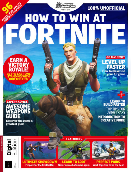
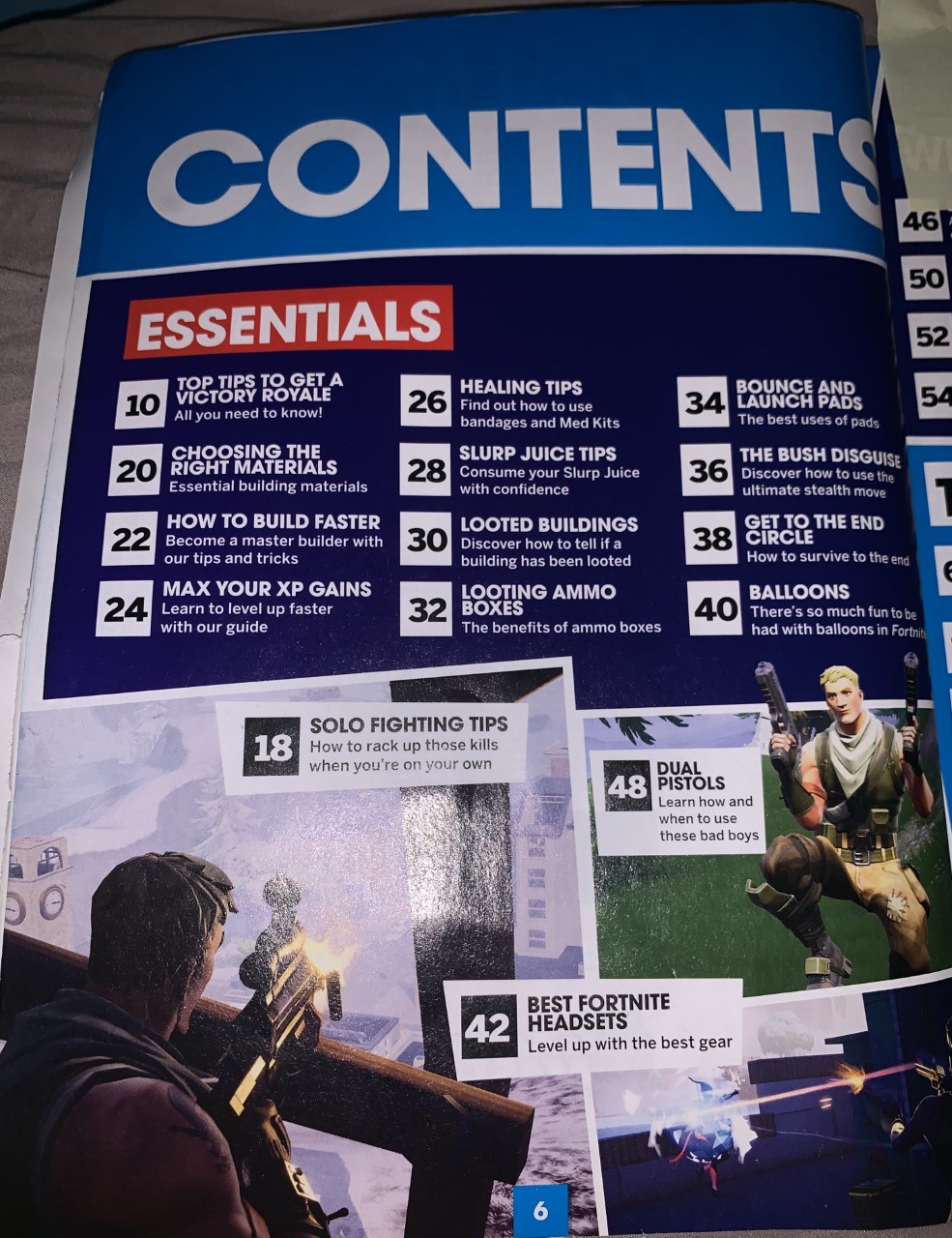
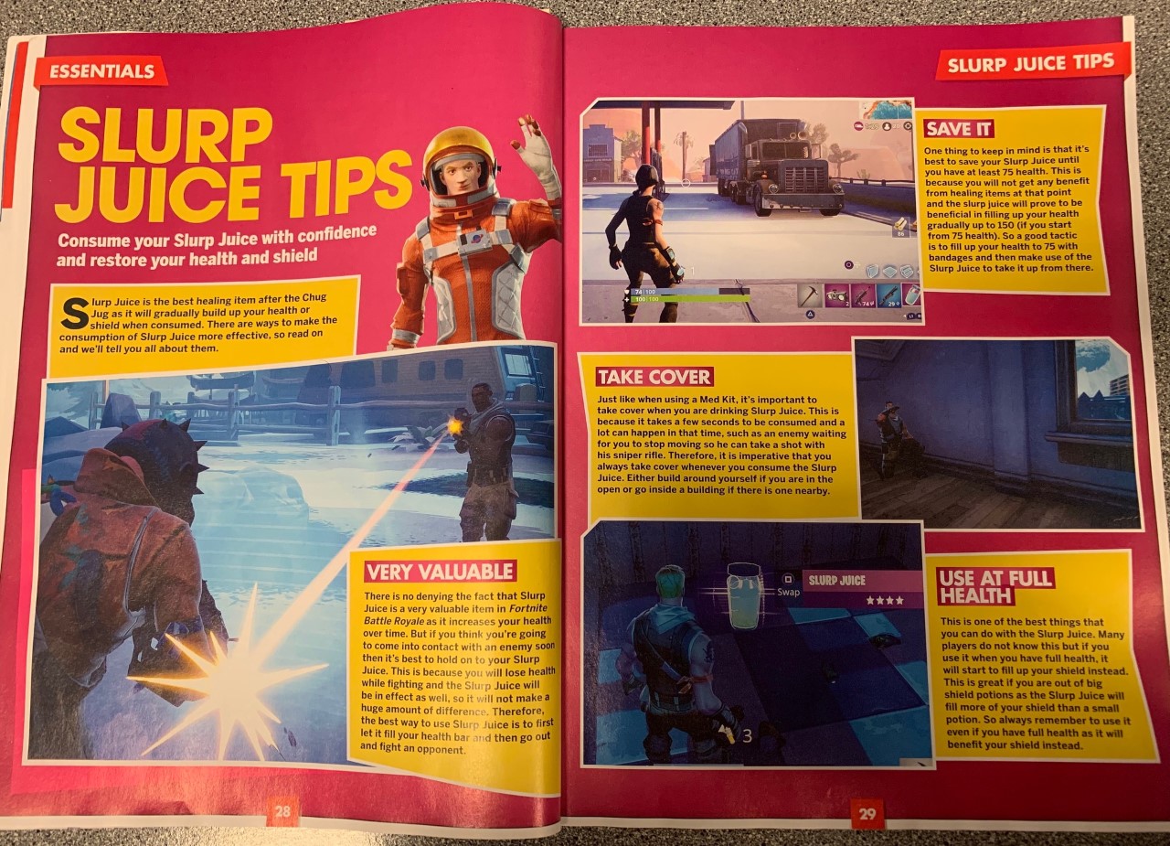
My aim was to have a magazine that has something for all teenage gamer’s, and with that I chose an overall basic colour theme with black, white and red, but also included a musty yellow to add a brighter colour. I designed the ‘100’ of my masthead to have the two zeros as coins, similar to ones collected in various video games, to keep the design closely and clearly linked to gaming, and therefore recognizable to the reader. A sans-serif font was used to create an informal and relaxed look, suitable for a teen based magazine. I based the layout on a fortnite magazine cover I had in class, using the rule of thirds to help guide the reader around the cover, with a main image on the whole top half, but with the masthead slightly covered by the dominant signifier. Then on the bottom third, a gallery of 3 more images and captions to display some of the articles inside. I used extra puffs and plugs on the sides to include as much information about the pages found inside, to interest as many possible consumers.
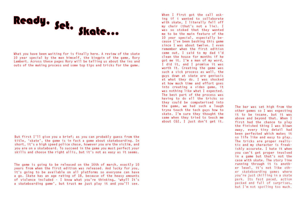
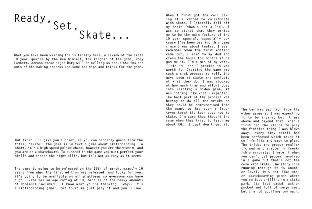
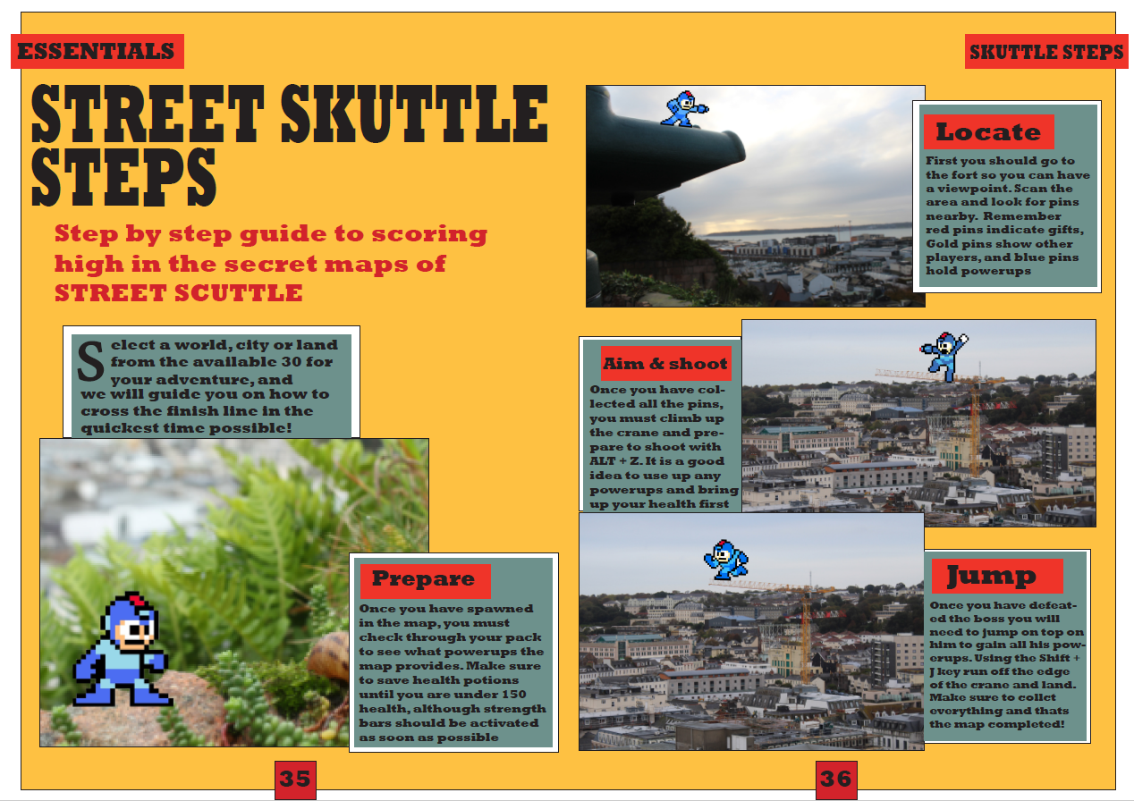
With the contents page and double page spread I referred closely to my style models, and kept the colour theme running through, with a bold and basic font often found in gaming magazines. I included lots of original imagery and created a game for a step by step guide which was found in many pages of my style model.
I gave the magazine a reasonable price for a 100 page magazine, to be affordable and accessible to the younger teenage audience, who would mostly be middle class student, possibly with only a small pocket money allowance.