

Statement of intent:
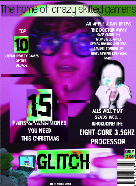
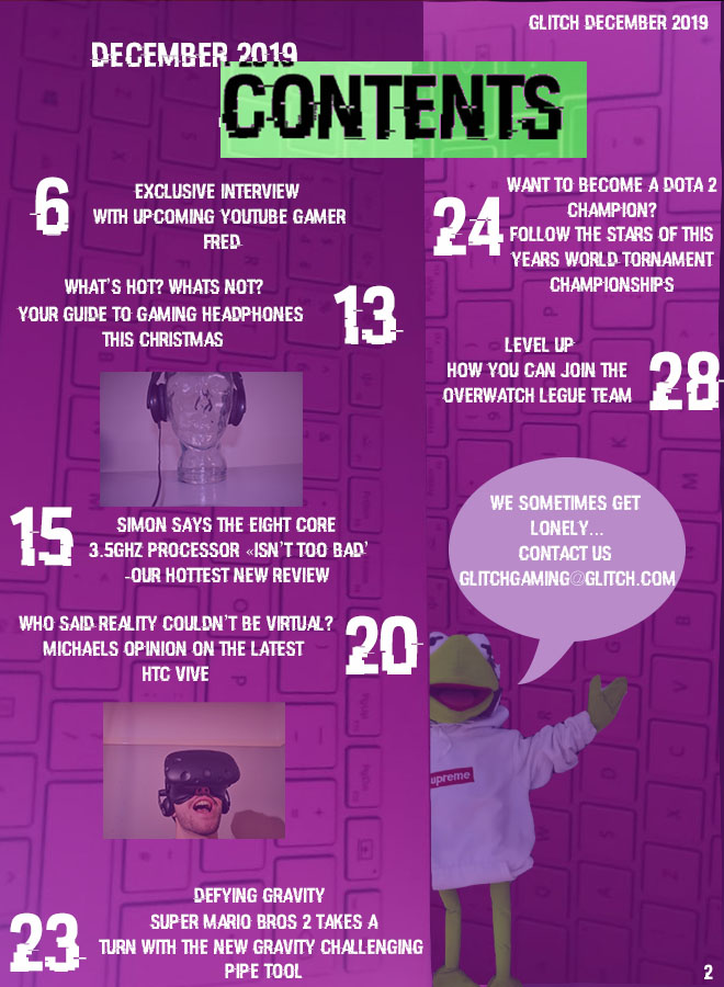
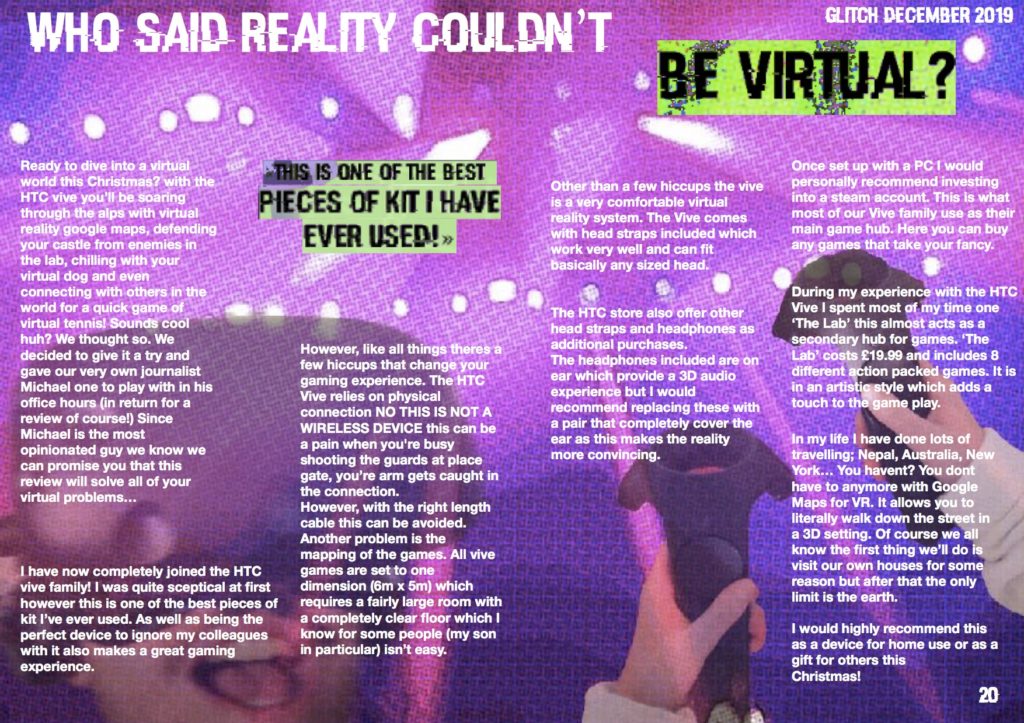
I intend to create a magazine cover, contents page and double page spread all focussing on the world of gaming. My target audience are all people with a keen interest in gaming around the working class demographic. This audience will not be required to have a high level of english to decode this magazine however this magazine will be primarily aimed at gamers over the age of 14 as some of the featured articles may not interest a young gamer. From research I have concluded that the age group with the largest amount of video game enthusiasts and spenders is 18-24 with 16% of the worlds gamers. This group will be my primary audience.
Since my audience are in the working class demographic they would not stereotypically look at buying an expensive magazine. The pricing of the magazine is targeted to be in the range of £2-£3. To create my magazine to be tailored to a specific audience I found out that gaming psychographics conclude that women make up 48% of the gaming population however only 5.5% of these are willing to spend money on gaming (games, equipment, books, magazines…) as oppose to 17.5% of men. So, when creating a gaming magazine it is kept in mind that the largest consumers of the product statistically should be men.
On the cover of my magazine I will use direct address to tell the audience they need a certain type of equipment or advice and plant the idea in their heads that they must read the articles inside. This directly relating to a theory by Albert Bandura ‘effects debate’ (the idea that the media can implant ideas in the mind of the audience directly). Many would argue that this refers mostly to media influencing actions and planting ideologies in society however I feel it can be used as a selling technique through persuading the audience they need something. (self actualisation- Maslow’s hierarchy of needs)
The USP of my magazine will be its graphology. The magazine will be called ‘Glitch’ which is the basis for all design elements. The images will be edited in a computed glitch style with a constant broken purple computer screen style throughout. Another theme within my magazine will be the theme of madness and disorganisation. I feel this will attract an audience from a far as its combination of purple and green is not common and will play on a humans natural curiosity.
