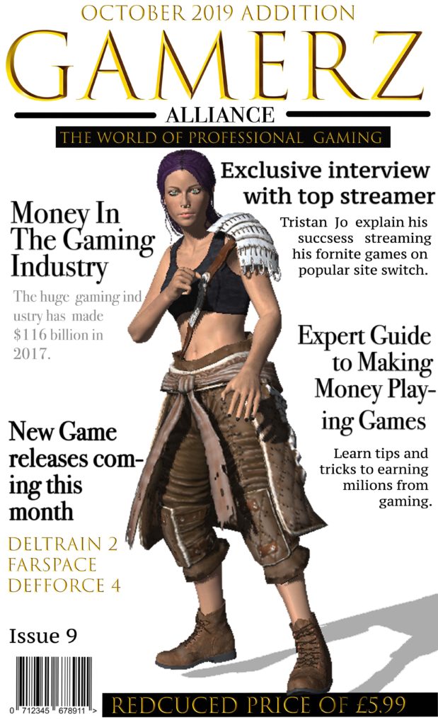

Statement Of Intent
For my magazine I decided to title it “Gamerz Alliance’ as I wanted it to be catchy. I thought this would appeal to my target audience of males between 28-30 and new affluent workers, who have a keen intrest in gaming and the world of professional gaming industrys. I used a games charater I designed in fuse as the dominate signifier to represent the theme of my games magazine. I chose to size my magazine at a width 11cm and a height of 17cm, I decided this as it would fit well into someones bag and would be a big enought size to read comfortably. I chose the gold font as it stands out and aims to my target audience of more sophisticated professional gamers, aswell as giving the magazine a sleek professional look and I chose to put it all into captial letter to draw attention to it. When coming up with the design and target market I research popular gaming magazines on market and was inspired by the use of Signifiers in the magazines to make it clear waht its about and whated to do this with having bold headlines.
I wanted to make the font really bold to stand out to attract my target customers and give some instate on whats inside the magazine. I chose to have my headlines all around the character in order to keep the magazine simple but also effective with the character adding colour into magazine and being the dominate signifier. As i am aiming my magazine as more of a professional magazine to experienced games i decided to price it at £5.99 after reasearching what some of the more professional gamers magazines are priced at i decided to go with a average price. I also promoted it as a reduced price inorder to attract more customers. I also used plugs with my headings and decided to use topic headlines that would attract my target audience of more porfessional gamers and therefore spoke about the business side of media.
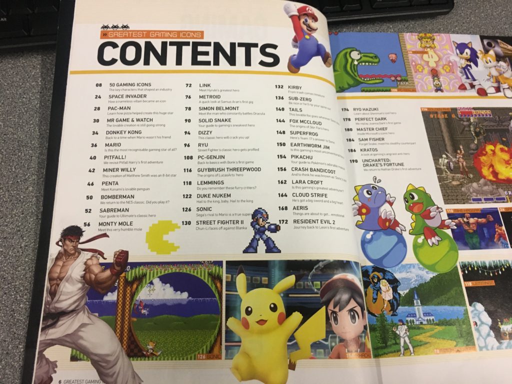
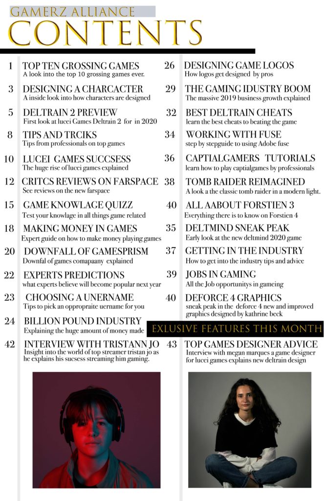
For my contents page I wanted to stick with the sleek model look I used on the front cover and used Greatest gaming Icons as a style model on how to lay it out but changed the colour scheme indoor to achieve a more modern mature sleek look. i wanted to include clear made feature of the month and used image to make the feature be prominent. the use of lines was to keep it organised and clear as to what is inside the magazine.
For my double page spread I wanted to again keep it sleek and modern as to fit to my theme and appeal to my target audience of 28-30 year old more sophisticated gamers. I decided to uses image using red a blue lighting indoor to both and colour and repressed interviewees brand. I decided to use column text keeping it uniform and neat in order to again appeal to my audience.