


Statement of intent
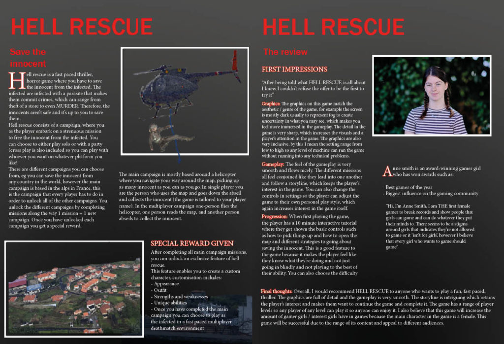
My main intention for my magazine was to show that females can be just as good at games as males can, I wanted to do this by making women the main feature of my magazine whilst keeping the main elements of games which make them fun eg adventure and combat. I intended to do this by supporting the launch of the new game HELL RESCUE. To find inspiration for my magazine I looked at PC GAMER magazines, through doing this research I noticed that there aren’t many gamer girl magazines out there and the gaming community is predominantly male. Therefore, I intended to make a magazine focused on girls to show that girls can game too aimed at girls aged 13-18, this led me to think of the title GAMER GIRL. My dominant signifier in the front cover is a female character, which challenges dominant ideologies due to the strong, independent impression given off. I wanted to make the magazine interactive, so I used different fonts (Franklin Gothic medium and heavy, serif and sanserif). I wanted the magazine to catch my audience’s eye so I wanted to make the dominant signifier pop by creating a sense of depth of field between the character and the mountains in the background by using a shadow. I wanted to make it appealing by using a catchy slogan ‘RUN HEAD FIRST INTO THE GAMING WORLD’, where i wanted to add a colour block, shadow and wave effect to stylise it. I wanted to use the rule of thirds(title, main components, other information). Another way I did this was by using a range of colours / images whilst keeping the magazine uniform throughout to present a clean finish. In my contents page I wanted to clearly show what was in my magazine, I then looked for a template to follow and saw that most game magazine contents pages were in boxes like mine is, I also used images to show a visual representation of what’s in it. For my double page spread I wanted to create a professional looking spread, so again I used a template. I included images to aid in the description of the new game HELL RESCUE, for a more aesthetic appeal to my intended audience (13-18-year-old girls). I have used a range of symbolic signs (colours red, black, white and grey). Inexical signs (buildings symbolising a village where the main campaign is set.