Gaming Magazine
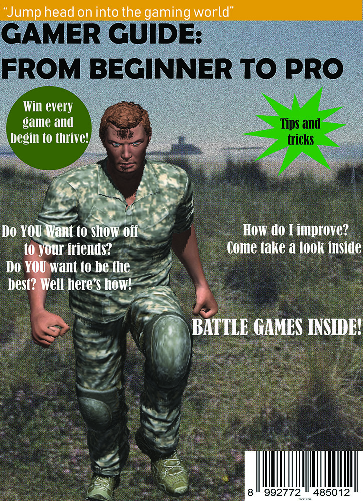
Front cover (I don’t have my updated copy at home):
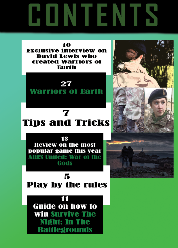
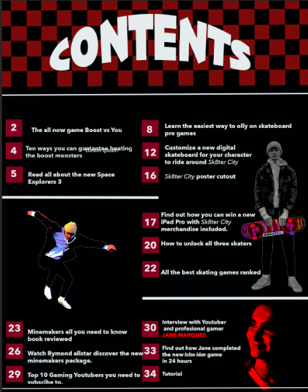
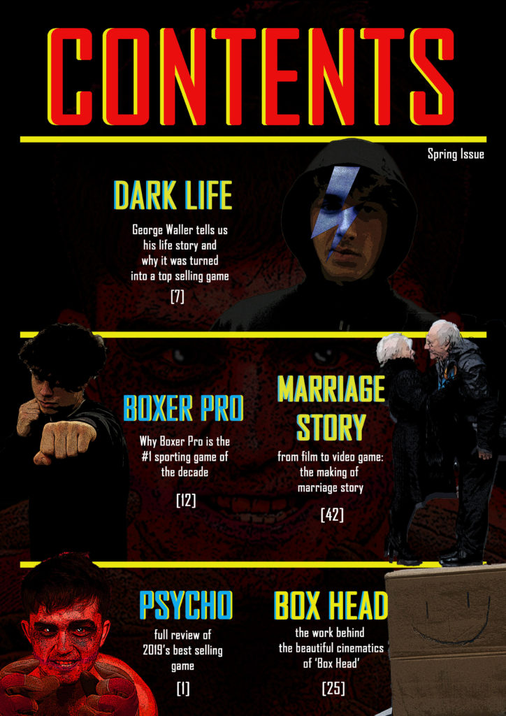
Contents page:
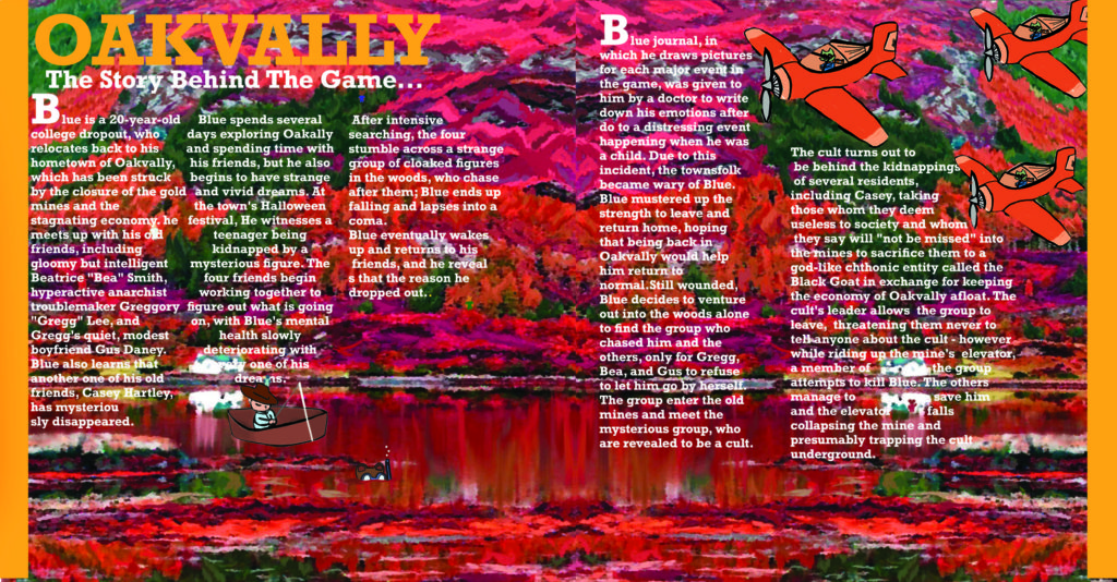
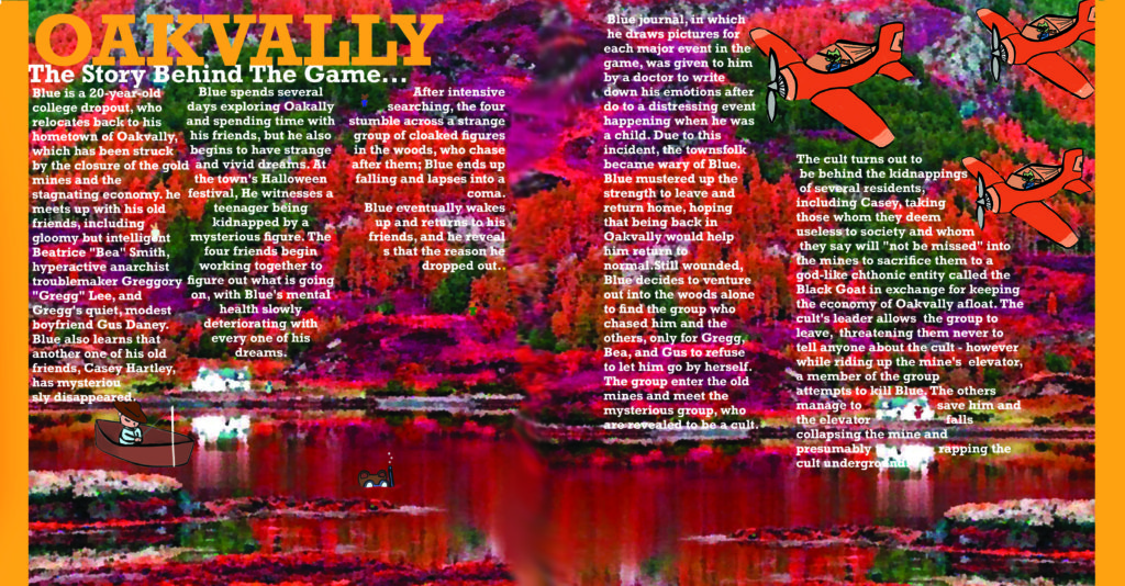
Double page spread:

Statement of intent:
I want to create a magazine which will reflect how people can improve in games they want to improve in and will be appealing to the reader/consumer, and I intend to make a gamer guide for beginners as people today are often in need of guides however they often cease to exist. I would like to include relevant information to my initial ideas and needs to be up to date, informative and somewhat interesting as this product does need to appeal to the target audience. I intend to make it readily available to a variety of people and include a wide variety of games. My target audience (ideal consumer) will be for teenagers aged 15+ (both genders) as this is generally the age where most people get into gaming and want to improve.
My dominant signifier in my front cover is being represented as being ‘big’ and muscular which implies masculinity and represents how we portray men in the present day. We expect them to be muscular and strong and fight to get what we want or think we deserve as that’s what we’ve always known; it’s what we accept in society nowadays because it’s not something that has been introduced but has just been with us in the community for decades. This could be considered dominant ideology.
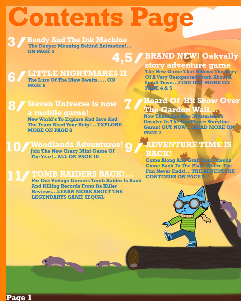
My contents page will resemble how this guide is supposed to be fun and have educational factors within it. The iconic images represent exactly what will be in the magazine and it gives the receiver an insight on what this magazine will actually contain. Although my contents page is simple it will show consistency throughout as everything will be in a more or less similar format as I don’t want to take away the physical content inside this magazine. The colour theme of the magazine is kept throughout the contents page as I don’t want to override the importance of the front cover and I don’t want to take away from the dominant signifier.
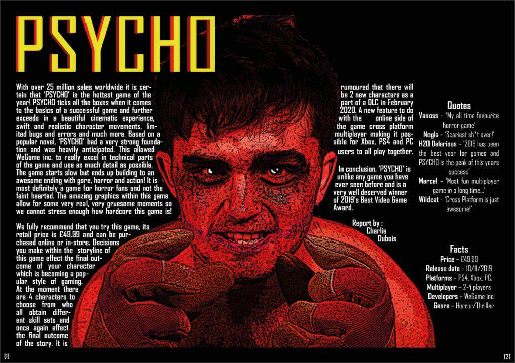
My double page spread will consist of one main image of a game and then have a guide on how to be good at this game and win it the majority of the time, with detailed descriptions of how to approach these tips. It will have some useful tips in order to facilitate the purpose of my magazine. It will be simple as I don’t want to take away from the purpose of this section.


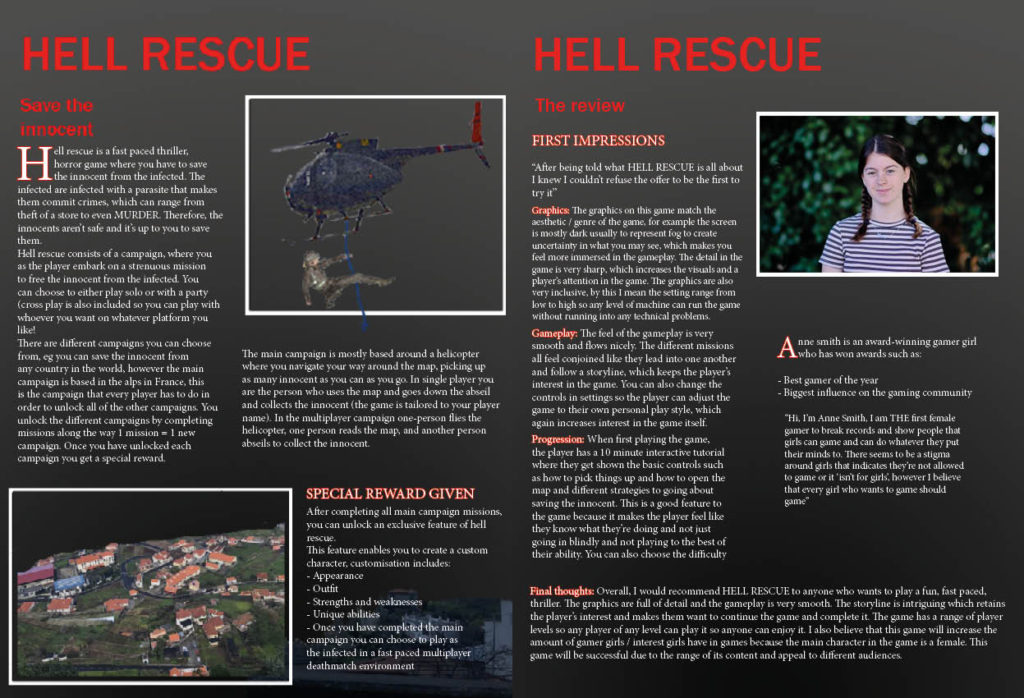
Statement of intent
My main intention for my magazine was to show that females can be just as good at games as males can, I wanted to do this by making women the main feature of my magazine whilst keeping the main elements of games which make them fun eg adventure and combat. I intended to do this by supporting the launch of the new game HELL RESCUE. To find inspiration for my magazine I looked at PC GAMER magazines, through doing this research I noticed that there aren’t many gamer girl magazines out there and the gaming community is predominantly male. Therefore, I intended to make a magazine focused on girls to show that girls can game too aimed at girls aged 13-18, this led me to think of the title GAMER GIRL. My dominant signifier in the front cover is a female character, which challenges dominant ideologies due to the strong, independent impression given off. I wanted to make the magazine interactive, so I used different fonts (Franklin Gothic medium and heavy, serif and sanserif). I wanted the magazine to catch my audience’s eye so I wanted to make the dominant signifier pop by creating a sense of depth of field between the character and the mountains in the background by using a shadow. I wanted to make it appealing by using a catchy slogan ‘RUN HEAD FIRST INTO THE GAMING WORLD’, where i wanted to add a colour block, shadow and wave effect to stylise it. I wanted to use the rule of thirds(title, main components, other information). Another way I did this was by using a range of colours / images whilst keeping the magazine uniform throughout to present a clean finish. In my contents page I wanted to clearly show what was in my magazine, I then looked for a template to follow and saw that most game magazine contents pages were in boxes like mine is, I also used images to show a visual representation of what’s in it. For my double page spread I wanted to create a professional looking spread, so again I used a template. I included images to aid in the description of the new game HELL RESCUE, for a more aesthetic appeal to my intended audience (13-18-year-old girls). I have used a range of symbolic signs (colours red, black, white and grey). Inexical signs (buildings symbolising a village where the main campaign is set.


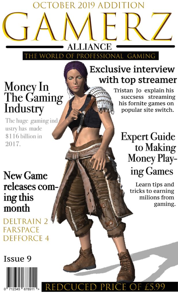

For my magazine I decided to title it “Gamerz Alliance’ as I wanted it to be catchy. I thought this would appeal to my target audience of males between 28-30 and new affluent workers, who have a keen intrest in gaming and the world of professional gaming industrys. I used a games charater I designed in fuse as the dominate signifier to represent the theme of my games magazine. I chose to size my magazine at a width 11cm and a height of 17cm, I decided this as it would fit well into someones bag and would be a big enought size to read comfortably. I chose the gold font as it stands out and aims to my target audience of more sophisticated professional gamers, aswell as giving the magazine a sleek professional look and I chose to put it all into captial letter to draw attention to it. When coming up with the design and target market I research popular gaming magazines on market and was inspired by the use of Signifiers in the magazines to make it clear waht its about and whated to do this with having bold headlines.
I wanted to make the font really bold to stand out to attract my target customers and give some instate on whats inside the magazine. I chose to have my headlines all around the character in order to keep the magazine simple but also effective with the character adding colour into magazine and being the dominate signifier. As i am aiming my magazine as more of a professional magazine to experienced games i decided to price it at £5.99 after reasearching what some of the more professional gamers magazines are priced at i decided to go with a average price. I also promoted it as a reduced price inorder to attract more customers. I also used plugs with my headings and decided to use topic headlines that would attract my target audience of more porfessional gamers and therefore spoke about the business side of media.
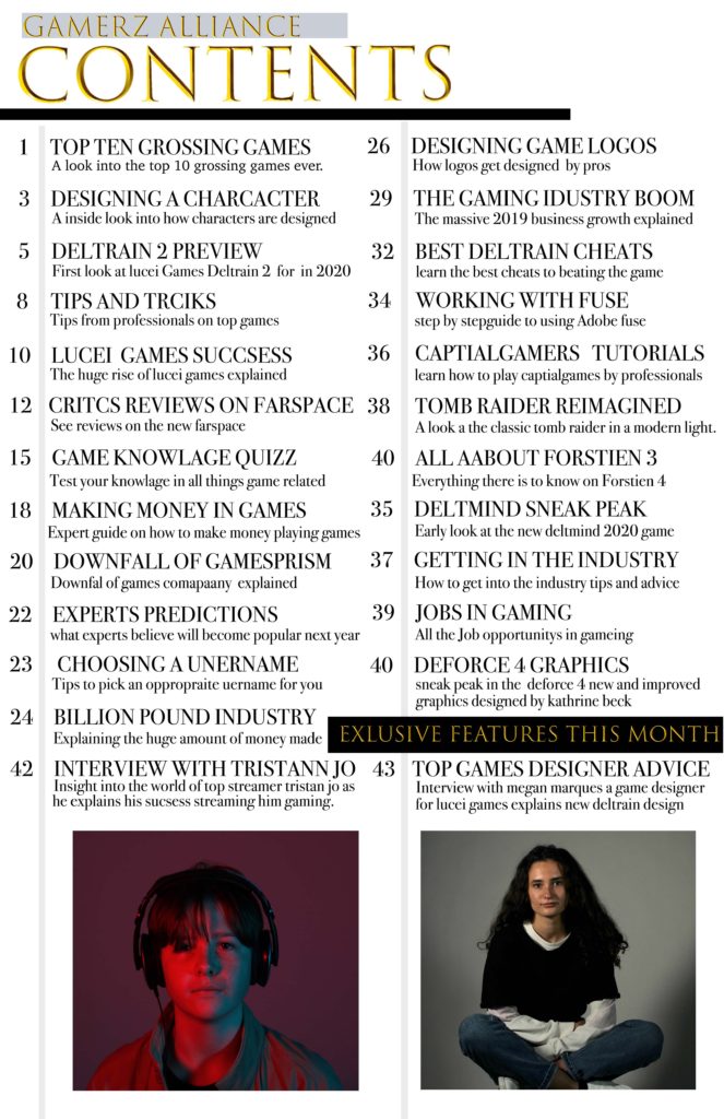
For my contents page I wanted to stick with the sleek model look I used on the front cover and used Greatest gaming Icons as a style model on how to lay it out but changed the colour scheme indoor to achieve a more modern mature sleek look. i wanted to include clear made feature of the month and used image to make the feature be prominent. the use of lines was to keep it organised and clear as to what is inside the magazine.
For my double page spread I wanted to again keep it sleek and modern as to fit to my theme and appeal to my target audience of 28-30 year old more sophisticated gamers. I decided to uses image using red a blue lighting indoor to both and colour and repressed interviewees brand. I decided to use column text keeping it uniform and neat in order to again appeal to my audience.

Double Page Spread Statement of Intent:
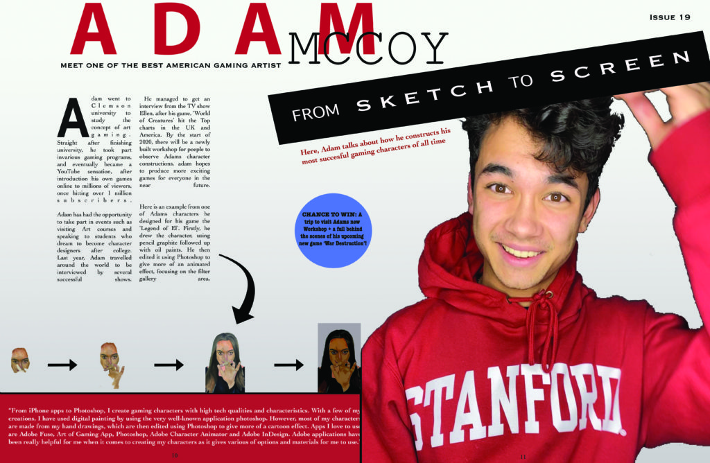
For my DPS I decided to talk about a gaming artist. I went for a color theme of red, as the model is wearing a red jumper. These pages are designed to be informative and easy to read as my target audience is young teenagers. I have made some writing bold to make it stand out, for example, the ‘sketch to screen’ font is very large and bold, as I wanted my audience to know what the page is all about.