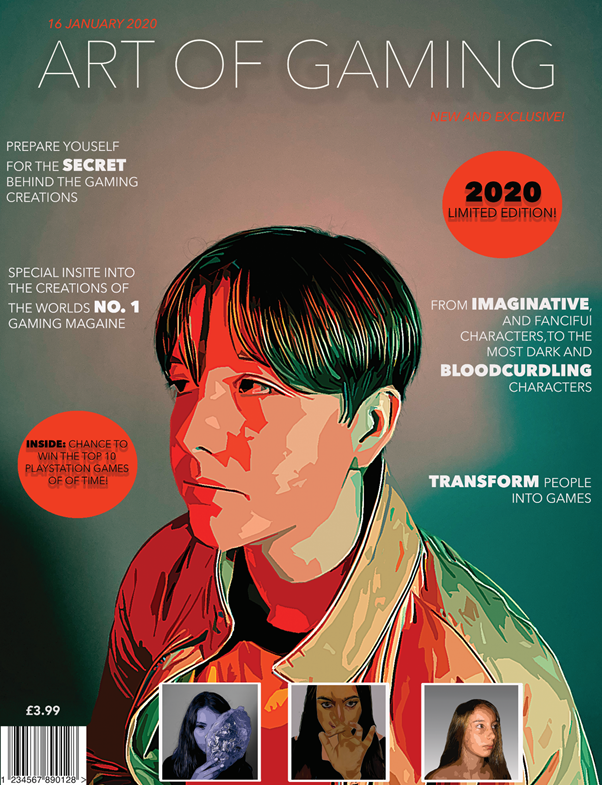
Front cover statement of intent
I have redesigned my front cover to look more colorful and appealing. Furthermore, I created it to satisfy the personal needs of my target market; teenagers with an interest in art, by showing drawings in the plugs, and words such as ‘creations’, ‘imaginative’ and ‘transform’. My target is for my audience to satisfy their needs and escape into their enjoyment of art. The main colors I used to create this front cover was orange, green, white and black. Linking to C.S Pierce, who looked into semiotics, which is the study of signs, I have used a symbolic sign by using a vibrant orange to give the magazine a more gaming style, as a feel that bright luminous colors are used in games. Also, I have used an lexical sign within one of my plugs, which is a mask, held by a girl. This mask links to disguise, which can link to gaming characters such as Assassin’s Creed. So audiences who like Assassin Creed will be intrigued to buy this magazine. I have used different fonts to give bolder, sharper texts and light, clean texts. I have made some words within the texts a larger size, and bolder to make the words stand out. The words I have chosen to stand out are key words that represent the magazine as a whole; ‘imaginative’, ‘transform’, ‘secret’. For the main picture in the center, I used color red and blue color sheets to create this orange light effect. I like this as it gives the magazine more of a gaming effect as it looks more creative and robotic.