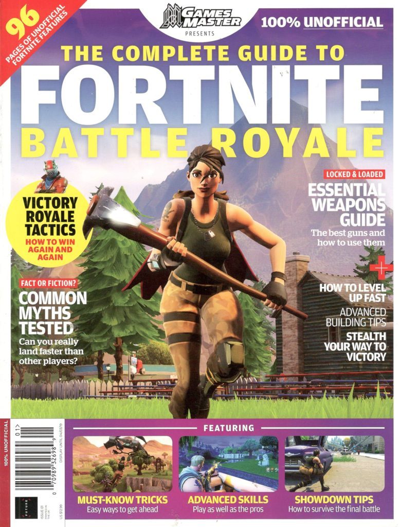
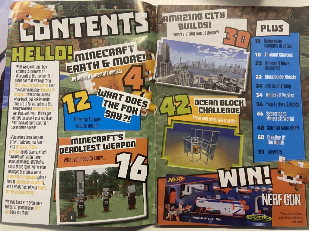
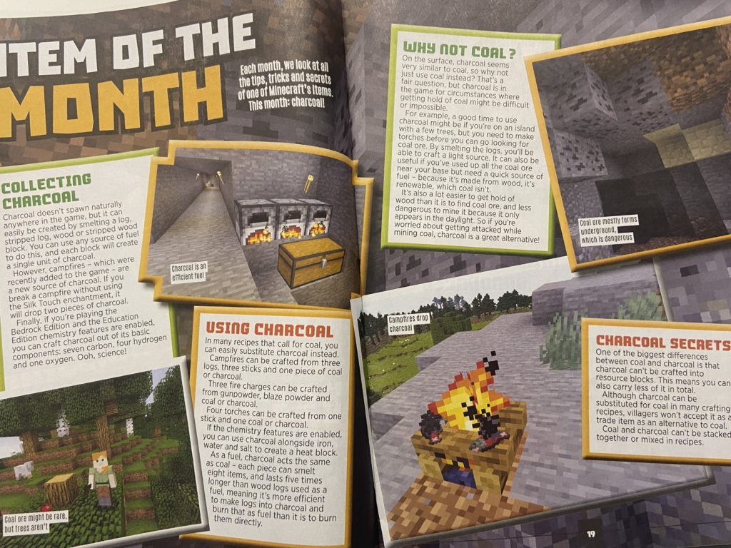
Style Models
My Produced Work
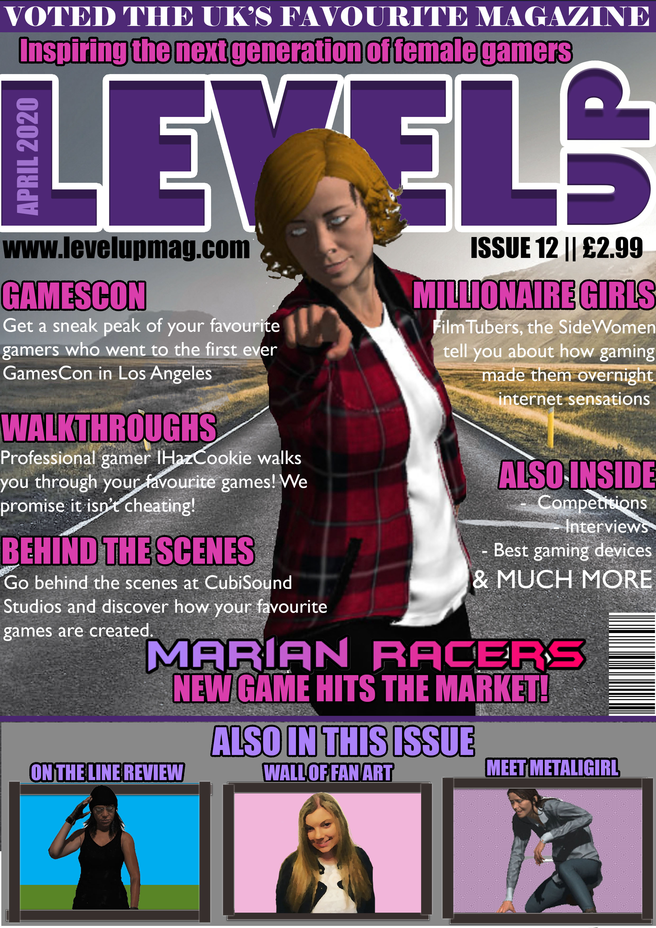


Before I began creating my coursework, I closely studied gaming magazines that are currently on the market and noticed that games characters are predominately male and there are not many gaming magazines aimed at females. Therefore, I have decided to create a front page, contents page and double-page spread aimed at getting teenage girls (11-18 years) into gaming, an industry that is currently more male dominated.
The language I have used is predominately colloquial because of my target audience’s age and understanding of more formal language that adults may use. I have also used colloquial language in order to attract my target audience as my magazine will serve as a source of escapism from school and life. This is also reflected in the cheap price of my magazine, which will allow my target audience to buy my magazine with their weekly pocket money. I have thought carefully about the sizing of my magazine and decided a size that is smaller then A4 is most suitable for my target audience as it will easily fit into their school bag.
I have followed a very simplistic style model for my magazine and its contents and followed a colour scheme of stereotypical female colours (pinks and purples) as these colours are the reactionary colours that occur on girls magazines aimed at older children/teens. However, the contents of my magazine will appear radical, such as the cover image of my magazine and images included in my magazine going against the dominant ideology of females having an hourglass shaped body and define feminine features. I have purposely created the women in my magazine to appear radical in order to create a message that women and men are equal, which is shown by me purposely not including makeup on any of the females within my magazine. The no make-up wearing females produce a truthful message and will bring more confidence to women, who may wear make-up in order to hide themselves, whereas my magazine is showing that the beauty is who you are, not what you look like. I have also included drop caps, columns and page numbers for every page within my magazine, as I am following the style model of a professional gaming magazine already out there on the market and I want my magazine to appear similar quality to those that are already sold in supermarkets and bookshops.
The cultivation theory says that by creating more media challenging the dominant ideology, you will be able to change people’s theories. Within my magazine cover, double-page spread and contents page, I am cultivating the idea of equality for both males and females which is shown by the common occurrence of females doing more male orientated activities, such as Marian (a female) on my front cover being a rally driver and the woman appearing on both my contents page and front cover is an Army Veteran. I am also cultivating the idea of equality towards males and females by strategically making the female games characters included within my magazine wear clothes which are strategically covering their bottom, as a majority of the famous games covers out on the market that involves a women character has them wearing clothing which is ‘revealing’ in order to emphasise their feminine features.
I have also included the magazine’s social media usernames, as around 94% of teenagers have social media and 71% of that percentage used more than one social media site. While designing my magazine, I have thought carefully and from my own experiences as a teenager, I have included things that would appeal to my target audience, such as interviews with professional streamers, as it has been reported that 75% of children aged 6-17 had said they would like to become a “YouTuber” or Games Streamer. I have also included pages that are based around games of every genre, in order to widen my audience and attract more consumers to buy the magazine due to its coverage of games of their preferred genre.

