

Statement of Intent
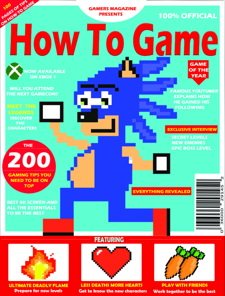
I decided to make my magazine within the retro gaming genre. I decided to make my colour theme red and blue as they’re complementary colours and the contrast makes my magazine stand out. This links to semiotics theory because the indexical colour red indicates danger which makes the game seem dangerous and exciting.
I will create this type of magazine for my target audience because the dominant ideology indicates that they’re more likely to like adventure games as that’s what most children their age like to play. Since 8-10 year old’s are in their key social and emotional developmental stages of growing up they’re more prone to follow trends as they want to fit in and build friendships.
I’ll make my title bold and use a block-like font which is easy to read because I want my magazine to be understandable without the trouble of reading fancy fonts; however I’ll add texture to my title so that it draws some attention. I’ll a short title ‘ how to game’ because I want the magazine title to be straight to the point as my consumers are young and they won’t want to read loads of words. The style of language I will use is informal, colloquial language because it’s more appealing to my target audience as that’s how they speak in their everyday life. Since they’re able to relate to the magazine it will bring them joy and they can use it as a form of escapism.
I ‘ll make the majority of my images cartoon-like and friendly looking because of cultivation theory. Since these are the types of games and characters that are popular they’re constantly seen on screens , this makes the audience begin to like and agree with the dominant ideology (which states that cartoon games and characters are good) because if they’re constantly being shown these games and told they’re good they’ll start to believe it therefore my magazine fits within a popular gaming genre.
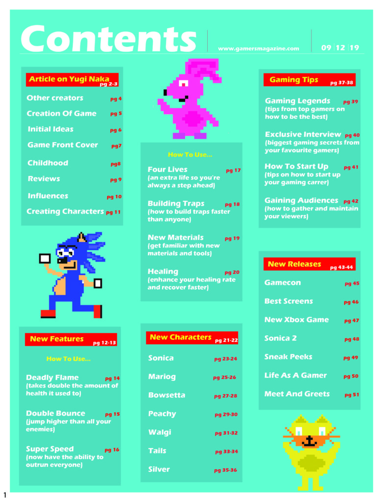
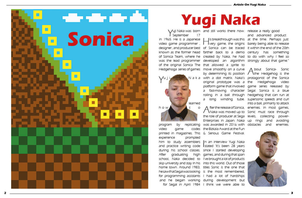
For my contents page and double page spread I’ll make columns of three to separate and make the structure of my pages appear more organised. I’ll use boarders, titles, gutters, numbers, dates and images with text wrapped around them. I’ll placed the most interesting and important information on the top left corner of my page as it’s been proven that, that is where we first look on a page. I’ll add images on my page too because younger children are more interested in pictures as opposed to text therefore I have added images to maintain my target audiences attention.
