Cover, Contents page and statement of intent


Statement of Intent

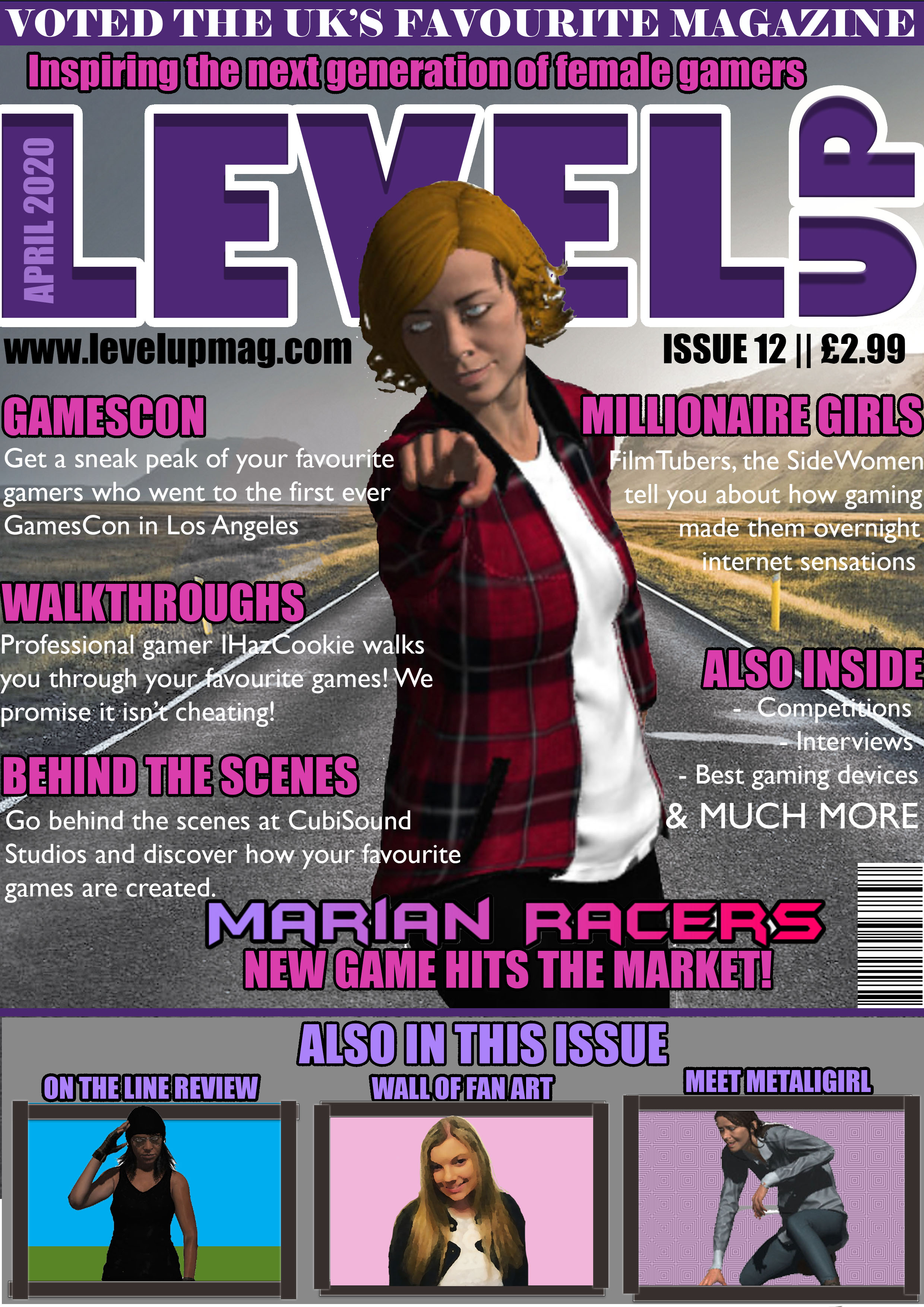
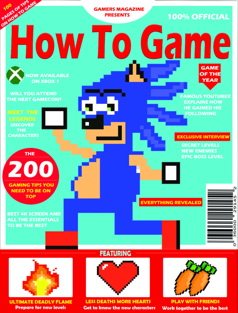
I decided to make my magazine within the retro gaming genre. I decided to make my colour theme red and blue as they’re complementary colours and the contrast makes my magazine stand out. This links to semiotics theory because the indexical colour red indicates danger which makes the game seem dangerous and exciting.

I will create this type of magazine for my target audience because the dominant ideology indicates that they’re more likely to like adventure games as that’s what most children their age like to play. Since 8-10 year old’s are in their key social and emotional developmental stages of growing up they’re more prone to follow trends as they want to fit in and build friendships.

I’ll make my title bold and use a block-like font which is easy to read because I want my magazine to be understandable without the trouble of reading fancy fonts; however I’ll add texture to my title so that it draws some attention. I’ll a short title ‘ how to game’ because I want the magazine title to be straight to the point as my consumers are young and they won’t want to read loads of words. The style of language I will use is informal, colloquial language because it’s more appealing to my target audience as that’s how they speak in their everyday life. Since they’re able to relate to the magazine it will bring them joy and they can use it as a form of escapism.

I ‘ll make the majority of my images cartoon-like and friendly looking because of cultivation theory. Since these are the types of games and characters that are popular they’re constantly seen on screens , this makes the audience begin to like and agree with the dominant ideology (which states that cartoon games and characters are good) because if they’re constantly being shown these games and told they’re good they’ll start to believe it therefore my magazine fits within a popular gaming genre.

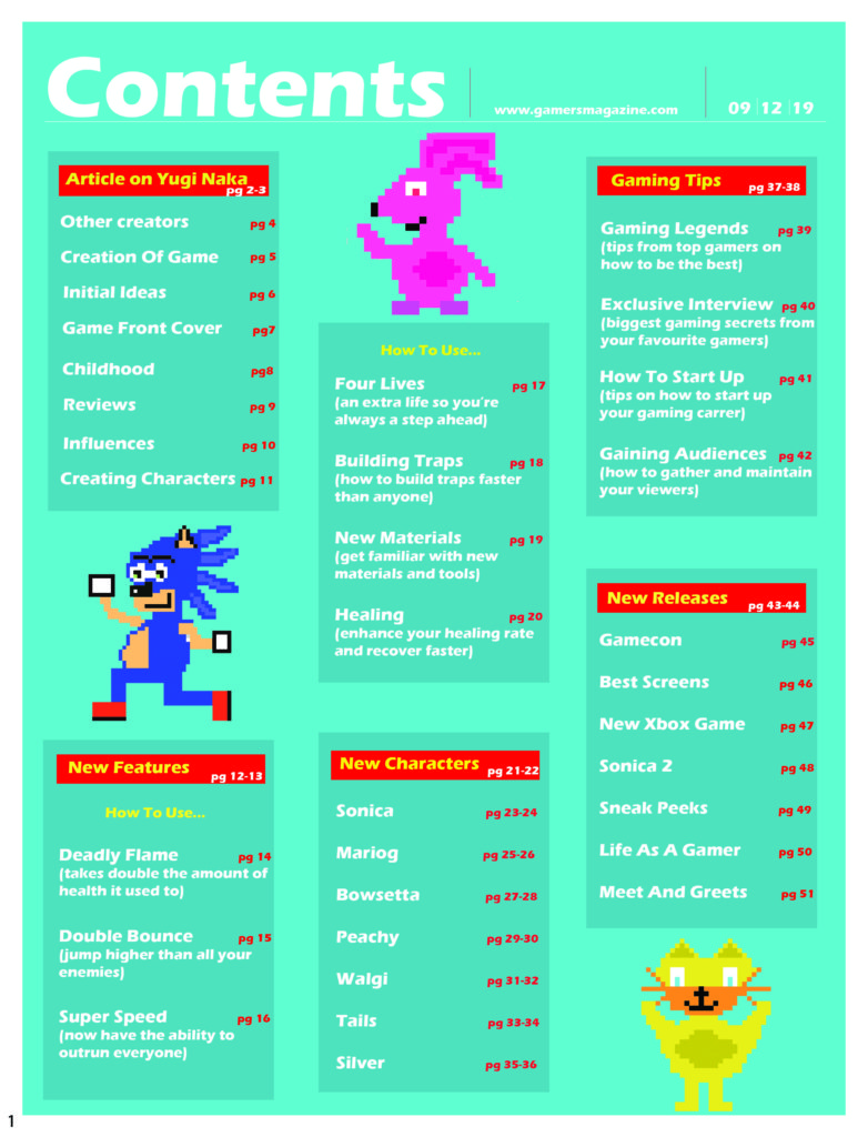
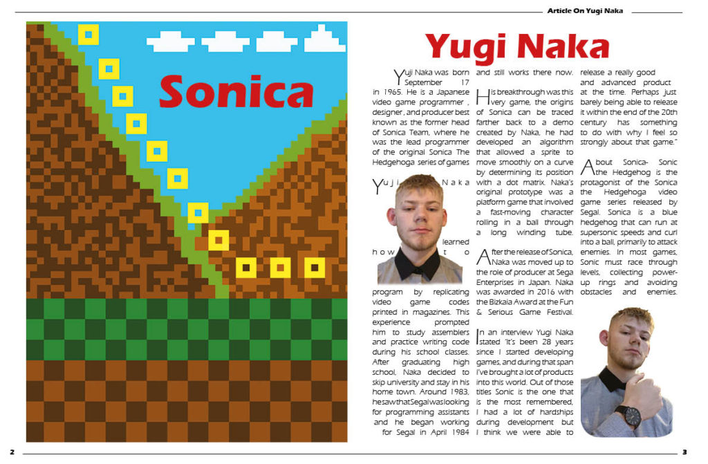
For my contents page and double page spread I’ll make columns of three to separate and make the structure of my pages appear more organised. I’ll use boarders, titles, gutters, numbers, dates and images with text wrapped around them. I’ll placed the most interesting and important information on the top left corner of my page as it’s been proven that, that is where we first look on a page. I’ll add images on my page too because younger children are more interested in pictures as opposed to text therefore I have added images to maintain my target audiences attention.

NEA COURSEWORK & STATEMENT OF INTENT

Style Models

My Produced Work

Before I began creating my coursework, I closely studied gaming magazines that are currently on the market and noticed that games characters are predominately male and there are not many gaming magazines aimed at females. Therefore, I have decided to create a front page, contents page and double-page spread aimed at getting teenage girls (11-18 years) into gaming, an industry that is currently more male dominated.

The language I have used is predominately colloquial because of my target audience’s age and understanding of more formal language that adults may use. I have also used colloquial language in order to attract my target audience as my magazine will serve as a source of escapism from school and life. This is also reflected in the cheap price of my magazine, which will allow my target audience to buy my magazine with their weekly pocket money. I have thought carefully about the sizing of my magazine and decided a size that is smaller then A4 is most suitable for my target audience as it will easily fit into their school bag.

I have followed a very simplistic style model for my magazine and its contents and followed a colour scheme of stereotypical female colours (pinks and purples) as these colours are the reactionary colours that occur on girls magazines aimed at older children/teens. However, the contents of my magazine will appear radical, such as the cover image of my magazine and images included in my magazine going against the dominant ideology of females having an hourglass shaped body and define feminine features. I have purposely created the women in my magazine to appear radical in order to create a message that women and men are equal, which is shown by me purposely not including makeup on any of the females within my magazine. The no make-up wearing females produce a truthful message and will bring more confidence to women, who may wear make-up in order to hide themselves, whereas my magazine is showing that the beauty is who you are, not what you look like. I have also included drop caps, columns and page numbers for every page within my magazine, as I am following the style model of a professional gaming magazine already out there on the market and I want my magazine to appear similar quality to those that are already sold in supermarkets and bookshops.

The cultivation theory says that by creating more media challenging the dominant ideology, you will be able to change people’s theories. Within my magazine cover, double-page spread and contents page, I am cultivating the idea of equality for both males and females which is shown by the common occurrence of females doing more male orientated activities, such as Marian (a female) on my front cover being a rally driver and the woman appearing on both my contents page and front cover is an Army Veteran. I am also cultivating the idea of equality towards males and females by strategically making the female games characters included within my magazine wear clothes which are strategically covering their bottom, as a majority of the famous games covers out on the market that involves a women character has them wearing clothing which is ‘revealing’ in order to emphasise their feminine features.

I have also included the magazine’s social media usernames, as around 94% of teenagers have social media and 71% of that percentage used more than one social media site. While designing my magazine, I have thought carefully and from my own experiences as a teenager, I have included things that would appeal to my target audience, such as interviews with professional streamers, as it has been reported that 75% of children aged 6-17 had said they would like to become a “YouTuber” or Games Streamer. I have also included pages that are based around games of every genre, in order to widen my audience and attract more consumers to buy the magazine due to its coverage of games of their preferred genre.

NEA DPS (+STATEMENT OF INTENT)

I have designed my double page spread to be a tutorial on how to use Adobe Fuse because I feel the more creative side will interest my target audience. I also chose a tutorial because I want to differentiate from other magazines and challenge the dominant conventions of a standard gaming magazine. I also feel a more creative element will attract my target audience as teenagers are usually interested in the craftier side of things where they can escape from the daily grind rather than being  bombarded with information that could make them lose interest due to the stress of exams and school. I have ensured to follow the style model I have used on both my contents page and front page in order to create consistency and deliver a clear layout which will engage my target audience.   

I have split my opening paragraph into two columns, in order to create a clear and professional layout, as well as follow the codes and conventions of a double page spread, in order to make mine appear a similar quality to the ones produced by professionals. I have also included a drop cap and page numbers, as they are following the standard style model of a standard double page spread that you would see in a professional magazine out there on the market. I have also used a white background because I wanted my double page spread to be gentle on the eyes, especially as I already have lots of colours on both the pages.

I have used very simplistic language, mainly because my target audience are young teenage girls, as I feel a majority of my target audience won’t know advanced language that adults use. I have also laid it out and colour coded the different sections with the steps and the image in alternate colours to the next step and image in order to make it clear to my target audience. Finally, I have used multiple images as it will appeal to my target audience, especially because from personal experiences, I know at the age of my target audience, they would pick up a magazine and buy it because of all the pictures and the lack of words, as loads of words would bore them and counteract my aim, which is to satisfy their needs of escapism from school and serve as a source of entertainment.