(My Double Page file is too big for the blog so I will email it)
Statement Of Intent –
For my gaming magazine I am going to prioritize the genre of retro gaming; supporting consoles such as Commodore 64, Nintendo 64 and NES. My magazine is predominantly aimed at a younger male audience around the age of 12 as the dominant ideology suggests they are more likely to be interested in violent games, they are also mainstreamers, this is because due to their age – they’re more likely to follow the ‘trend’ and what they think is ‘cool’.
The style of language that I will use is a mix of informal and colloquial because I want the magazine to be professional and factual in relation to its contents. it should be appealing to my target audience through the informal language; they would use in everyday life so that they can relate to it, using the magazine as a form of escapism, interlinking with the uses and gratification theory.
In addition, I will also use the san-serif font – ‘Acumin Variable Concept’ –I will also use a sans-serif font for the selling line to follow the house style. By using an informal font, the product is more eye-catching to a younger male audience who may want to rebel against more classical, formal fonts. The text can also act as anchorage for plugs.
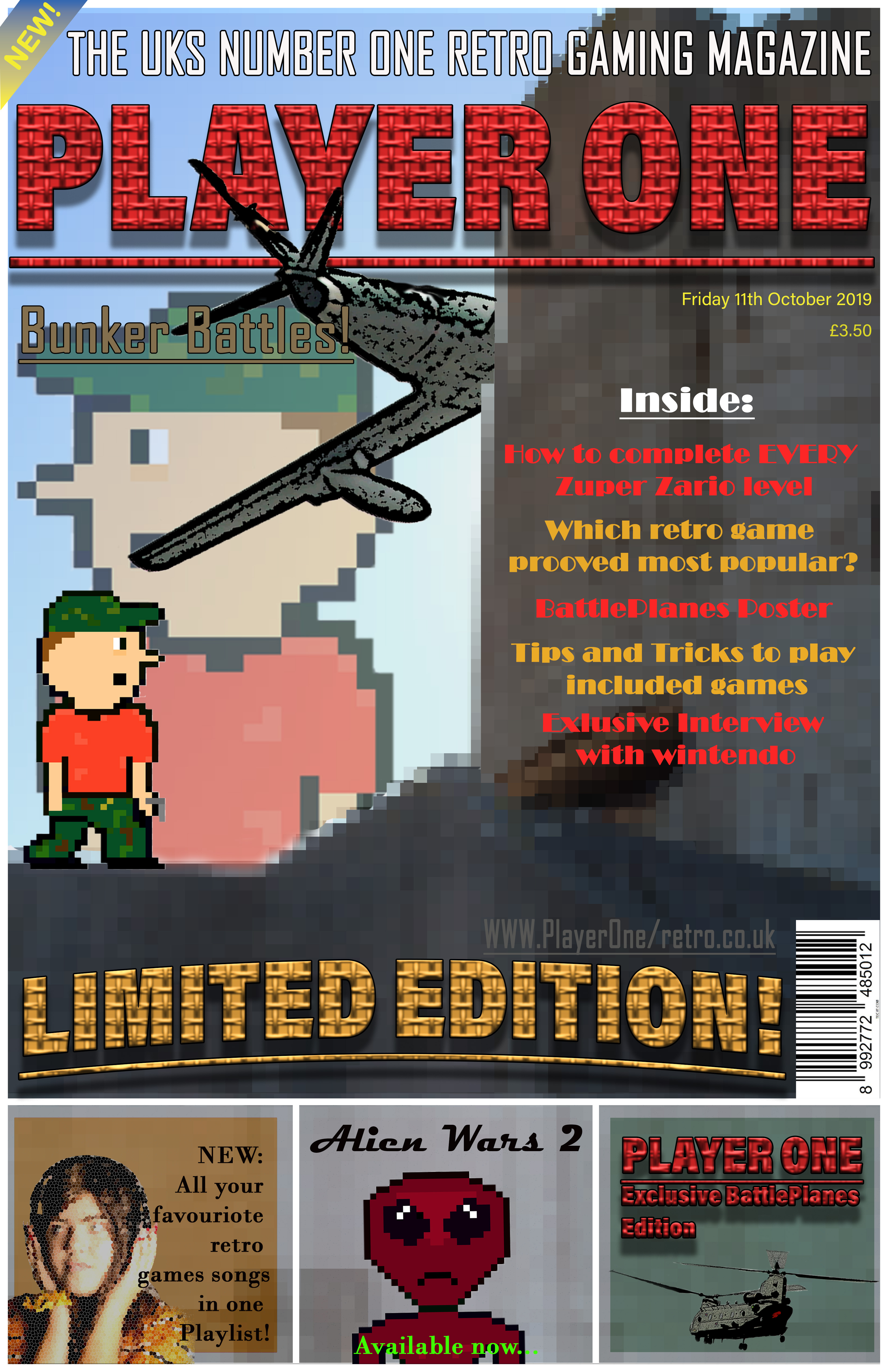
When creating the actual of the magazine cover, I am going to use the tabloid size, similar to popular 80s magazines. With a width of – 27.94 CM and a height of – 43.18 CM. I will use this size as the majority of gaming magazines released in the 80’s would have been a similar size – just below A4. Therefore, the dimensions of the double-page spread will be double – a width of 55.88 CM and a height of 86.36CM.
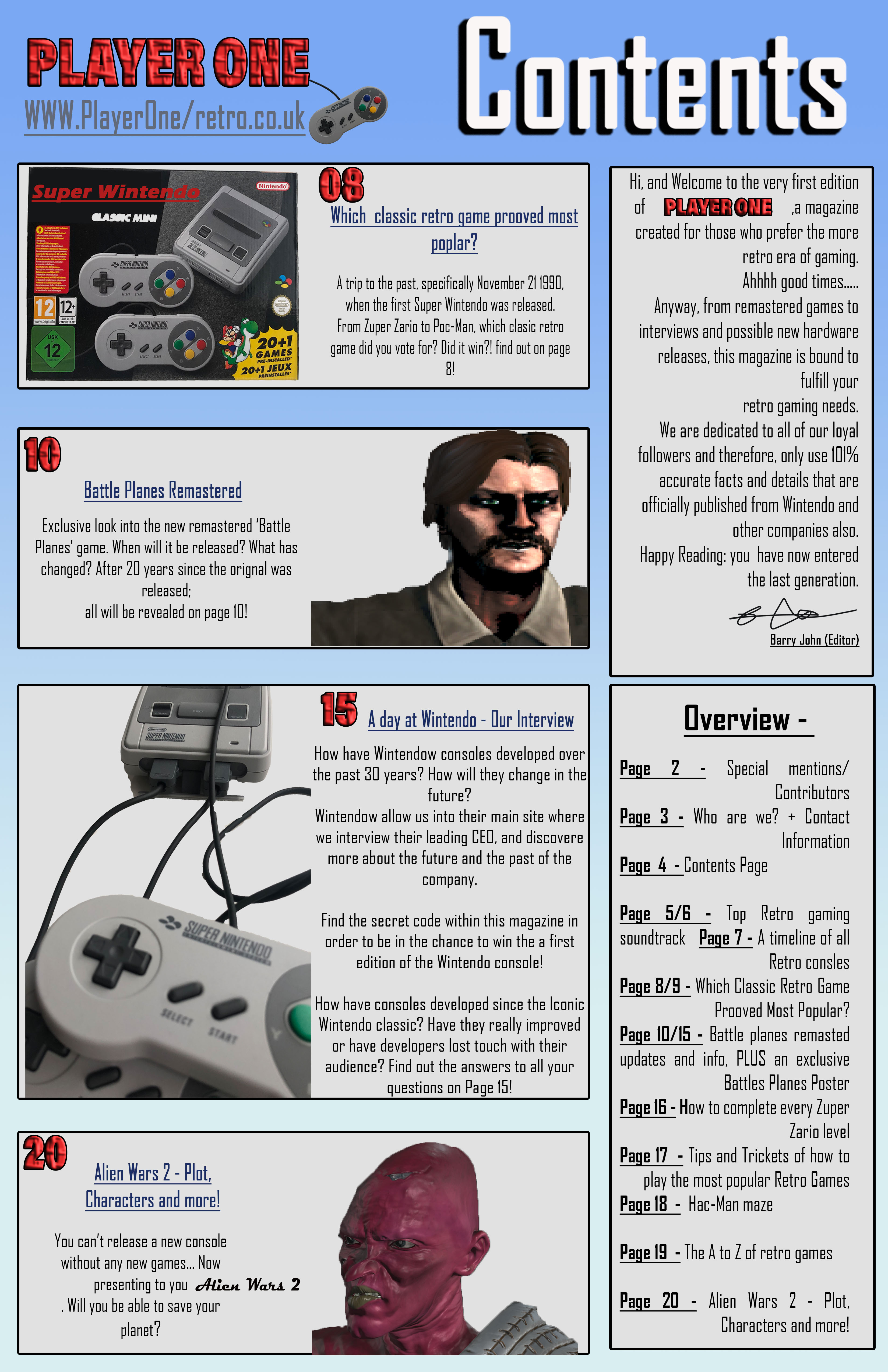
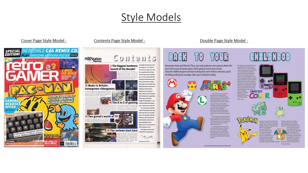
Contents – influenced by parts of my style-model by displaying key parts of the magazine, reference to the title and a description of what the magazine is about. However, I will change a few things to compliment my individual style. For example, I used columns and boxes in order to make it more organised and a section on the pages and what they contain. The magazine will also follow common codes and conventions by using similar fonts and the same background, so the magazine can flow. For the double page spread, I also used a boarder, similar to the previous pages, and a gutter so when the magazine is folded, there would be nothing going across the centre which could distort the image.