According to the Internet, children are 27% of the entire population and fall in the DE Social group. My magazine will serve as a source of escapism and will be cheap, so anyone of any social class can afford it. Before planning my front cover, I created multiple magazine covers of different styles, to see which one was the most effective at persuading the consumers to buy it and was suitable for my target audience. I concluded that having 3 little plugs with photos summarizing pages in my magazine was most effective and suitable for my target audience.
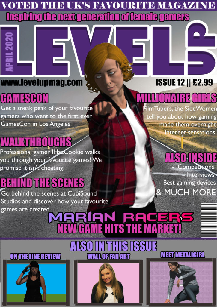
Before planning my magazine cover, I looked at covers of famous gaming magazines and noticed that game characters are predominantly male. The main aim of my magazine is to promote more females into the gaming industry. Elements of my magazine will help to promote female gamers, such as interviews with female gamers.
I have also included plugs, such as an interview with professional gamers as gaming is very popular with teenagers, so I feel the interview will be relevant to my target audience. The photo of Marian will be an iconic sign and the “Marian Racers” logo will be an iconic sign, so that the consumer automatically knows that a main article within my magazine is the launch of “Marian Racers”. Finally, I have thought very carefully about the sizing of my magazine, and I have decided on an A4 size of magazine because it will be able to fit into the consumer’s bag.
I have created Marian to appear radical to create the interpretation that women can be like men, in the fact that they can take on the adventure and action as well. I’ve also designed Marian to have masculine features to remove her sexuality and make her like male characters, as usually female game characters have large breasts, and their body is in an hourglass shape. This is also shown by the posing of Marian, usually females are posing sideways, so that their feminine features are defined, however, I have put Marian in a masculine pose, to challenge the dominant ideology and emphasise how women should be equal to men. Marian is also wearing clothes strategically covering her bottom, challenging the dominant ideology of females and the representation of women on games covers. I’ve also included no makeup on Marian to challenge the dominant ideology and emphasise how women and men should be represented truthfully, as not all females are the same as what is represented by the dominant ideology.
The cultivation theory says that by creating more media challenging the dominant ideology, you will be able to change people’s theories. On my magazine cover, I am cultivating the idea of equality for both males and females. This is shown by the common occurrence of females doing more male orientated activities, such as Marian (a female) is a female rally car driver, challenging the dominant ideology that only men can participate in car racing.