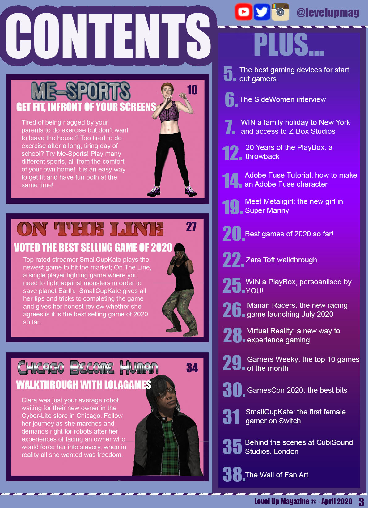
I have decided to follow a purple colour scheme as I feel this colour is a stereotypical female colour, thus emphasizing who my target audience is. The colour purple is also a symbol for power, which creates a radical message from my magazine as my aim is to get more females into gaming, an industry predominantly occupied by males. The colour purple is also radical as I am trying to deliver a message that within the gaming industry, both genders are equal. Throughout my magazine, I have followed a suitable style model by using the same fonts that have appeared on my front cover, so that is appears consistent and professional-looking. In the top right-hand corner of my Contents Page, I have included social media links to the magazine’s social media pages, as a majority of my target audience will have social media accounts because it was reported that 9 out of 110 teenagers have a social media account.
My featured articles are in a large pink box because it sticks with the stereotypical female colours and I want it to stand out, so I feel the bright pink background will attract my target audience’s attention. On the right-hand side of my Contents Page, I have a box that has a majority of all the other articles appearing in my magazine issue. I haven’t included all of them as it might stultify my target audience, so instead I have decided to include the articles that might appeal to my teenager target audience, such as competitions, interviews and tutorials. For my featured articles, I have included many game characters of a different ethnicity to include that minority, presenting my magazine as radical because not a lot of game characters are of a different ethnicity. I also have the featured games characters designed to appear quite masculine and in masculine poses to appear radical and reinforce the idea that both males and females are equal.
The fonts I have used are the same as the fonts that have appeared on the front cover and double page spread, as I want to keep my style models consistent and clear. I do not want to bombard my target audience with loads of text as I am aiming my magazine as teenage girls, therefore a lot of text will make them lose interest, therefore I have kept to the minimal text possible, but ensured that I have still covered the minimal requirements that have been set.
