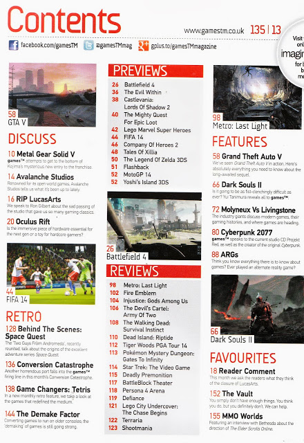

I am going to base my magazine contents on this contents page by the Official PlayStation Magazine and this contents page from GamesTM.
- I am going to have subheadings for each section (ie interviews and genres of games) for the audience to easily locate a page.
- Like GamesTM, I am going to have a line beside the “Contents” title with the website and the issue number so that the reader can know what issue number this is and that there is a website they can access for exclusive content. I am strategically placing the website at the top to entice the reader to visit the website as according to research, people notice the top of a page more then the bottom. Therefore I am going to put the important articles within this issue towards the top so that people take more notice of it.
- This house style (title and then line with the website and issue number) will be a house style I will also use on my DPS to create consistency.
- I am going to use the same/similar colours I have used on my front cover to keep with the house style of my magazine and the colour scheme I am using to create consistency.
- At the bottom of the page, I am going to have in small font the page number and the name of my magazine (Level Up) because to the audience it is not important, hence why O will have it small, however it is a necessity of a contents page/any page of a magazine so the audience know what page they are on.
