| Technical Code | Denotation (ie what is it – simply describe what you see / hear) | Connotation (ie what does it signify) |
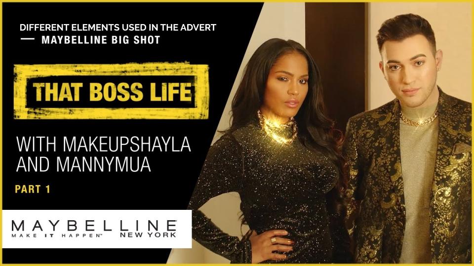
| Setting | New York city, streets, hotel room and back alley. then gold room. | expensive city, nice room connotes rich and elite. |
| Clothing | normal clothing, normal hotel staff uniform/ dark colours, then gold clothing/gold uniform/sparkly clothing. | gold connotes rich and luxurious. |
| NVC | ||
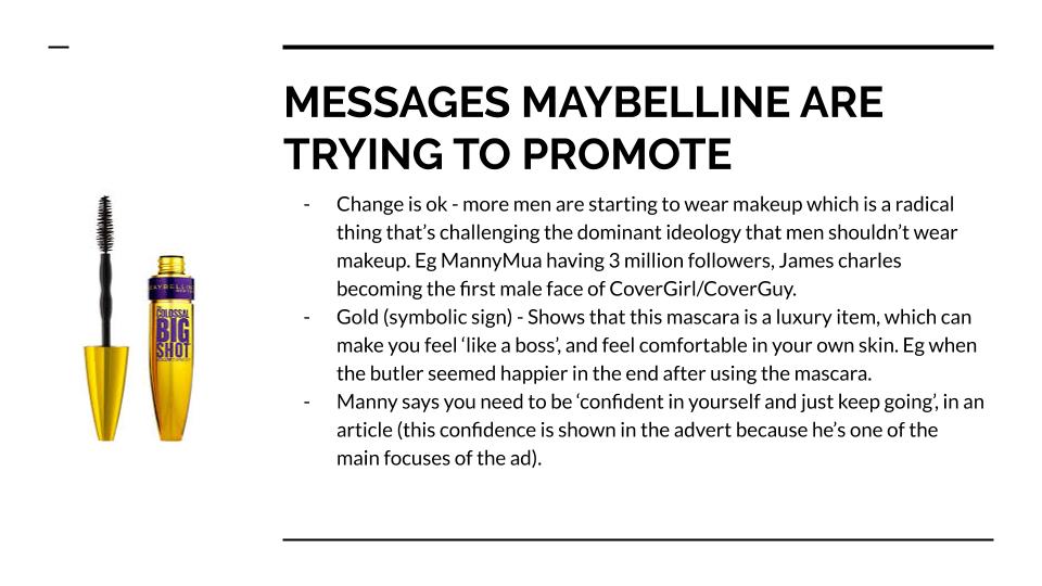
| Dialogue | ‘lets get bossed up’ | connotes that the product will make you a boss. the word boss has connotations of being in charge and being important |
| Sound Effect | sparkly sound when the gold case comes in. | connotes the case has something in it that is special and expensive. |
| Music | music in the background after they get ‘bossed up’. | connotes that life gets more exciting after they are ‘bossed up’ as the music gets louder. |
| Camera shot size | ||
| Camera movement | ||
| Editing |
Monthly Archives: November 2019
Filters
Language Of Moving Image
| Technical Code | Denotation (ie what is it – simply describe what you see / hear) | Connotation (ie what does it signify) |
| Setting | New York | Glamorous, Fashionable, Wealthy/Rich, Modern |
| Clothing | Starts off dull/plain and simple but becomes Sparkly, Gold and Fancy | Glamour, Wealth, Mascara will make you feel good and ‘Bossed up’ |
| NVC | Gestures, Shift in representation of identity | Indicating Bossed up mascara is a good product, Stereotypes are changing |
| Dialogue | Interaction with each other and the product, Energetic | Introduces product, Enthusiasm |
| Sound Effect | Kind of ‘Twinkly’, Swoosh | Magical, Sparkly, Bossed up, sudden change in perception |
| Music | Upbeat, Modern, Classy | Bossed up mascara is a classy product, gives confidence |
| Camera shot size | Wide Angle | A lot to take in |
| Camera movement | Angles change throughout the advertisement | Implies how the product can make you feel, can feel better about yourself if you use this product |
| Editing |
| Technical Code | Denotation (ie what is it – simply describe what you see / hear) | Connotation (ie what does it signify) |
| Setting | new york | success, wealth and high-end |
| Clothing | clothing goes from greyscale to shiny gold and silver | transformation |
| NVC | they appear confident and powerful after applying the mascara | this product will give you unshakable confidence |
| Dialogue | they stop talking once they get “bossed up” because they don’t have to | shows that their power speaks for them |
| Sound Effect | sparkle | magic, transforming |
| Music | hip hop | feeling powerful |
| Camera shot size | Different camera angle cuts | shows the product being used and provides evidence to the audience that they are using the product so the results are more realistic |
| Camera movement | emphasizes the transformation | power |
| Editing | enhanced gold effect | shows the suitcase as being valuable and worth a lot |
LANGUAGE AND CONNOTATIONS IN “THAT BOSS LIFE”
| Technical Code | Denotation of the advert – What is in it and what is it trying to promote | Connotation – What is it signifying) |
| Setting | New York penthouse, whole set changes when Manny and Shayla opens the golden suit case filled with the mascara. everything transforms into the theme of the mascara and is ” bossed up” (intensified music and everything is golden) | |
| Clothing | Bland basic clothing to start with, then transitions into bright golden clothing. | |
| NVC | Body language that was first displayed is exaggerated and flamboyant to express deep emotions of happiness and excitement. after they are “bossed up” they start to model themselves into powerful, strong and cool stances to show the audience that not only was it just a physical appearance change, it was a mental change as well. | |
| Dialogue | Conversations promoting the product. | |
| Sound Effect | Subtle trap and upbeat music under the characters voice. Music increases when Manny and Shayla transform. Lots of shimmering chimey sounds used to emphasise the products desire for the viewer. | |
| Music | Trap music with a heavy beat throughout the whole advert | |
| Camera shot size | Different camera angle cuts (long shot, closeup, extreme closeup) to show off that you can look good at any angle with the mascara. | |
| Camera movement | Slow-motion shots used to emphasise the sleek and hotness that the makeup can supposedly make you. | |
| Editing | Different camera shots are edited with music to again, emphasise how amazing you can look with the mascara. |
Language of moving image (boss life)
| Technical Code | Denotation (ie what is it – simply describe what you see / hear) | Connotation (ie what does it signify) |
| Setting | Flat, high up | Power |
| Clothing | Dull ordinary clothes change to shimmery gold clothing | Change in peresective, feel like a boss |
| NVC | Shift in representation of identity | Identity is becoming more fluid and stereotypes are changing |
| Dialogue | Energetic | Shows enthusiasm |
| Sound Effect | Swoosh | Shows the sudden change in perspective / identity. (transformation) |
| Music | Upbeat | Confidence and enthusiasm |
| Camera shot size | Wide angle | It’s a lot to take in |
| Camera movement | Changes angle | Different perspectives / views, how the product can change the way you feel |
| Editing |
BOSS LIFE


Theories of audience reception
Cultivation theory: explains the long-term effects and the more something is seen, the more people believe it’s true, that they should watch it or that they should use it.
The more the Maybelline advert is shown, the more people will want to try out the product to see whether the product is as good as it’s suggested. Due to the fact that the product is made to seem so good, to back this up the product is gold. This suggests a magical effect or a sense of luxury. The audience watching the video are then intrigued to want to try it out in order to be made to feel this specific way.
Reception theory: someone’s opinion is stated then a comment can be made about their statement which can be positive, negative or undecided so that people can agree or disagree.
In the Maybelline advert shown, the two youtubers featured in the video are stating how great the product is that people should invest in it and buy it. However, people might be intrigued to buy the product or others could disagree and not want to buy it.
Many factors could affect whether the audience take the dominant, oppositional or negotiated reading.
- Age
- Beliefs
- Culture
- Gender
- Life experience
- Mood at the time of viewing
Maybelline advert


maybelline facts
- Maybelline invented mascara
- The founder, Thomas Williams, wanted to be remembered as “the king of advertising.”
- Maybelline was the precursor of the highly popularized before and after ads. The brand slowly replaced Hollywood celebrities from their marketing campaigns with non-famous models in before and after shots of their products.
- maybelline was valued at $2.398 billion making them the 16th most valuable cosmetic company in the world
- It is owned by l’oreal who have a net worth $107.5 billion
Genders representation and the impacts on its consumers
In my essay, I am going to be talking about the stereotyping of genders and the negative mindsets it encourages. I am using two different forms of media to explain and expose the subliminal similarities these sources show. The sources I’m exposing today are the popular magazine “Men’s Health”, and the video game cover of “Tomb Raider. The topics I will be discussing “Men’s Health” are first specifically chosen dominant signifier and its fabricated dominant ideology, associated with male stereotypes. Also, I will be talking about the planned bold subtext and chosen primal colours, that are meant to attract certain audiences throughout men’s health magazine. I will then be interpreting and explaining why it can give off a negative mindset for its audience. Then I will be explaining how not just the title page is covered in subliminal messages that complies with Maslow’s audience theory. After that I will lead onto tomb raiders and the links with Men’s Health and Gauntlett’s audience theory, additionally I will mention about the protagonist on the front cover of Tomb Raider, and how it enforce opinions of objectifying women. After going over that, will finish with my conclusion of how the gender shown in media impacts its audience either in a positive matter or negative matter.
Beginning with the magazine known as “Men’s Health” and its meticulously, chosen layout of its front cover, the audience is first drawn to the dominant signifier of the male figure, on the centre of the page. The most noticeable feature in this image is his positioning and lighting effects on his muscles. The company has specifically directed his stance and the lighting to accentuate his biceps. The company’s reason for doing this would be to comply with the stereotypical male and the theme of the magazine. Subliminally stating in the image that a man is strong, cool, determined are all symbolic signs to add to the theme of the magazine to attract male audiences. This can impact audiences, psychologically, because it can set too high of a standard of living, and identity, which isn’t realistic for males to live up to. This dominant ideology of the stereotyped male is toxic and can damage the mental health of men excessively. By subliminally telling their male consumers, who may not have the appearance or presence of “coolness” that this image has, being anything different is supposedly bad, or won’t be liked by society. The company’s choice of representation and subliminal messages it can give off can refer to cultivation theory by George Gerbner based around his research on TV viewing. Explaining that with time and exposure to a certain opinion, can change the consumer’s thoughts unknowingly to fit the companies once radical ideas, into reactionary dominant ideology.
Moving onto his chosen clothing of neutral colours of grey and black, further complies with the stereotype, held up to men. It’s considered normal for men to wear dark and bland colours since it helps make them look “cool”. Referring to colour psychology, colours influence perceptions that aren’t obvious, to display emotions, making things more favourable, more exciting, and are symbolic signs that can tell an audience who the magazine is for without saying it. For example, the colour pink in a magazine can mean its more of a girl magazine since it’s a stereotype that women are linked and love the colour pink. Focusing on the certain type of t-shirt he is wearing is important to notice he has short sleeves, tight around the tops of the arms but looser around the chest, and he has a v-neck to show more of his muscles off, without being too revealing. For male models, it’s quite radical to ever see a man in a crop top, or in sexualized positions used in women’s modelling because its classified as radical. I think instead someone should challenge the dominant ideology of the stereotypical men and women, so they aren’t so different and toxic. Why can’t women and men stereotypes, be more realistic, encouraging, and accepting? Giving off good motivation and messages when generations are influenced by them, instead of giving them something impossible to live up to.
Looking back now at the text around the dominant signifier of the front page it’s noticeable to see many bold, blue coloured, subheadings, framing around the centre of the magazine. There are over 10 plugs used to attract certain audiences, uses of colour psychology and uses an example of a counter type and a universal sign, by using the colour blue saying its known that all boys like the colour blue, and are linked with the colour blue. This paradigm can all fall under the category of codes for the media, but on a more specific note, I want to focus on the plug that is called “SHORTCUTS TO T-SHIRT ARMS”.Furthermore, this phrase complies with the gender narrative and negotiated identity theory created by Swann of how the once agreed upon identity of let’s say a man’s arms being strong, is then set in stone to be a standard by all and therefore becomes the dominant ideology. With this phrase, I read further about the page it’s linked too and it talks about the exercises for his “blockbuster arms” with weight training. It then goes onto talk about how to “Fire Up Your Engines” by sprinting, but I’d like to point out the key language the writer used when writing of counter typing of having certain titles and subheadings in blue or having the background colour of a paragraph blue. Subliminally telling readers that this page is for boys. The use of targeted language, specifically pointing out to the reader about growth hormones and testosterone increase. Instead of mentioning other hormones like endorphins or dopamine which is less directed to male readers, they used the word testosterone and growth hormones because it makes the information more direct and desired to read since its set that men need a lot of it to be considered a real man. Secondly, the connotations and Anchorage on this page are the lighting bolt above the paragraph to signify energy, and energy with humans can be associated with exercise so that’s why it’s used. The use of Anchorage would be the bullet points used to make the information easier to read and to keep the interest of the reader.
Elaboration the middle page I really only want to focus on the bottom left image with its speech bubble. The image is of the front cover protagonist named Diesel and the speech bubble says, “Diesel slant is one to aspire”. I want to go further into this phrase, since it’s a great example of subtle and subliminal control of consumers ideology. Why is something so pointless as a way of standing need to mean anything?, Why does the media chose to make a certain way of standing, something we need to worry about in our day to day lives. This just adds to the list of things we are expected to be and do and the theory explained by Gauntlett of constructed identity to convey specific ideas and values related to culture and identity in society.
Talking more about Gauntlett Audiences theory, Gauntlett’s theory can relate to the video game Tomb Raider, new and old version. On the front cover of the newer Tomb Raider, the shape of the main character Lara croft complies with the theory of constructed identity and reality. You can see this because developers created Lara Croft in a specific way for her to be more desired. Which also links to the stereotype built for women and how women should be thin which links with the identity part of Gauntlett’s theory. By her having an unrealistic but desirable shape their game is therefore more desired by the public. Since first, the hourglass shape is sexualized for women and have been known to be more wanted by the male audience from generations and generations idea of the ideal woman. To the female audience the image of Lara croft can give an impression of how they should look, and that’s again theory of constructed identity. Furthermore the different audiences that are showed this game can be put into categories, just like in Stuart Hall’s Audience Theory of preferred reading. Were you can have an audience love the character design for its sexual nature for instance the majority of male audiences. Then the negotiated audience, who are indecisive about the character design, possibly contemplating if they agree with the characters subliminal message or not, this could be some women or girl gamers who fall into the trap of constructed reality. Finally the oppositional audience, these types of gamers would reject the character design completely, for its message and the constructed reality it implies.
With this in mind, another noticeable thing about Lara Croft’s character is how her pose, and clothing are clear examples of objectifying women. Starting with her pose, Lara Croft is facing left with her face turned to face the front of the cover, this is done because then her butt is in frame plus her hourglass shape can be more noticeably recognised. Why is this allowed and normalized in society? Allowing covers to pose women specifically, just for the benefit of attracting audience by appealing to sexual aesthetic. Tomb raider is one of the first games with a female protagonist which I can see as a positive action done by the developers, but the way they have displayed her character is engunuin since on the one hand, it’s promoting female protagonist, but then on the other hand the cover has subliminal messages behind the character to make her more desired by sexualizing her.
In conclusion I think that media platforms such as Tomb Raider and Men’s Health use what I would consider, quite harsh and terrible ways to control their audiences, by impacting and controlling consumers confidence desires, and anxieties. I think that this contributes to bad mental health being formed, just so media platforms can sell their products.