
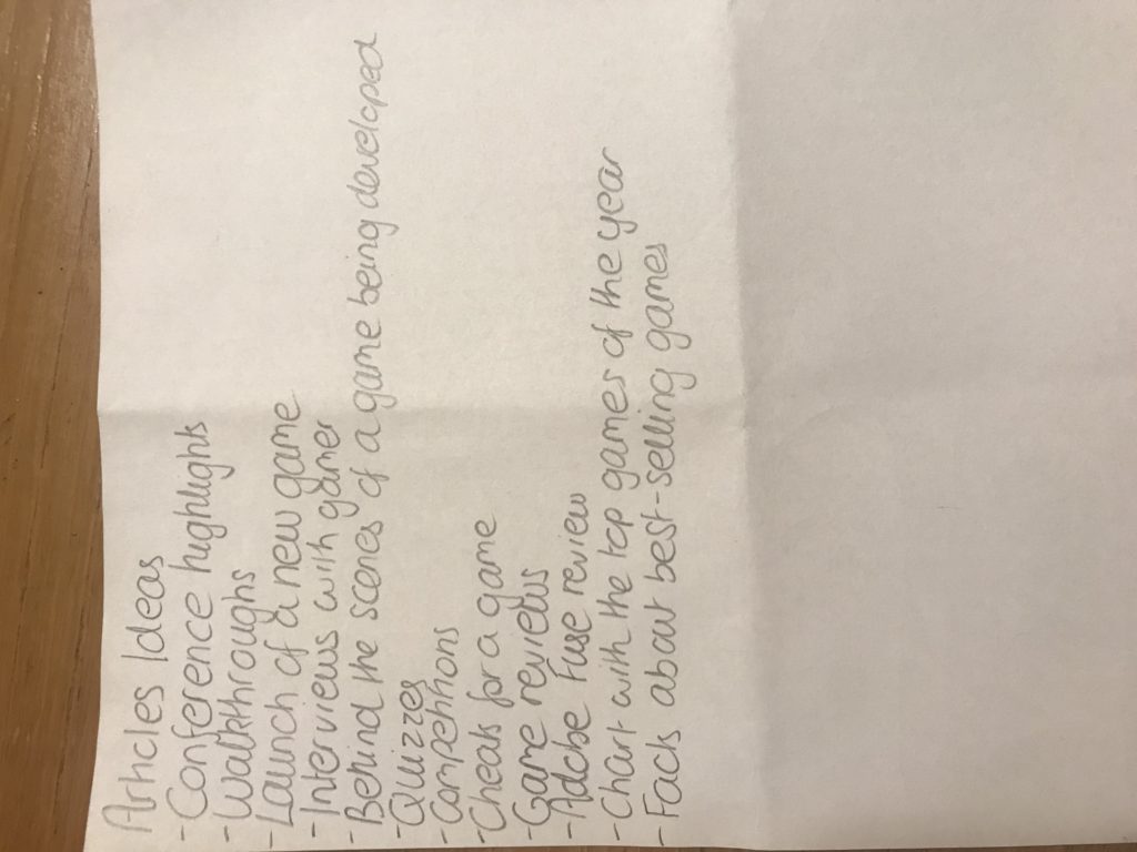
Use a 4 paragraph structure to create an effective statement of intent.
Monthly Archives: October 2019
Filters
Magazine Cover – Background
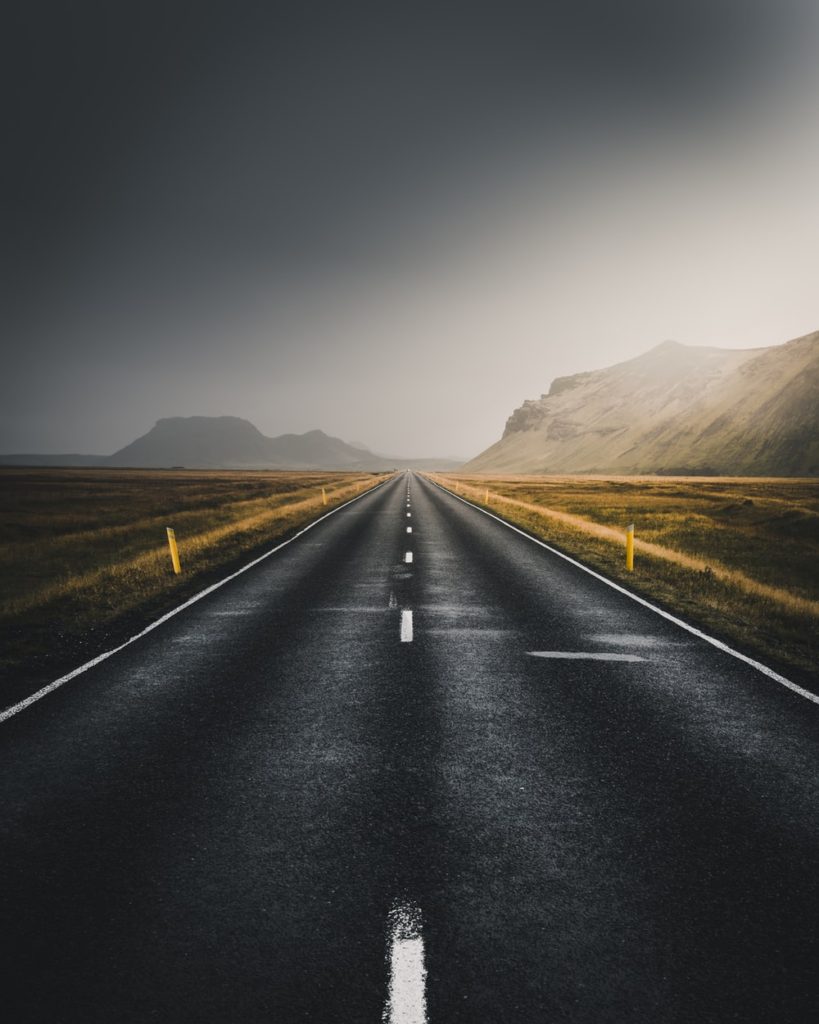
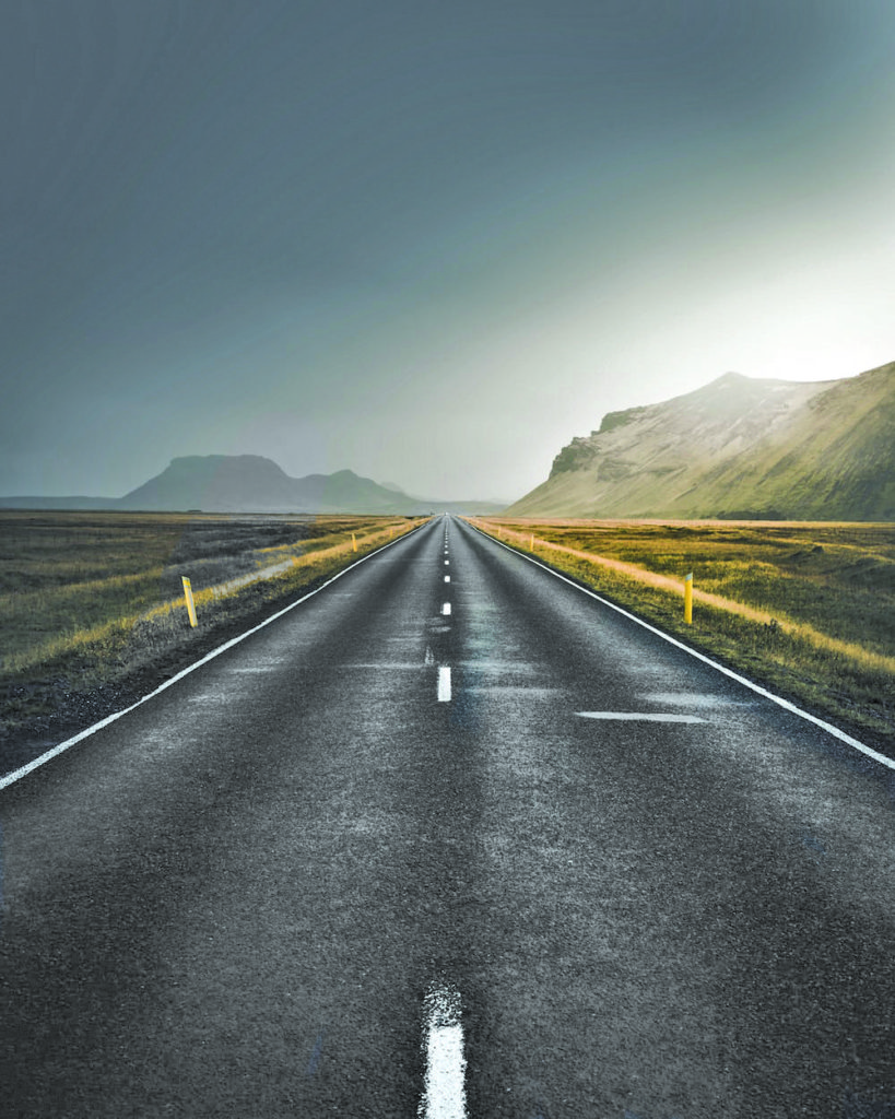
I found an image that I liked on Google Images, and then I edited it by changing some of the colours and the brightness. This will serve as the background of my magazine cover, as it is primarily based on ‘Marian Racers’, so the road in the background suits with the cover image of my magazine.
Magazine Cover – PLAN 2
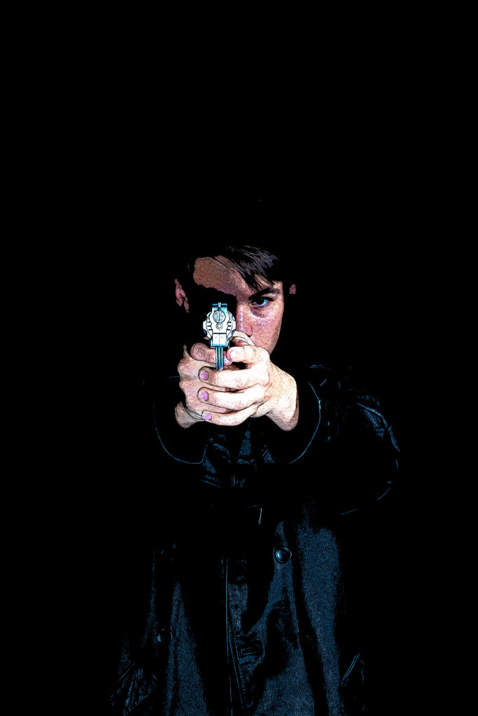
Game Character Edit
Marian Racers – Title
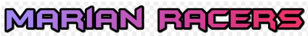
I created this Title for “Marian Racers” using an online font creator, where I chose the style of the font I am looking for and the colour scheme, then the website creates loads of presets I can edit. I chose this font because I find it is quite funky and I also like the gradient of the purple-pink-red as it really fits in well with my colour scheme.
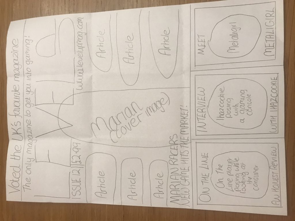
FRONT COVER HISTORY AND CHOSEN FRONT COVER AND NEA STATEMENT OF INTENT

Young and Rubicam’s 4 C’s – The Struggler, The Mainstream and The Aspirer as I feel that this sums up the majority of those in their late teens/early twenties
7 New Class Types – Precariat, traditional working class and technical working class


When creating my front cover, it took a few attempts as I wasn’t satisfied with what I created. As I wasn’t satisfied, I remembered that magazines are aimed at a large demographic so I decided to create a quiz containing questions such as “are you a gamer” or “what colours do you associate with gaming?” etc. You can find it here: https://forms.gle/65xxsvQM8L9GDQXu9.
I found that creating this quiz benefitted me as it helped choose a front cover design that not only I like, but one that others would enjoy too. I had 46 people answer my quiz and out of that quiz, 30 males and 16 females had taken it. I found that with my “are you a gamer?” question, 30 people had chosen the “yes” answer and 16 people had chosen the “no” answer which aligned with the male to female ratio on the quiz so from those stats, I managed to figure out what audience I should be aiming at, although in hindsight, my assumptions were a little biased.
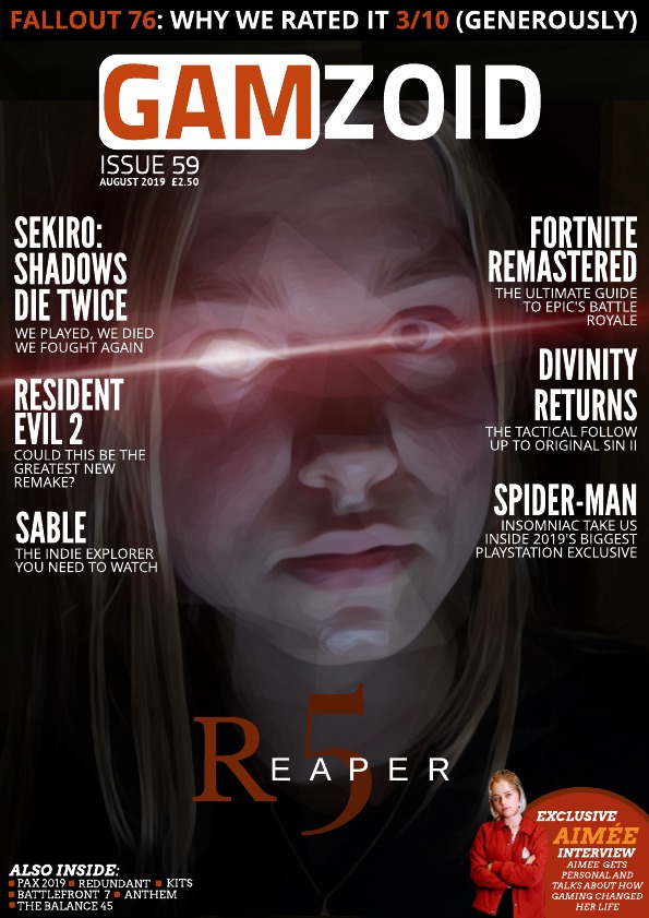
For the third front cover I decided to display a made-up character from a game I decided to name “Reaper 5”. For my article titles, I decided to use bold white text, as I find that ‘less is more’. I attempted to match the colors of the background with the text, to create an aesthetically pleasing visual. This has the purpose of grabbing the attention of my targeted audience. In the right hand corner of my magazine, I’ve placed an image of a made-up famous gamer in the gaming industry, Aimée. As she is intended to be a famous gamer, I felt like it would attract more people to read my magazine. However, I feel like I could’ve have made her a more noticeable, but if I had, I would have taken away the focus from the main article displayed.
Marian – photoshoot for cover image
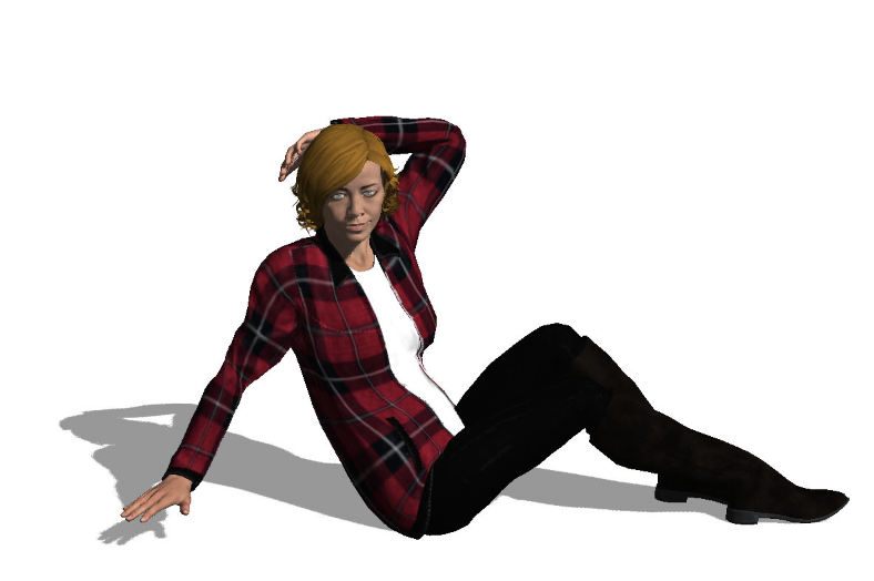
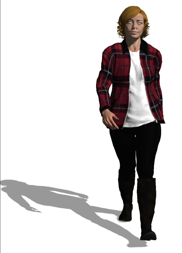
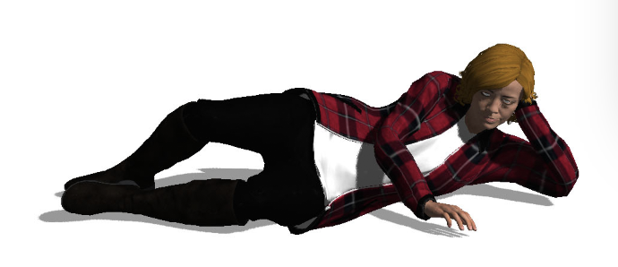
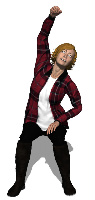


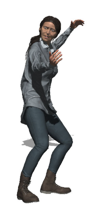
Marian is the cover image of my magazine. I have tried many poses with her (lying down and sitting down) because I am unsure if she will be in the car or pose by it. While I am editing I will see which type of pose looks the best.
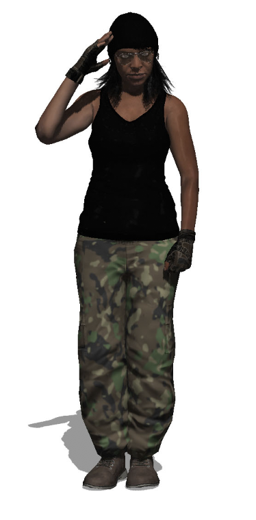
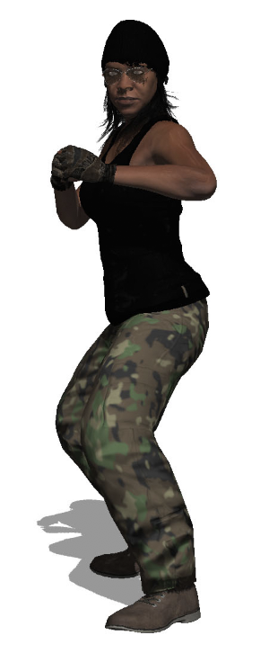
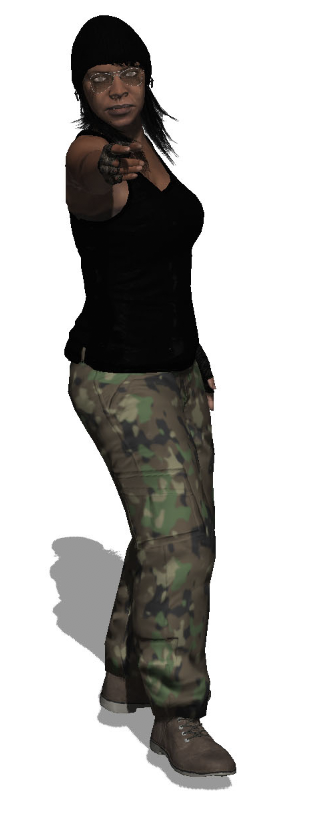
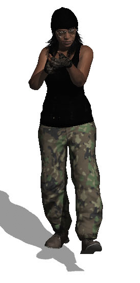
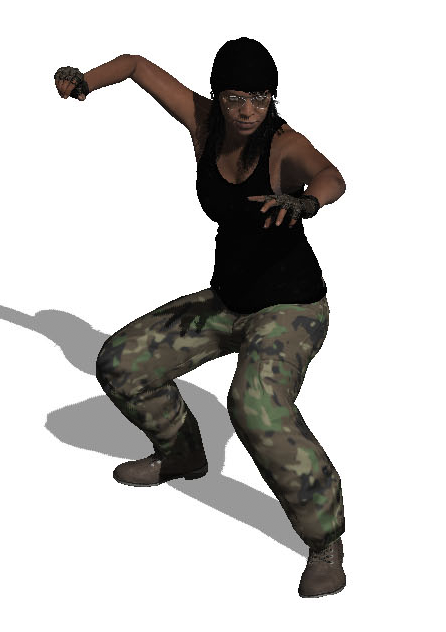
ON THE LINE – FRONT COvER PHOTOSHOOT
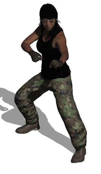
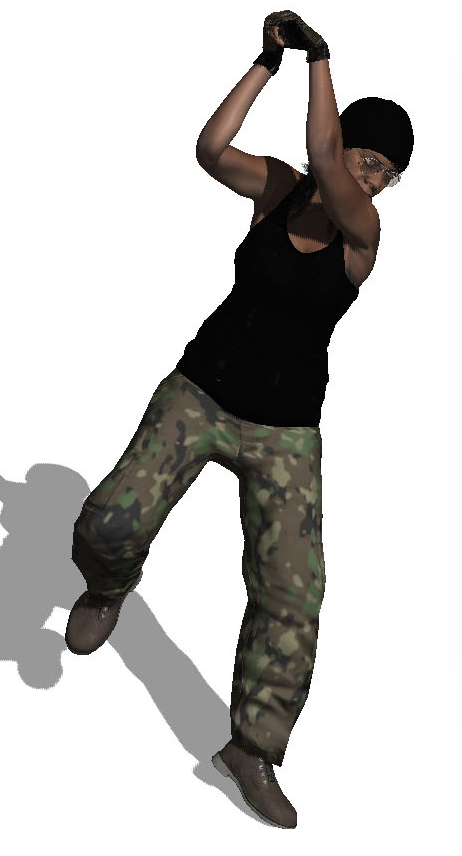
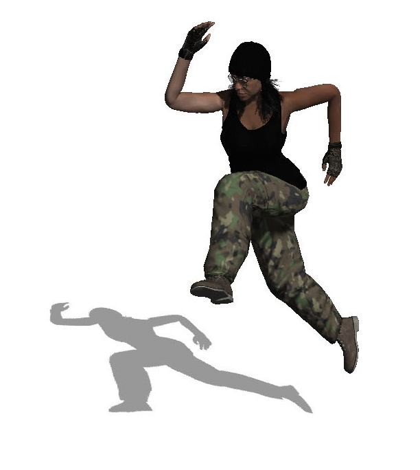
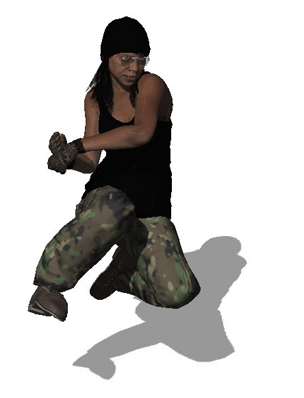
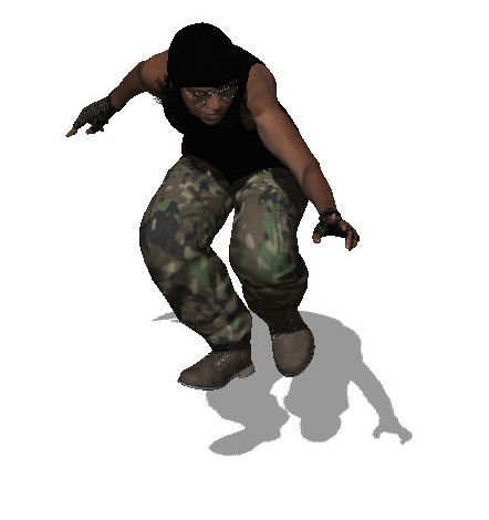
Like the Metaligirl, I created a character for my front cover in Adobe Fuse, and then changed her pose (as she is meant to be in the Army). I have based this character off the well known game, “Call of Duty”.


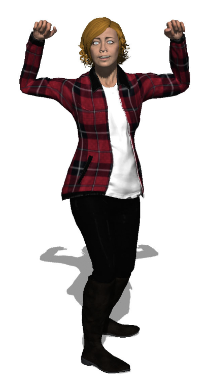
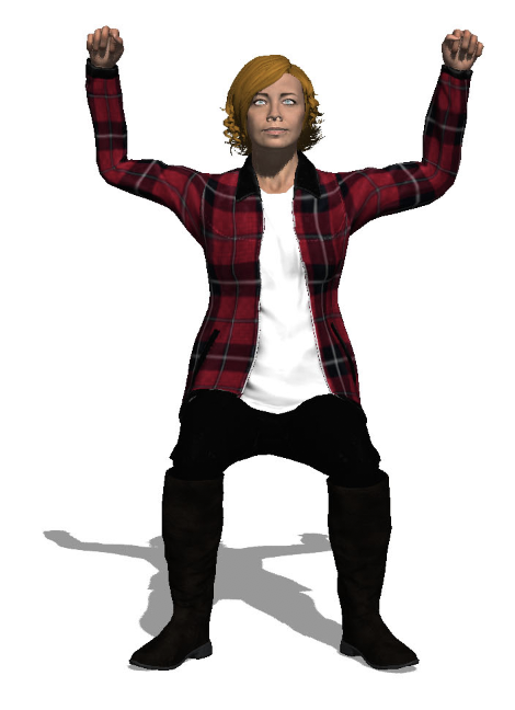
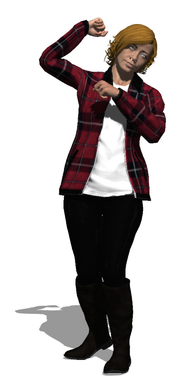
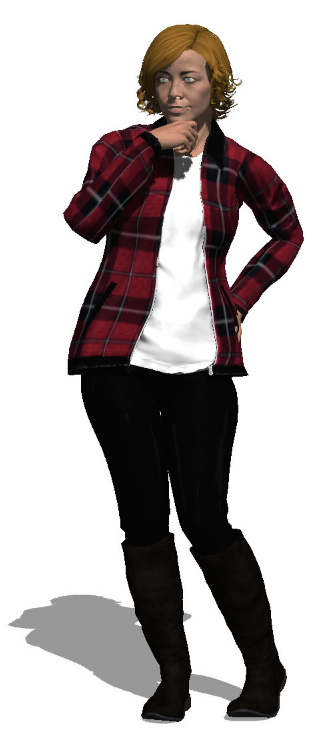
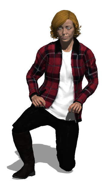
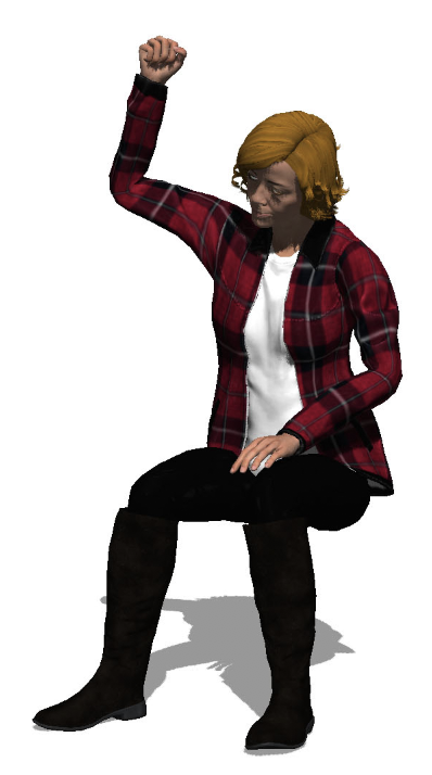
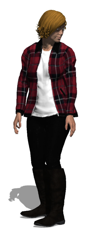
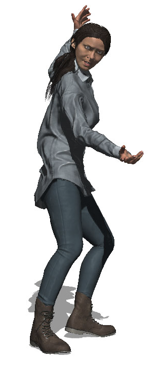
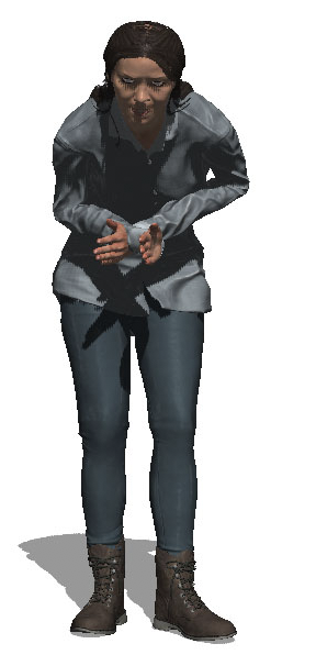
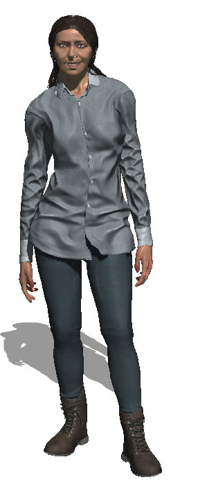
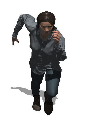
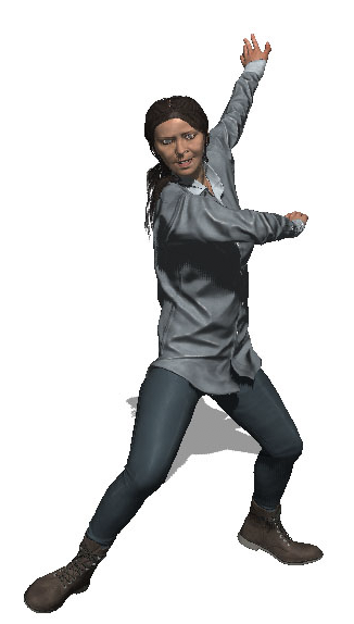
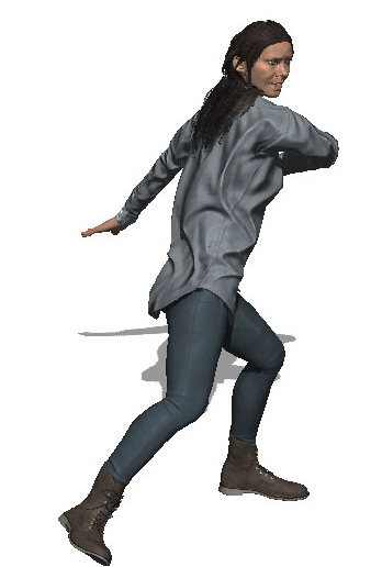
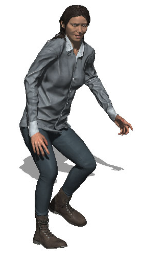
METALIGIRL – PHOTOSHOOT


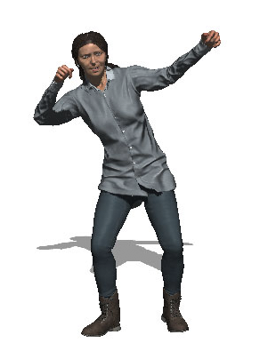
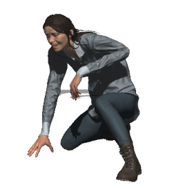
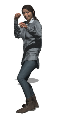
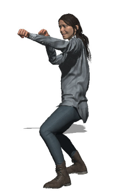
(Please note, I haven’t cropped out half the body, to upload them here, the site automatically cropped them)
I created Metaligirl in Adobe Fuse and then changed her posing in Adobe Photoshop. I wanted her to look a bit like a villain. I am pleased with the way the photos came out, but I am unsure which one to use on my magazine cover because I like how they all turned out!