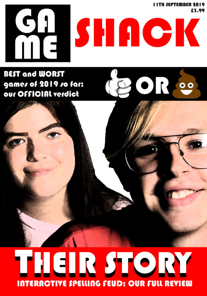
my working title for this gaming magazine is ‘Gameshack’ – this title implies that the reader is part of a tight community of gamers and that they are in the ‘shack’ – they are in the know, where gaming is concerned. As my target audience are 16-24-year-old men, this sense of being ‘in the know’ is helpful, as this demographic tend to follow trends both in gaming and in wider society. This demographic is addressed by the use of relatively simple language on the magazine cover, giving way to more technical jargon on the inside (traditional gaming magazines tend to use this strategy of simple outside/complex inside) and ensuring the magazine’s broad appeal. my magazine will include an article about the game mentioned in the cover strapline – Interactive Spelling Feud – and it will interact with the magazine’s readership through ‘best and worst games of Summer 2019’-type discussion in the magazine, designed to spark debate. my magazine’s main image is a depiction of the two main characters in Interactive Spelling Feud, demonstrating the centrality of that game to this issue of the magazine, and the magazine uses white text on bright red on the magazine’s headline in order to draw the attention of the reader to the magazine’s coverage of Interactive Spelling Feud. I used the font ‘Bauhaus 93’ in order to create a futuristic and electronic style on the magazine’s cover.
This magazine, despite its relatively mainstream characteristics, remains viable due to the fact that the gaming magazine market is still a growing market with much space for high-quality new additions. It also uses the standard conventions of a date and a price.