Statement of intent;
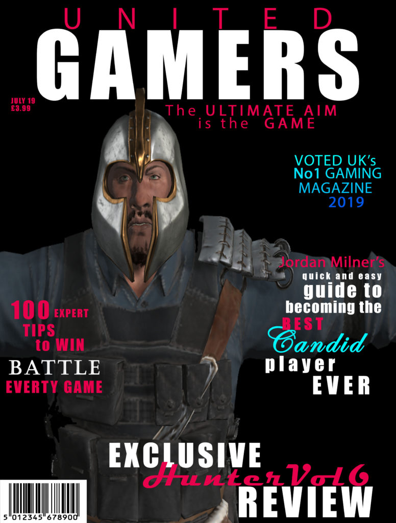
The main intention of my magazine was the create a gaming magazine that was inclusive to both males and females. To do this I did some research on some existing magazine covers including PC GAMER and GAMES TM. I found the majority of the covers were using dark colours and featured characters. Using this research, I decided to layout my magazine with 4 plugs and the main image of a character from a game. I also made the background black as it connotes death and mystery which link to the theme of my magazine.
My gaming magazine is called ‘UNITED GAMERS’. The target audience for my magazine is teenagers (12-19 years old) who are male and female, who have an interest in gaming. I named my magazine ‘UNITED GAMERS’ as the word united immediately connotes that everyone is joined by a common interest and the word gamers indicates that the magazine’s topic is gaming. I used the fonts Impact and Mydrid Pro which are bold fonts that are eye-catching for the target audience. The colours I used for my cover are black, red/pink, blues and white. I used black and white as they are both shades and are not linked to a specific gender. I then used the blues and red/pink as these denote male and female which again portrays that the magazine has content for both girls and boys. Also, the colour red links to danger which relates to the plugs which are about battle and war games.
The main image is a cartoon man from one of the games mentioned in the plugs, this will be instantly recognizable for the target market that plays the game and knows the character. My cover has 4 plugs which are all in the same 3 fonts to make it cohesive. I n the plugs I used words like “exclusive”, to make them stand out and appeal to the target audience by implying that this magazine is the only place to get the information. I also have a barcode, date and price as these are part of the codes and conventions.
Representation;
The dominant ideology of my magazine cover is about war and battle games. I used a male character from one of the games who follows the stereotype of a male, which features large muscles and angry expression. This image represents the ideal male this makes my magazine a reactionary text. As my target audience is teenage males, they will be able to engage with the cover as they might idolize the character. Also, the name of my magazine is ‘UNITED GAMERS’ which is an iconic sign and provides anchorage for the target audience.
Audience theory;
- The encoded message of my magazine is war and battle games.
- appeals to my target audience because emphasizes there interests.

