Statement of Intent
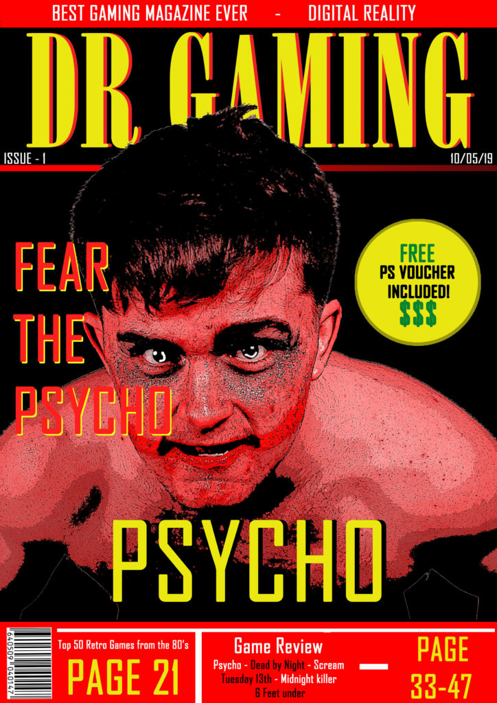
The choice of red as one of my main colours on the front cover was intended as a symbolic sign to represent danger and emphasise the sense of horror in the game ‘Psycho’. I also chose to make my main character (front cover image) red to increase a sense of fear in the reader. The yellow text contrasts against the red of the character and background so stands out. The red and yellow colour scheme is not associated with a single gender therefore making my magazine unisex. My target audience, therefore, is anyone aged between 15 and 25who would be interested in horror and dark games. This game would not be suitable for younger children. I used the Dollar signs as an indexical sign to signify money which would be appealing to this audience as they are young and probably don’t have as much money to spend on smaller / luxury items such as vouchers compared to older individuals. The word ‘FREE’ is in the same colour as the dollar signs to make it stand out and having ‘FREE’ and ‘$$$’ close together makes the reader subconsciously think about free money. I would maintain an iconic style with all of my front covers and make it aesthetically pleasing over multiple issues so that it becomes a magazine that readers would want to collect which would appeal to the audience, as gamers often enjoy collecting random gaming related items. This is because gaming has become a lifestyle for many as well as a hobby and I would want my magazine to be a part of that lifestyle.My title ‘DR GAMING’ has a catchy style to it and the DR also stands for Digital Reality which is a memorable tag to accompany the title of the magazine. I used a mixture of gaming related terminology and code to appeal to my audience. The effect of a large title that stands out in the top third of the magazine cover is to attract readers as this is all they would see if the magazine was in a rack at a shop. The main image appears behind some text and in front of the title to give it a 3D effect and stand out to the reader.
