To create my magazine cover, I first carried out research into different magazine covers to gain inspiration for my brief. From my research I discovered this example of a magazine front cover and subsequently decided to base my front cover of this style model.

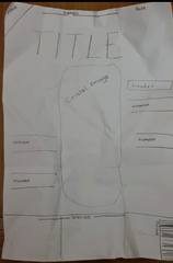
Using the rule of thirds I constructed this rough plan for my cover. I have replicated the general structure of the style model and incorporated it alongside my own ideas to create my front cover. I developed many of my original ideas after constructing this plan, including the inclusion of plugs at the base, a sticker on the top left corner, this has increased the strength of the piece in looking like a professional magazine cover.
My intentions of the magazine are to create a wide target audience, this magazine is not bound to a particular gender or age group and instead it is aimed at anyone with an interest in gaming or the world of gaming. I have included a particular selection of articles on the front cover with the aims of appealing to a varied audience and trying to broaden the market of this magazine to encourage different interests and buyers of the magazine. These ideas are reflected through the use of the headings on the front cover. The inclusion of varied headings such as; a mixture of board gaming articles and digital gaming articles, tips and advice that might appeal to serious or armature gamers. Interviews with programmers which gamers or those with an interest in that particular field or career may find appealing. Competitions to actively involve buyers of this magazine, and luxury prizes to encourage more people to purchase the magazine.
The title of my new magazine for gamers is ‘Game On’. I have named it this because it has alternative interpretations; the Gamer colloquium for ‘the game has started’ as well as the continuation and future of gaming. It is the colour red because of it is semantically symbolic and associated with fire, energy, danger/hate, as well as passion/love, typical themes associated with gaming.
The background colour is white, often associated with new things, (digital games) or with tradition (board games). As the background is plain it can represent the start of a game, an empty board or new level.
For all text, excluding the title, I have used the same font and colour. However, I have varied the size, positioning of the text and put certain words in bold, (aiming to draw the focus to the key words) and done so in no particular order or structure, only with the explicit aims to make it varied and entertaining, such as gaming itself. I have used all black text to stand out from the white background, this has the connotation between good and bad, which is heavily associated with either board or digital games (as this magazine addition is equally focuses on both.)