I wanted to create a gamers magazine cover with a theme of adventure games and cartoon imagery. Therefore my ideal consumer would be 12 or 13 years old. They would wear brightly coloured trainers and a t-shirt with comic or gaming characters printed onto it. They have glasses that are square shaped with blue frames. So this person would have a stereotypically geeky look/style. The main idea of my cover is promoting a new game called ‘Action Adam’ where you can create your own animated action character like ‘Adam’, who is pictured in the middle.
For the layout of my cover, I have used the rule of 3rds. The top section of my cover is the heading, the middle is the main picture which is also going to be the dominant signifier and the bottom right is a text box that shows what’s inside the magazine. The image inside the text box is four gaming teenagers which relates to the audience the magazine is aimed for. The font and size of my heading has bright colours with an orange and red gradient. Underneath the heading there is a tag line saying “the best guide to beat the bad guys” this suggests a theme of ‘good and bad guys’ in gaming. I also used the word ‘exclusive’ in a slightly bigger font to make it stand out and draw your eyes to that part of the text.
To create my dominant signifier I have used photoshop to manipulate a picture of a teenage boy into a cartoon looking form. This allows my ideal consumer to be able to relate to what they are buying. The image will be highly saturated to bring out the colours which contrasts the black background. The fact that he is looking into the distance creates an effect of empowerment in gaming and that he is strong and serious. This would hopefully be relatable to teenagers who are interested in gaming as it represents them and they would want to become like that boy on the cover.
My dominant signifier is reactionary as it is what you would expect a magazine cover of that genre of game to look like. I would say the genre is an adventure game. The way the character is looking into the distance shows he is focused and motivated to go on an adventure. However, you could argue that the dominant signifier is radical as you wouldn’t expect a younger boy to be a hero of an adventure game. It would usually be an older strong male like Indiana Jones for example. But the fact that my dominant signifier is younger makes him more relatable to the ideal consumer of a young boy.

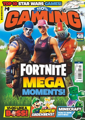
This is the magazine that I based my own cover off of. I mostly took inspiration from the yellow and red colours of the text and how they went together with each other, I wanted to use that in my own cover. I also liked the idea of the gaming characters being in the centre of the cover with the text surrounding them. I also took the idea of including a picture that shows ‘what’s inside’ as it advertises the rest of the magazine to the viewers.
Overall I wanted to create a smart, bold and colourful cover using a theme of good and bad characters in gaming.
