Daily Archives: 10/11/2019
Filters
Statement of Intent
I wanted to create a gamers magazine cover with a theme of adventure games and cartoon imagery. Therefore my ideal consumer would be 12 or 13 years old. They would wear brightly coloured trainers and a t-shirt with comic or gaming characters printed onto it. They have glasses that are square shaped with blue frames. So this person would have a stereotypically geeky look/style. The main idea of my cover is promoting a new game called ‘Action Adam’ where you can create your own animated action character like ‘Adam’, who is pictured in the middle.
For the layout of my cover, I have used the rule of 3rds. The top section of my cover is the heading, the middle is the main picture which is also going to be the dominant signifier and the bottom right is a text box that shows what’s inside the magazine. The image inside the text box is four gaming teenagers which relates to the audience the magazine is aimed for. The font and size of my heading has bright colours with an orange and red gradient. Underneath the heading there is a tag line saying “the best guide to beat the bad guys” this suggests a theme of ‘good and bad guys’ in gaming. I also used the word ‘exclusive’ in a slightly bigger font to make it stand out and draw your eyes to that part of the text.
To create my dominant signifier I have used photoshop to manipulate a picture of a teenage boy into a cartoon looking form. This allows my ideal consumer to be able to relate to what they are buying. The image will be highly saturated to bring out the colours which contrasts the black background. The fact that he is looking into the distance creates an effect of empowerment in gaming and that he is strong and serious. This would hopefully be relatable to teenagers who are interested in gaming as it represents them and they would want to become like that boy on the cover.
My dominant signifier is reactionary as it is what you would expect a magazine cover of that genre of game to look like. I would say the genre is an adventure game. The way the character is looking into the distance shows he is focused and motivated to go on an adventure. However, you could argue that the dominant signifier is radical as you wouldn’t expect a younger boy to be a hero of an adventure game. It would usually be an older strong male like Indiana Jones for example. But the fact that my dominant signifier is younger makes him more relatable to the ideal consumer of a young boy.
This is the magazine that I based my own cover off of. I mostly took inspiration from the yellow and red colours of the text and how they went together with each other, I wanted to use that in my own cover. I also liked the idea of the gaming characters being in the centre of the cover with the text surrounding them. I also took the idea of including a picture that shows ‘what’s inside’ as it advertises the rest of the magazine to the viewers.
Overall I wanted to create a smart, bold and colourful cover using a theme of good and bad characters in gaming.
magazine cover
Magazine images
nea – MAGAzine cover, style model and statement of intent

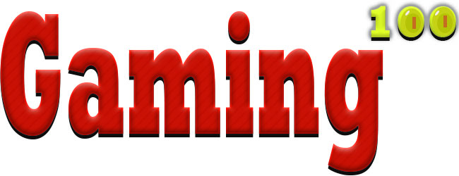
Gaming Magazine front cover
Style Model
Statement of Intent:
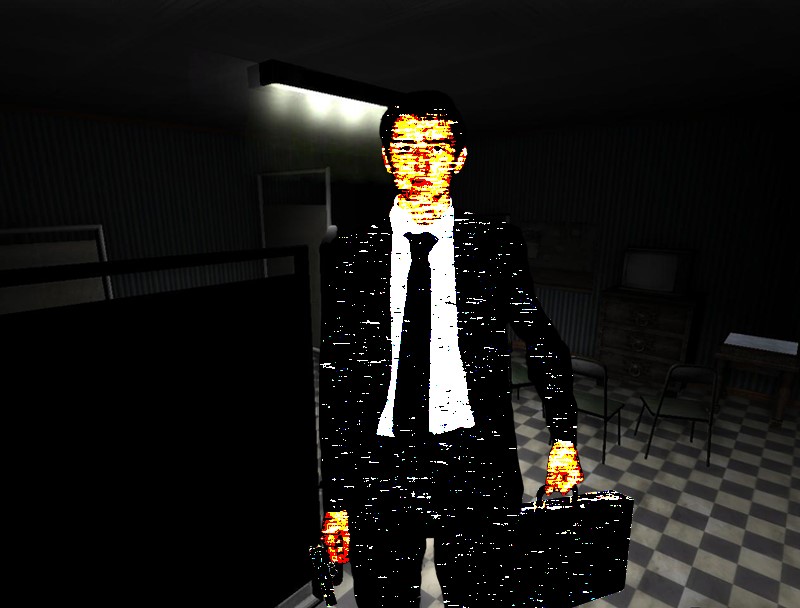
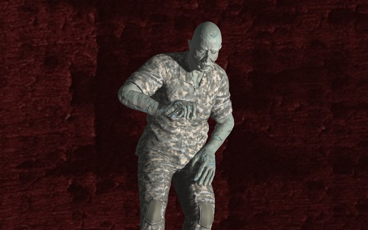
I planned to create a gaming magazine with a main image on the front cover from a game character. For this I used an image I took of my classmate and edited it using the motion blur, posterize, levels and multiply effects to make it look like a game character. Since this character represents a thriller/horror type game, I chose an image conveying mystery or despair with the character staring straight at the viewer. I also chose this because I wanted to use a screenshot like the style model to make the magazine look more impactful.
I added extra hooks on the sides and bottom of the magazine. The purpose of these is to entice the buyer and inform them quickly about what content is included in the magazine. I made put them in black boxes to make the text easy to read compared to if they were simply placed above the background image. I included to hook of reviews of the newest games from popular franchises to make the magazine appeal to a large audience, as both casual and hardcore gamers would know about popular franchises and should be interested about buying the magazine if reviews and articles about games in those franchises are featured. In addition, I included news from a gaming convention “E3”, A guide for the popular game Fortnite and links to two stories about gaming at the bottom of the magazine cover.
My magazine features the strapline/tagline “Reviews – Gameplay – News”. I chose this tagline as it is easy to remember so will stick in customers heads, and also it describes what is featured in every issue of New World Gaming.
For the title of my main game (the title anchored to the main image) I used emboss and satin effects to make it look like a title of a thriller/horror/mystery game. The satin affect adds a fracture-like feature in the text which I believe adds a horror element to the title and makes it look visually appealing to a potential customer.
My masthead features the title of the magazine “New World Gaming” which has connotations of exploration and discovery, and this links to what my magazine does, which is to explore all sorts of new games and tell the reader about them. The masthead has a branding of Embossed red text on a white background with a red border around it. This makes the masthead recognizable as it stands out among the rest of the magazine cover’s features. This also makes customers associate my magazine with these colours.
Magazine Cover first draftS
Notes:
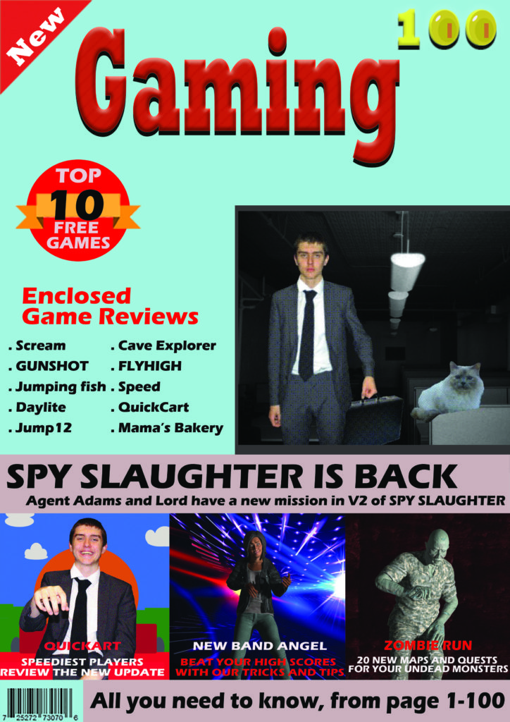
Add a block colour behind the game reviews to add another segment
Redo the main image, remove the cat and edit man differently
Change the cover line accordingly
Change the background colour to a darker colour, possibly light grey
Pixelate the bottom left character more
Add a price in top or bottom left corner
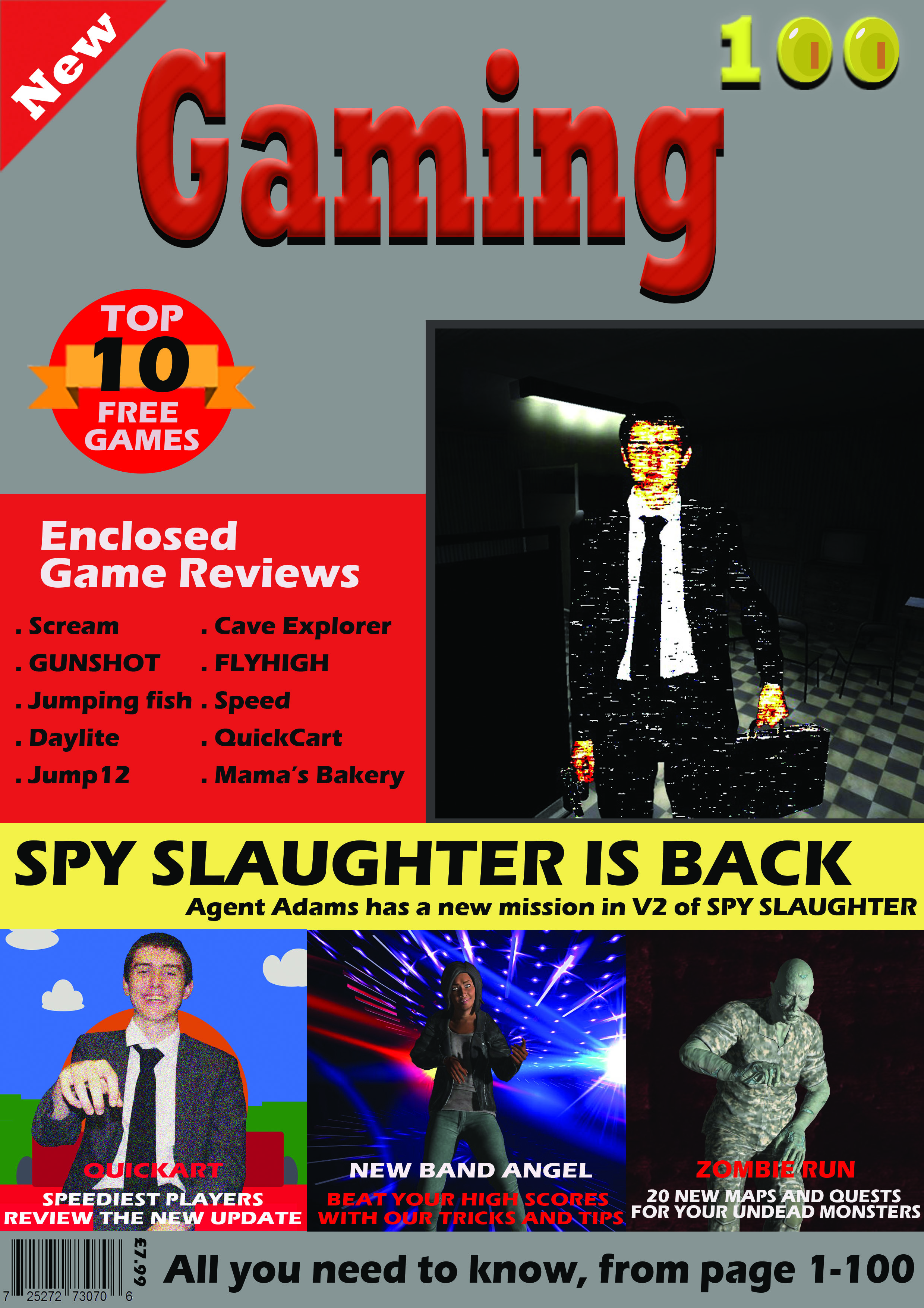
This was my cover for my first thought design, but then i decided to rearrange and add plugs on the top half to be closer to my style model
statement of intent:
I wanted my front cover to be appealing to young adults and adults with children, and before I started working on it properly knew that I intended to make the cover look sleek and professional. I edited the image on the cover thoroughly so that it would almost have a gritty and intense effect on whoever were to look at it; and made sure that readers would be immediately drawn in. The theme of “a Magazine for Gamers” is ideal in the sense that gaming is entertaining and a hobby which means that potential readers will already have an avert interest in this topic. I chose the name “Gamestarz” to subtly promote the idea that withing the digital world, you can make something of yourself and be a “star”. This notion would be appealing to young adults and teenagers. Also, the bright contrast between the black and white , and blue and red looks right at home with “pop culture” and furthermore brings more attention to the magazine as a whole brand. After looking at genuine and authentic games magazines I chose a clean and simple layout that would still be effect. Also, I decided to use a controversial question because not only is it a realistic piece of journalism but because it is relevant to the media society today.
media Magazine front cover coursework
Magazine style model
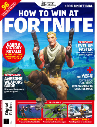
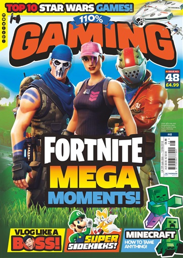
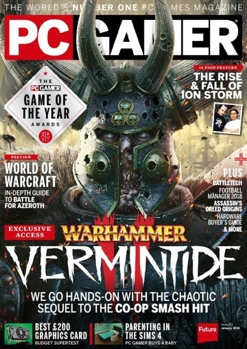
I have chosen to style my magazine cover similar to this Fortnite Magazine, as i liked the gallery display at the bottom of 3 different games, and will add this to my own design. I’m also going to include article plugs at the side with a red puff, as it it an effective way to reference multiple articles that will be in the magazine to interest the reader.
Magazine cover
Not finished.