Magazine nea front cover and statement of intent

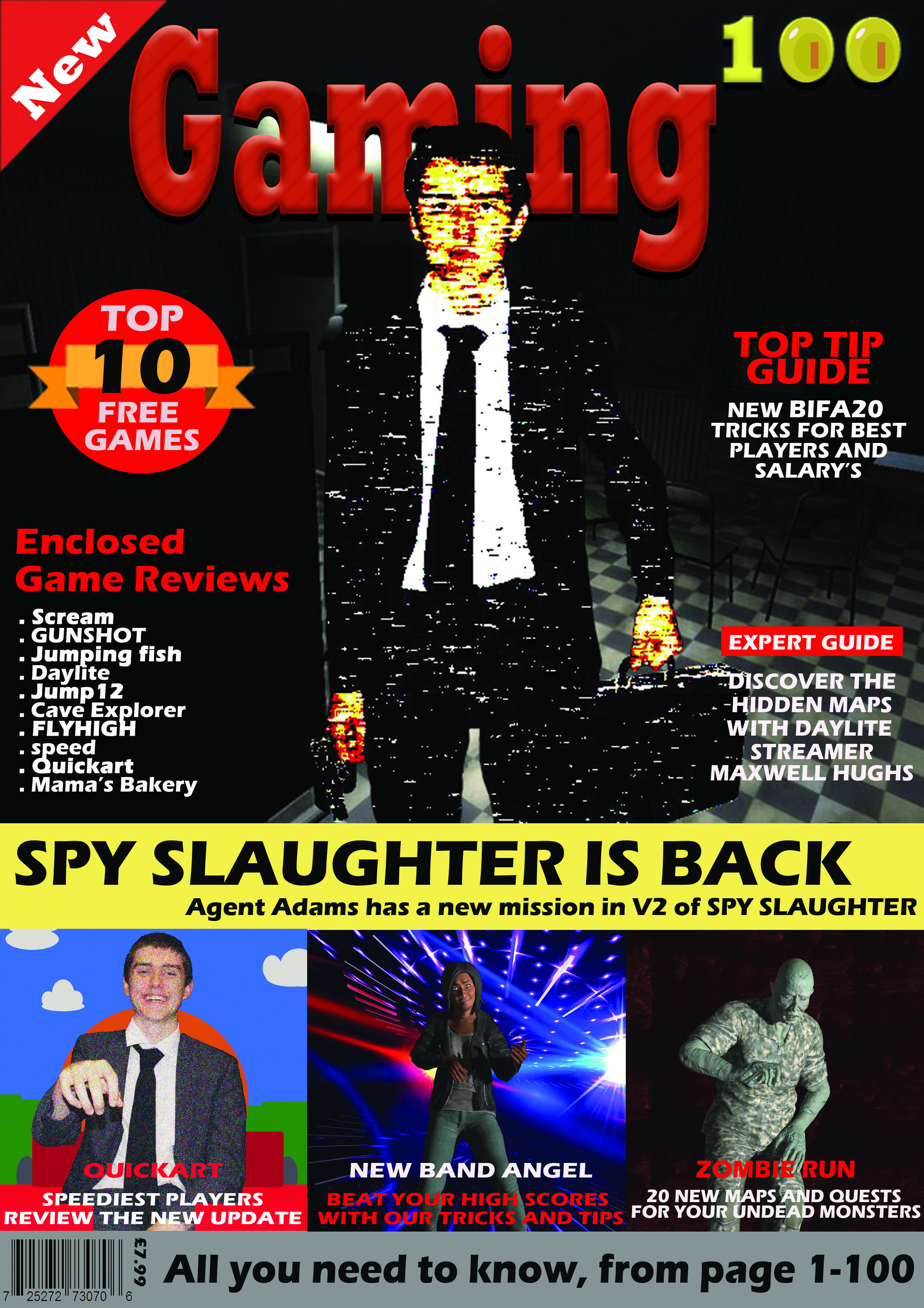
My magazine is named ‘GAMEIN’ this is an attempt at a play on words as it is a gaming magazine which is about all the inside information and insights into the gaming industry, GAMEIN sounds similar to the word gaming. My intended target audience is male teenage gamers in the age range 13-17 who are based in the United Kingdom. 

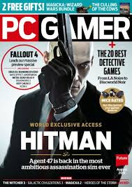
My style model for this magazine is the already existing magazine ‘PC GAMER’ and you will be able to see the conventions of it throughout my magazine. The main font used for text throughout the magazine will be Arial. My masthead will be in capital letters and in bold writing and a bold colour to ensure that it is eye-catching and stands out around other magazines.

There is a clear house style to my magazine, all the pages will be black with the masthead on the front cover being a lilac colour, this colour will be carried through the magazine and used for the copy and headlines. The colours red and yellow will be used for plugs throughout the magazine. I have used the colour black as the background / page colour for my magazine as black is associated with power, strength and rebellion, these connotations often relate to my intended target audience and will make them more attracted to the magazine. I have also used the colour red as it is intense and it connotes symbols of blood, danger and war which is what a lot of teenage boys in the age range 13-17 are interested in so it draws them into the magazine and makes them interested.  

All images, logos and copy is original, and I will create my magazine on adobe Photoshop. To create images for my magazine I will use adobe fuse to create life like cartoon characters to make them look as though they are actual characters from video games. I will also create 8-bit art to create vintage style games characters and icons. 

I will used Blumler and Katz uses and gratifications theory and will create my magazine to be informative and educational about the gaming world I also would like it to be entertaining. The main image is an iconic sign of a man in army style clothing. The code within the magazine will be through the use of colour. The codes will convey connotations of power, danger and violence. The magazine will be a reactionary text as it follows societies ideas of gaming and masculinity within it.                                   

NEA

Statement of intent – title

I wanted my magazine cover to appeal to young adults, who don’t feel like they fit in. I used more darker and sleek imagery on the title to appeal to a more mature audience as well as a sleeker colour scheme (red). Furthermore, I have created some game titles which are used to as an anchor to the text. On the cover, I have used a large amounts of the colour red, which is a bold colour, allowing it to be easily seen and noticed. Furthermore, for my plugs, I have allowed the reader’s attention to be caught easily. A particularly good example of this is the middle plug, “fact or fake? Game myths debunked”. This causes the reader to be curious of the contents of the magazine. This means that one of the social needs, Knowledge about the World, is sated by buying this magazine.

As well as this, I have used a brightly-coloured plug, with a green glow surrounding it. This means that the plug is immediately noticeable. This could also encourage the reader to buy the magazine if they are struggling with the fictional game ‘Biolight’.

Another factor I used for the cover is an image of myself. This may fill the first personal need – as I myself am nonbinary and present uniquely to the norm. This can leave a sense of belonging to many others who feel unrepresented in media. Furthermore, I have used myself as a model for a fictional character. In this context, a non-conforming person to society such as myself being a character in a video game and presented for the front cover can fit the personal need of understanding the self to those who are marginalized and see themselves represented. This, as a result can cause them to be more willing to buy the magazine as the cover is radical in nature which can cause the correct title audience to purchase it as they feel represented. This is further presented on the rightmost plug at the bottom of the magazine, discussing representation is video games, enticing the reader further. Having a radical cover instead of a reactionary cover ensures that groups that may not usually purchase magazines due to lack of representation in media may feel more inclined to buy mine.

This radical idea can be taken through many ways by the audience – for example, if we use reception theory, the dominant response would be to accept this representation, that gaming is for everyone. This audience is likely going to be the ones seeking representation. the negotiated response is likely to be a mixed response about the representation, for example, an acception of the representation, but a dislike for video games. This could be people who fit into the age range of the magazine but do not fall into this marginalized group or gamer group. The oppositional response would be a complete dislike of this representation, which could be from anyone, but is most likely to come from an older generation with more traditional beliefs. Furthermore, those who were raised under traditional beliefs may take a dislike towards the magazine.

Statement of Intent

I wanted to make a magazine that I would buy; this means my target audience is a 16-year-old male that is a casual gamer. Fulfilling the need of enjoyment and escapism under the Katz, Gurevitch and Haas theory using “the mainstreamer” psychographic description. To convey a modern stylised magazine, I used the rule of thirds to place my strapline, plugs and iconic sign. In my image, plugs and strapline I use cold colours to draw you into to the readers eyes primarily to the arm colours in the face, to create leading lines to the gun that points towards the reader, and the red background of the title. In the title I have used Sans Serif text to create a casual and informal aesthetic. I used this colour choice, of monochrome and red, as that is what my style model used for the title (PC Gamer). I carry this choice of font into the plugs and straplines in the magazine. I use a lexis of words “best” and “first look” to carry a modern and casual feel throughout the magazine as the target audience that it is intended for are for a casual, young audience. The placement of my plugs around the iconic sign, the image, is also based off of my style model (PC Gamer).­ The plugs on the bottom of the cover show what is inside the magazine without needing to open it to make it easier so they have a better idea of what they are buying. For the Jack Ryan text, below his iconic sign, I made it 3D in Photoshop, using the bevel feature, to make it stand out more to show important than the plugs around it and draw attention to it. Also, I used the grey colour for it and made it 3D to make it look similar to how they made it for the television series on Amazon Prime. The grey colour also makes the colour of the gun stand out more.


Representation

My magazine is reactionary as it supports the dominant ideology. One way it supports the dominant ideology is through a male being the violent gender holding a gun. Another way it supports the dominant ideology is how the iconic sign of Jack Ryan is not sexualised. It also supports it through strategic butt coverage since he has a long coat that covers it.


Audience Theory

George Gerbner’s theory was that if the source supports the dominant ideology over time they completely believe this ideology. My magazine supports the dominant ideology and helps to back up this idea so over time it will become the norm.

Statement of Intent AND MAGAZINE COVER

For my magazine cover I have decided to create a magazine aimed at young teenage boys preferably aged 11-13. My ideal consumer is that age, it’s a male who can speak English, is in a wealthy family and gets enough pocket money every week to have enough left to buy my magazine each week, he’s very interested in gaming and would like to get better, he has no siblings therefore has a lot of time to himself and can dedicate it to gaming and learning and gaining new gaming skills.

I decided to make the main colour theme of my magazine to be red and blue as they’re complementary colours and therefore the contrast makes my magazine stand out and catches the eye of the consumer. Blue is also the most popular favourite colour amongst young boys so I thought this would make them like the magazine even more.

I made my title bold and big and used a block-like font which was quite simple and easy to read because I wanted my magazine to be clear and easy to understand without the trouble of reading fancy fonts; however I did add texture to my title so that it did draw some attention. I used the basic words ‘ how to game’ because i wanted the magazine title to be straight to the point so that my young audience knows exactly whats within the magazine and doesn’t get bored by too many words on the front page.

I have made one big main image in the middle and I tried to make a child friendly character with yet again the popular blue colour so that the young boys would be interested in playing the game. The blue contrasts the red and makes the character stand out and I’ve left white spaces around it because I don’t want my magazine to be too crowded and I’ve got my layout inspiration from a PC gamer magazine.

Around the sides I have added stickers and interesting facts and information about the magazine. My magazine has hard lines around the boarder and I have overlapped my headings on them because I wanted to bring them forward so that my reader instantly spots them and their importance is emphasised. I have used descriptive words such as ‘deadly, exclusive, free and new’ so that the reader is more prone to buy my magazine because they feel as if they’re gaining rare and exciting things from reading my magazine. Also the word ‘new’ would make parents more likely to buy the magazine for their sons since they’ll feel like they’re getting their moneys worth. Lastly. I used pronouns so that my reader feels as if my magazine is directed towards them and so that they feel like they’re part of something and included when reading this magazine.

My inspiration magazines

Representation- My character follows dominant ideology and is reactionary because my main character is a male who is stereo typically the brave hero who saves the day.

Audience theory

Dominant- these are the people who agree with what my magazine is saying and they believe that gaming is fun. This would probably be younger males who enjoy gaming.

Op-positional- These are the people who completely disagree with my magazine and they think gaming sucks for example this could be adults or elderly people.

Negotiating- these are the people who are in the middle, they don’t think gaming is amazing but they also don’t hate it. This could be younger girls or boys who haven’t gamed before, these people are the people I’m trying to appeal to because they’re the ones who you want to persuade onto your side.

Magazine Cover + Statement of intent

Statement of intent

The target audience for my gaming magazines is aimed at teenagers, predominantly between age 13 and 16, interested in a range of different games. I chose the title ‘Gaming 100’ representing the 100 pages of my magazine, which allows this magazine to be inclusive to both boys and girls, with any genre of gaming interest.

My aim was to have a magazine that has something for all teenage gamer’s, and with that I chose an overall basic colour theme with black, white and red, but also included a soft yellow to add a brighter colour. I designed the ‘100’ of my masthead to have the two zeros as coins, similar to ones collected in various video games, to keep the design closely and clearly linked to gaming, and therefore recognisable to the reader. A sans-serif font was used to create an informal and relaxed look, suitable for a teen based magazine. I based the layout on a fortnite magazine cover I had found online, using the rule of thirds to help guide the reader around the cover, with a main image on the whole top half, but with the masthead slightly covered by the dominant signifier. However, the cover line is the most eye-catching as the bold black contrasts to the yellow background, whereas the masthead, supported by only half being clearly shown, fits into the background. Then on the bottom third, a gallery of 3 more images and captions to display some of the articles inside. I used extra puffs and plugs on the sides to include as much information about the pages found inside, to entice as many possible consumers.

I gave the magazine a reasonable price for a 100 page magazine, to be affordable and accessible to the younger teenage audience, who would mostly be middle class student, possibly with only a small pocket money allowance.

NEA Gaming Magazine Coursework

Statement of Intent –

For my gaming magazine I am going to prioritize the genre of retro gaming; supporting consoles such as Commodore 64, Nintendo 64 and NES (Nintendo Entertainment System). My magazine is predominantly aimed at a younger male audience around the age of 11 as the dominant ideology suggests they are more likely to be interested in war/ Sci-fi related games, they are also mainstreamers, this is because due to their age – they’re more likely to follow the ‘trend’ and what they think is ‘cool’.

The genre of my magazine is retro, and this will be represented as the magazine will include promotions of 8-bit characters acting as an indexical sign for the genre, interactive quizzes related to retro games characters/ retro games and a plug referring supporting a playlist containing tunes/ songs from popular retro games.  

The style of language that I will use is a mix of informal and formal because I want the magazine to seem professional and be factual in relation to its contents but I also want it to appeal to my target audience by using more colloquial language they would use in an everyday life so that they can relate to it and use the magazine as a form of escapism, interlinking with the uses and gratification theory.

In addition, I will also use the san-serif font – ‘Acumin Variable Concept’ – for my masthead as it is fairly blocky therefore portraying quite a retro effect. As well as this, I will also use a sans-serif font for the selling line as it emphasises its importance. This font style isn’t formal, therefore more eye-catching to a younger male audience.

When creating the actual foundations of the magazine cover, I am going to use the tabloid size which Photoshop generated. With a width of – 27.94 CM and a height of – 43.18 CM. I will use this size as the majority of gaming magazines released in the 80’s would have been a similar size – just below A4.

As well as this, I am also going to layout my plugs/ advertisements along the bottom of the page in order to make the overall magazine structured by using lines and columns to separate each one, similar to the style model I have chosen which adds depth to the magazine due to the depth of field caused by the lines and boxes between the plugs and the actual front cover. In order to increase the authenticity of the magazine, there will be a ‘New!’ sign in the top left to act as a signifier to show the intended viewer that this is the latest realised version of the magazine. In addition, the use of text throughout the plugs also acts as anchorage; supporting other similar games/ magazines.

Representation –

In some respects, my magazine cover can be veiwed as a radical text as modern games which are ‘popular’ today don’t tend to be retro or 8-bit style. The dominant signifier of the magazine – the 8-bit soldier character can be seen in camo trousers, holding a gun. Therefore, this magazine cover could also be portrayed as a reactionary text as the main genre – action/ thriller follows the dominant ideology of having a male lead who is carrying some sort of defence (the gun) not commonly associated with women.

As well as this, a dull/ dark colour scheme has been followed which therefore aims the magazine to a male audience due to the stereotype of males not commonly opting for bright or neon colours due to it’s link with femininity.

In addition, aother reason which supports this text being reactionary would be how covered or plain the main character is due to his gender. Whereas if the main character was female, the dominant ideology would be to have her clothes be slightly more revealing and her body to be slightly more emphasised in order to sexualise/ objectify her to appeal to the standard male audience.

Audience Theories –

Reception Theory – Stuart Hall – Suggests that media texts are encoded and decoded; the producer encodes messangs and/ or values into their media which is then decoded by the audience or viewer/s.

Cultivasion Theory – George Gerbner – This theory suggests that over time, exposure to media can cultivate/ change a veiwers attitude or opinion towards different subjects. Frequent television viewers are more likely to be ‘exposed’ to their perceptions of reality being changed (for better or worse) / become reflective of the most common messaged which are advertised.

Theory Of Preferred Reading – when the audience rejects the preferred reading, and creates their own meaning for the text – An oppositional View. Negotiated Reading – This is when a member of the audience partly agrees with part of the product.

Style Models –

My Magazine Cover –

STATEMENT of intent

To create my magazine cover, I first carried out research into different magazine covers to gain inspiration for my brief. From my research I discovered this example of a magazine front cover and subsequently decided to base my front cover of this style model.

Using the rule of thirds I constructed this rough plan for my cover.  I have replicated the general structure of the style model and incorporated it alongside my own ideas to create my front cover. I developed many of my original ideas after constructing this plan, including the inclusion of plugs at the base, a sticker on the top left corner, this has increased the strength of the piece in looking like a professional magazine cover.

My intentions of the magazine are to create a wide target audience, this magazine is not bound to a particular gender or age group and instead it is aimed at anyone with an interest in gaming or the world of gaming. I have included a particular selection of articles on the front cover with the aims of appealing to a varied audience and trying to broaden the market of this magazine to encourage different interests and buyers of the magazine. These ideas are reflected through the use of the headings on the front cover. The inclusion of varied headings such as; a mixture of board gaming articles and digital gaming articles, tips and advice that might appeal to serious or armature gamers. Interviews with programmers which gamers or those with an interest in that particular field or career may find appealing. Competitions to actively involve buyers of this magazine, and luxury prizes to encourage more people to purchase the magazine.

The title of my new magazine for gamers is ‘Game On’. I have named it this because it has alternative interpretations; the Gamer colloquium for ‘the game has started’ as well as the continuation and future of gaming. It is the colour red because of it is semantically symbolic and associated with fire, energy, danger/hate, as well as passion/love, typical themes associated with gaming.

The background colour is white, often associated with new things, (digital games) or with tradition (board games). As the background is plain it can represent the start of a game, an empty board or new level.

For all text, excluding the title, I have used the same font and colour. However, I have varied the size, positioning of the text and put certain words in bold, (aiming to draw the focus to the key words) and done so in no particular order or structure, only with the explicit aims to make it varied and entertaining, such as gaming itself. I have used all black text to stand out from the white background, this has the connotation between good and bad, which is heavily associated with either board or digital games (as this magazine addition is equally focuses on both.)

Magazine Cover

Statement of Intent:

My working title is Macro Gamer and my target audience is primarily men aged between 16 to 25, which is why the colour pallet is mainly white with dark reds, browns and blacks. This is more of a horror gaming magazine as there are dark images which is more R rated then generic magazines. This portrays the paradigm of scary things meaning the magazine is not for younger readers. However my magazine also applies to other people such as women due to having a woman as one of the main characters on the front cover. The audience conforms to the emergent service workers due to being very young but high levels of cultural capital. Also, my target audience are part of the Explorers in Rubicam’s 4 C’s due to many games being covered in my magazine being a challenge. My magazine will cover reviews, exclusive interviews and a couple new emerging games. My cover is easy for people who are not fully cultured in the game industry due to using more informal language. Although my magazine reinforces the stereotype of the younger white male, it also challenges the dominant ideology of only men being interested in horror and more masculine magazines, with a female character on the cover as the dominant signifier.

Style Models: