
Gaming Magazine front cover
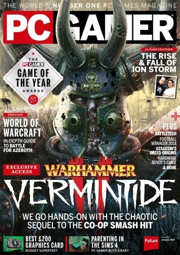
Style Model
Statement of Intent:
I planned to create a gaming magazine with a main image on the front cover from a game character. For this I used an image I took of my classmate and edited it using the motion blur, posterize, levels and multiply effects to make it look like a game character. Since this character represents a thriller/horror type game, I chose an image conveying mystery or despair with the character staring straight at the viewer. I also chose this because I wanted to use a screenshot like the style model to make the magazine look more impactful.
I added extra hooks on the sides and bottom of the magazine. The purpose of these is to entice the buyer and inform them quickly about what content is included in the magazine. I made put them in black boxes to make the text easy to read compared to if they were simply placed above the background image. I included to hook of reviews of the newest games from popular franchises to make the magazine appeal to a large audience, as both casual and hardcore gamers would know about popular franchises and should be interested about buying the magazine if reviews and articles about games in those franchises are featured. In addition, I included news from a gaming convention “E3”, A guide for the popular game Fortnite and links to two stories about gaming at the bottom of the magazine cover.
My magazine features the strapline/tagline “Reviews – Gameplay – News”. I chose this tagline as it is easy to remember so will stick in customers heads, and also it describes what is featured in every issue of New World Gaming.
For the title of my main game (the title anchored to the main image) I used emboss and satin effects to make it look like a title of a thriller/horror/mystery game. The satin affect adds a fracture-like feature in the text which I believe adds a horror element to the title and makes it look visually appealing to a potential customer.
My masthead features the title of the magazine “New World Gaming” which has connotations of exploration and discovery, and this links to what my magazine does, which is to explore all sorts of new games and tell the reader about them. The masthead has a branding of Embossed red text on a white background with a red border around it. This makes the masthead recognizable as it stands out among the rest of the magazine cover’s features. This also makes customers associate my magazine with these colours.