Statement of intent
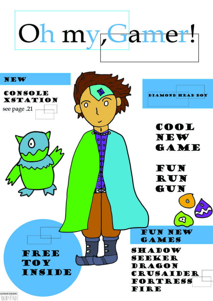
The title of my gaming magazine cover is Oh my, Gamer! the inspiration for my title was when I heard my colleagues struggling to come up with a title And I heard one of them exclaim “oh my God” so I thought I would set this as my title but with gaming relevance.
My audience is targeted for boys around the age of 4-6 as I put docile but bold format for my magazine as I made it so it would be understandable for the younger target audience as if the magazine had to complex writing the audience I was targeting wouldn’t want to ask their family but I did add the whole free toy for if the magazine were to be real the toy is the part of the magazine the kids want.
For my niche interest content, I made my game names related to genre’s like fantasy, battle, exploration these are types of games that will appeal to the younger generation as it has “cool” factor especially for names like for example Fortress Fire and the whole idea is the targeted audience even though young are able to comprehend that the game is attractive, “cool”.
My magazine is a viable magazine title because it is attractive and stands out and seems musical in a sense when you read it so it can get stuck in your head this is especially important since I have a young target audience so at their type of age they won’t remember a lot unless its key, rememberable information, for example, most young kid who asks to go to places like McDonald’s because they know that this means chips and chicken nuggets so if my title is rememberable enough the kids will want to buy the magazine when they spot it in a shop.
The proposed use of Language style for my audience is very simple and informal due to their age if they had to read very complex and formal writing my audience wouldn’t be able to understand and wouldn’t be attracted to the magazine and wouldn’t ask their parents to buy it.
My proposed use of representation form for the audience is a Pcgamer magazine but for a younger audience around the ages of 4-6 and I made a more docile version with white and blue with cartoonish character that I drew in photoshop but I kept some similarities with the original PCgamer like putting the main character in the middle of the magazine but there still the contrast to make it different as I mentioned before where I did white and blue when they normally do red and black.
Where I get my content from is just random ideas from my head but are influenced by thing like books and shows that I watch and since I had a cartoon rich childhood it affects how the characters look and are drawn as well I have played a good amount of videogames in my past which will also play a part on my content ideas.
