style model

The target audience for my magazine is targeted at 13-15 years old’s who have a strong interest in gaming. They would also be in education and wouldn’t work but the parents would be middle class. The point of my magazine is to provide escapism and enjoyment for its readers, the goal is for them to want read and learn more about here favorite games.
I researched into what gaming covers look like, what games are enjoyed and the most popular types. I used a gaming cover to base my cover from by being inspired by there layout and how they had presented it to give it an overall fun look.
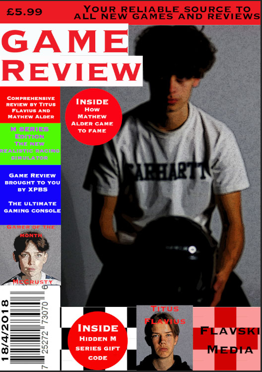
I decided to do my magazine on reviewing the most popular gaming icons and rating them, this would be done by a made up YouTube star. This would be a reactionary sign due to it being very common for male video gamers to bring out magazines. I used many popular gaming icons which I made on 8 bit art which captures an. audience due to there popularity. I used a black background to make the characters stand out against the dark background. I used a plugs to show the context and to make it more appealing.
Overall i think i did a good job at creating a interesting magazine cover which attracts attention and serves the purpose of providing people with the choice to escape reality.
Representation My magazine cover follows dominate ideology (reactionary) because the reviewer of the games is a male which is common for gaming magazines. My front cover is also mainly about popular game characters which is again common game idea and often used, this makes it an iconic sign as it is so recognizable.
Audience theory My audience would interpret my magazine as dominant reading as there interested in gaming, other people may view it as oppositional or negotiated but the people how buy it will enjoy gaming so they will like it.

Working Title= “High Score”
Target Audience= My magazine is targeted for girls between 13-20 years old for all levels of gaming. I chose to focus this magazine for girls because most gaming magazines are stereotypically aimed at boys and I wanted a magazine just based on girls. I chose this age range because it is quite a big scale from early teenagers to going into early adults so more people can buy it and the content can be more widespread.
Niche Interest context= My intention for this magazine was to not only to focus it on girls but to have a widespread of gaming content such as competitions and exclusive interviews for example. I put a girl playing a video game as my main image on my front cover to make her the main focus of the magazine, by doing this is allows the readers (girls) to feel more included in this type of media. I used colours such as pink to draw girls in and used black and white to make the text stand out.
Why is this a variable magazine title?= This is my title because it symbolizes that by reading this magazine it will guarantee the readers to achieve the best score and results. It gives the readers confidence by reading the title that they can do this. I made the master head big and bold by using a standing out text and using the colours black and white.
Proposed use of language= My front cover and my magazine will include informal language and codes to support the age group of 13-20 years old. By doing this it matches the generation and the readers can relate more to the text. But I will include some formal language to make it look more professional.
Proposed representation form for the audience= I aim to present my magazine to girls aged 13-20 years old. This magazine is for all classes and races so there is no stereotype for girls who can buy it, upper or lower class, it doesn’t matter. I made it for all girls to brauch out the interest of it because it is stereotypically for boys but by having a girls gaming magazine it allows girls to feel more excepted.
Where will I get my content from?= I know quite a few girls who like to game, so I can take photos of them for my magazine just like the girl on the front of my magazine. By doing this it gives the readers examples of people who like to game. All my content I include will be original and all my own.
Media Statement of Intent
To start creating my media front cover, I researched some magazine where I could get inspiration from and get an idea for my own front cover. I managed to gather a couple magazine front covers, and I choose one to use as an interpretation, which is this one shown here.
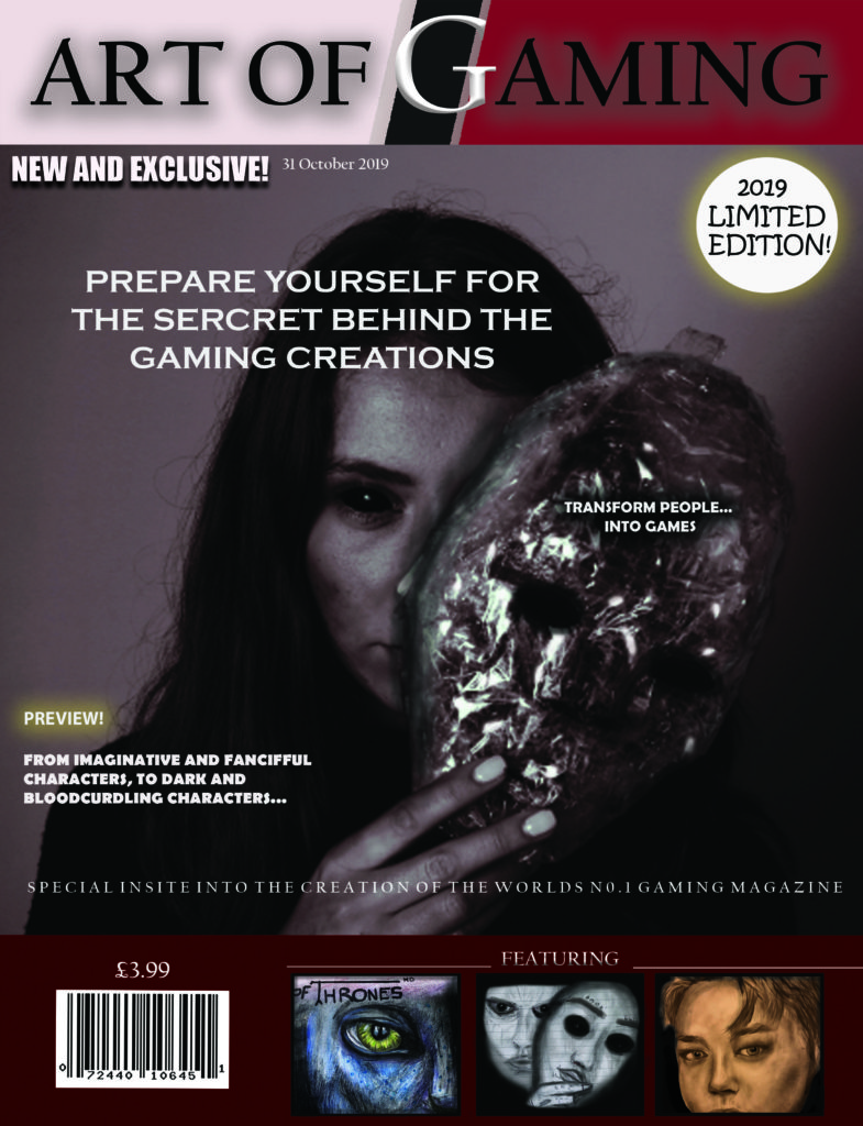
I have called it art of gaming as my magazine front cover is about the creation of gaming, which shows behind the scenes of how to create gaming characters. It is based around the theme horror, so, I would say my audience is mainly for people who like horror and scary gaming magazines.
Firstly, I gathered some of my drawings I used from my previous magazine cover, so I could add them into this current one. I made sure I had at least four images for my front cover.
To start with, I opened up Photoshop and started creating my title and masthead. I used the colours red and black as I feel that these colour create a dark, cold and eerie atmosphere, as the colour black is associated with power, fear and mystery. It can also be associated with authority, I have chosen this colour as I feel that my magazine front cover could have authority over other magazine covers that are seen as competitors. As the colour red is associated with fire, blood and strength, I feel that it’s a good colour theme to use for this specific gaming magazine cover, as it is based around the theme horror.
Next, I added my background photo, which is the girl holding the mask. I have chosen to do this as I feel like it brings attention to my cover, is it looks quite sinister and spooky.to make it more sinister looking, I photoshoped the face, by simply adding contour to darken areas of the face. I also photoshopped the eyes black, as it thought it finished the look. From my research, I saw I magazine cover which really intrigued me, so it inspired me to add a mask in with the photoshoot. (I made this mask using cling film and cello tape.( This item made my front cover stand out more as it looks creepy and gives more of sinister atmosphere.
At the bottom of my front cover, I added in plugs, to show what was inside the magazine. I set out three images, which I have hand drawn myself. I decided to hand draw these, as I feel it gives my creation and imagination to the whole aspect of the front cover. Furthermore, as my magazine is about the art of gaming, I feel like drawing my images was a good idea. I have drawn two menacing pictures, which will be showing how to create scaring characters from drawings, and the other image of a person, which will be showing how to create gaming characters from drawing people. Before putting these photos on to my magazine, I edited them in Photoshop to make them more eye catching and outstanding. For example, for the middle image in the plug section, I added more tints of black, and contoured around the drawing similar to how I edited my main image.
I have added some text, for example, “new and exclusive”. I have added this to intrigue customers into buying my magazine as it is one of my selling lines. Another selling line I have added is “limited edition”. This is a good idea to put into my cover as it shows that it’s a special magazine.
The reason I have chosen the price to be £3.99, is because that is the average selling price of a magazine. Also, I didn’t want it to be too expensive as I didn’t want people not to afford it. Furthermore, my audience isn’t specifically for young children, due to the sinister and menacing games theme, so there’s I didn’t want to lower the price, as my target audience is for older people who like horror, and they are more likely to afford it then a child.
REPRESENTATION: I would say that my front cover is radical and reactionary. Firstly, i think its radical as i believe that it is a unique gaming magazine, as it doesn’t advertise actual games, it focuses on the art of games, and how they are made. So, people are intrigues by the concept of not actually being games, but the actual art and creativity within it. On the other hand i think its reactionary because it supports the dominant ideology of the theme horror, due to the creepy features I have involved, such as the mask. In my opinion, I think that girls are always seen as the dominant figure in horror movies, however, in horror games, i feel that males are the dominant figures. So when people realize its a horror gamers front cover magazine, it turns from reactionary to radical.
AUDIENCE THEORY: George Gerbner theory of cultivation says that “Cultivation theory suggests that repeated exposure to television over time can subtly ‘cultivates’ viewers’ perceptions of reality.” In my magazine cover, i feel that my message to society/customers/people is that games have a very creative world of art, and that it need to be appreciated more.
following the concept of art of gaming, I believe that my intended message, which is that people need to perceive and value gaming more as art and creativity, not just playing a game for entertaining, i feel that my dominant audience would be mainly people who has an interest in art and people who have a very creative personality.
Statement of Intent
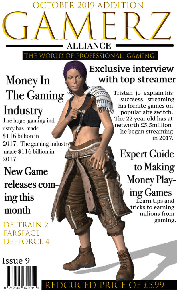
For my magazine I decided to title it “Gamerz Alliance’ as I wanted it to be catchy. I thought this would appeal to my target audience of males between 28-30 and new affluent workers, who have a keen intrest in gaming and the world of professional gaming industrys. I used a games charater I designed in fuse as the dominate signifier to represent the theme of my games magazine. I wrote the price of the magazine along the bottom as a plug and as ancorage to my magazine. I chose to size my magazine at a width 11cm and a height of 17cm, I decided this as it would fit well into someones bag and would be a big enought size to read comfortably. I chose the gold font as it stands out and aims to my target audience of more sophisticated professional gamers, aswell as giving the magazine a sleek professional look and I chose to put it all into captial letter to draw attention to it. When coming up with the design and target market I research popular gaming magazines on market and was inspired by the use of Signifiers in the magazines to make it clear waht its about and whated to do this with having bold headlines.
I wanted to make the font really bold to stand out to attract my target customers and give some instate on whats inside the magazine. I chose to have my headlines all around the character in order to keep the magazine simple but also effective with the character adding colour into magazine and being the dominate signifier. As i am aiming my magazine as more of a professional magazine to experienced games i decided to price it at £5.99 after reasearching what some of the more professional gamers magazines are priced at i decided to go with a average price. I also promoted it as a reduced price inorder to attract more customers. I also used plugs with my headings and decided to use topic headlines that would attract my target audience of more porfessional gamers and therefore spoke about the business side of media.