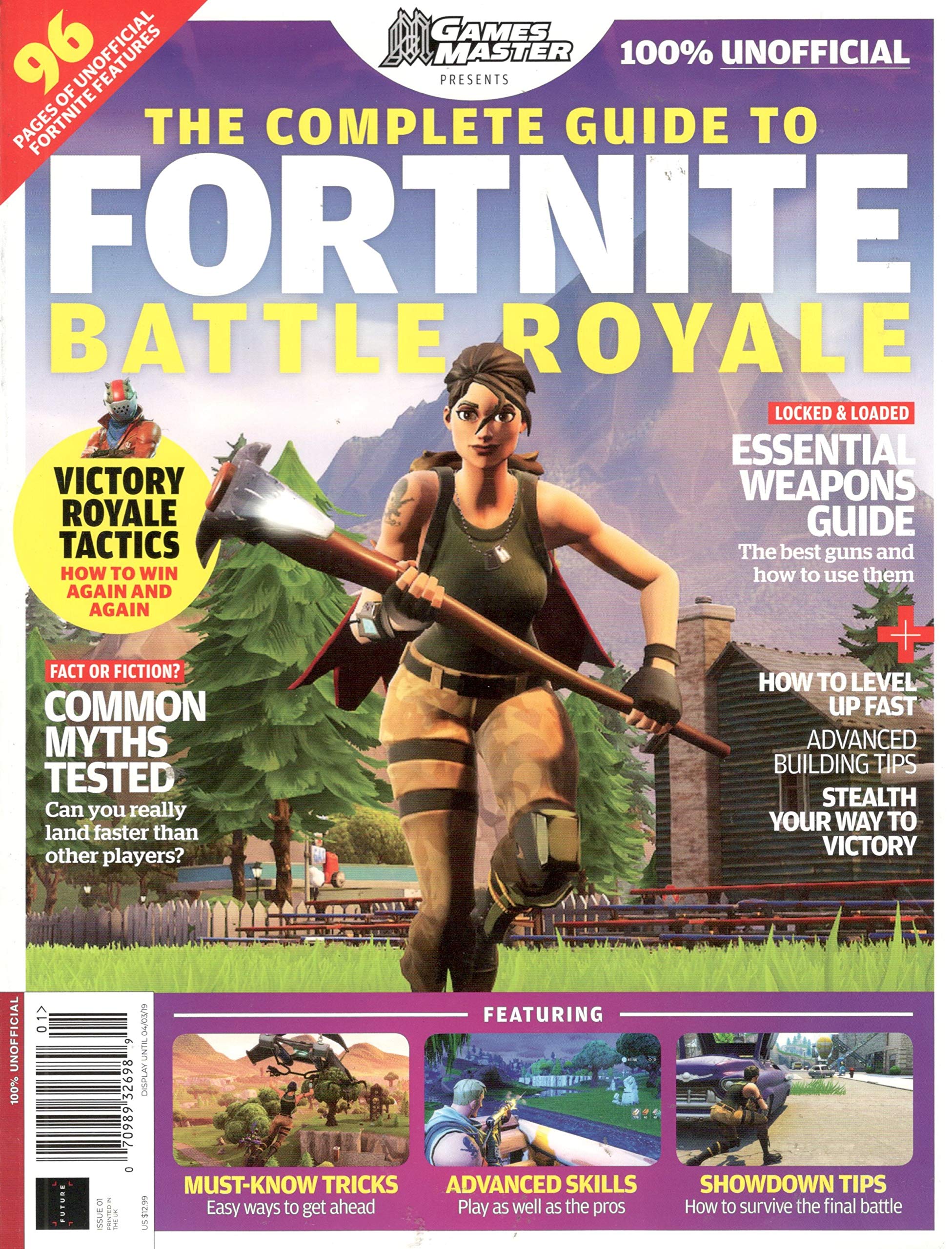
I have styled my magazine similarly to this Fortnite Magazine, in the sense that I liked to idea of the gallery at the bottom, therefore I have added in into my own designed magazine cover. What I have also taken from this style model is having the article plugs at the side, I have done this on my magazine because it looks effective and I also think it is clear and the reader’s attracted to the cover image, which will be one of the main selling points to entice consumers to buy my magazine.

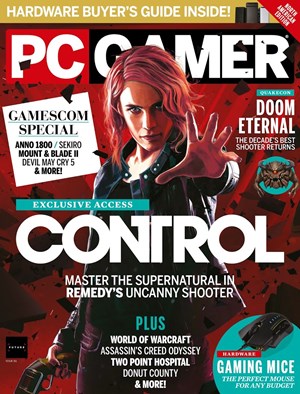
I have also designed my magazine similarly to this PC Gamer magazine cover. What I have taken from this magazine is how I stuck with a colour theme, pink, purple and mint to stand out. What I have also done similarly to this magazine is I included a banner that acts as a plug to entice my target audience to buy my magazine. I also have my cover image overlaying part of my masthead, because I think this is effective and attracts you to pick up the magazine. Finally, like the PC Gamer cover, my cover image is looking and pointing directly to the consumer as I feel this brings their attention to the magazine and it seems as if the magazine is trying to give them a message (to buy the magazine).
