How is gender represented in magazines and game covers?

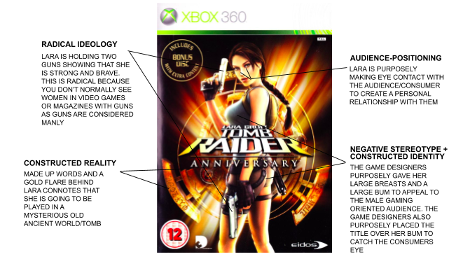
I have closely studied the front page and the double page spread of the Men’s Health magazine, I have also closely looked at the front cover and back cover of Tomb Raider. In my essay I will be speaking about the constructed identity of both front cover images in Men’s Health where it is Vin Diesel and in Tomb raider which is Lara Croft. I will counter this issue by explaining the use of graphic features in both photos where in Lara Croft’s case which is her breasts and buttocks and why the designers decided to do this, in Men’s Health the misconception of what a man should look like which is clearly stated on the double page spread where in has a little text next to a photo of him saying ‘Diesel’s slant is one to aspire to’. I will also be justifying how Gender is represented, this will allow me to link into How Lara Croft is Radical as she is challenging the dominant ideology of society and how they interpret Gender stereotypes. Also, how Men’s Health portrays Van Diesel as being the ultimate man and what all men should aspire to be could also be Radical as Men’s Health is trying to make society believe this is what a man should be where n reality it is not the case.

Constructed identity is shown in both articles, this is because both images are what the editors or designers wanted on their front covers, In Men’s Health the editor wanted Van Diesel as a representation of what all men in society should look like; in Tomb Raider Lara Croft is designed in a way to attract the male audience in society so that people play their game. Firstly Men’s Health use of constructed identity is not only used in the front cover but also in the double page spread, this has been utilised by the editors of the magazine to challenge audience theories, for example on the double page spread it has Phillip Howells who is a man at his age who Is very fit however by his appearance he looks like any other ordinary man, now Phillip Howells constructed identity is used strategically as he links into Van Diesel; society’s audience theory will convey that if they can aspire to be like Howells which is a lot more reasonable than looking Like Van diesel with sufficient training they to can one day be as fit as Howells but as physically strong as Van Diesel. The use of Howells constructed identity allows it to be radical as the magazine is challenging the every day mans belief of what their body can look like. Whereas with Lara Croft her constructed identity is strategically used to attract a male audience which mostly plays video games to play their game. By Lara Croft being radical in the way she challenges society’s beliefs/stereotypes in that there should only be male protagonists in games as they are stronger and more dominant the editors of the game designed he in a way that he graphic features are used as a tool to pull these males from society to play their game.

Linking into the previous paragraph I will be justifying how gender is represented in both articles. To begin with I believe Lara Croft is Radical as she was brought into a generation that was heavily dominated by male protagonists and the stereotype of how men were more powerful and how women were inferior and the impact she had on being one of the first female protagonists really challenged society’s views on how they portray their male and female stereotypes. On the front cover of Tomb Raiders game Lara croft has a yellow light behind her which also looks like an aura, this yellow aura can be portrayed as powerful this is because the colour yellow is reassembled to energy and energy brings power, she also shows power in the way her body is postured and how she is standing upright. However Lara Croft can also be portrayed as Reactionary I was shown this by the article on Tomb Raider and the creation of Lara Croft, this is because the creator Toby Gard originally intended ‘to make the character male which resembled Indiana Jones however due to law suits Lara Croft was Made’. The way in which Lara Croft is Positioned in the front cover; showing he behind and enhanced graphic features, females are portrayed in this way to draw in ‘straight Christian Males’.

Similarly, to Tomb Raider Men’s Health also use certain colours in their article to portray a belief, for example the Men’s Health article uses blue and black, these colours are linked into men as they are portrayed as manly colours by being dark and bold. Gender is represented in Men’s Health as Vin diesel is a dominant signifier and what a man should aspire to be this therefore challenges audience theories and makes them want to train, then on the contents page and front cover page the dominant signifier is supported by an anchorage which is a skinny male to change societies males in particular ways to portray fitness. This skinny male is surrounded by Van Diesel the dominant signifier as a way to convey to the audience that with the right training you to can look like Van Diesel this is shown on the article as it says ‘New Year Muscle (build a six pack for life)’.

In conclusion gender is represented in Men’s Health and Tomb Raider through being radical as they both challenge society’s views in Lara Crofts case in that how she is a protagonist and that she resembles power and she is challenging the dominant ideologies stereotypes in what a protagonist should look like, where as with Men’s Health Vin Diesel is used to challenge a males belief on what they should aspire to look like and how they will aspire to look like that. Also how constructed identity is used in both articles to attract audiences in Lara Crofts case her enhanced graphic features which are used to attract straight Christian males, also in Men’s Health how Vin diesel is used as a dominant signifier and is portrayed as what a man should aspire to be. Finally, I believe gender is represented in magazines and games covers to challenge society’s beliefs.

Gender representation essay

Both Tomb Raider and Men’s Health Magazine use over sexualised examples of people to present their products and target specific audiences. The dominant signifiers in theses texts are misrepresented because they imply that the way they appear is what everyone should expect in real life. These signifiers can be interpreted as counter types, negative and positive stereotypes for many different reasons.

To begin with, I believe that Men’s Health Magazine front cover has a fully negative representation of men and does not create a safe, nor realistic symbol for men to copy and aspire to look like. With phrases such as ‘Lose 8KG fast’ , ‘Blast Body Fat’ and ‘New year muscle’ Men’s Health have created a paradigm all emphasising the idea that men should lose weight and gain muscle to look ‘perfect’ and supporting the dominant ideologies of the male appearance. The use of Vin Diesel as the dominant signifier increases the chances of men striving to reach these body goals as he is well known, rich and famous, creating more and more goals that are unhealthy to strive towards.

 In comparison to Men’s Health, certain features of Laura Croft on the front cover of the 1996 game were stereotypically male such as her independence, strength and gun. These features impower Croft and turn her into a counter type for how women were presented in the late 90’s. However, more similarly to Men’s Health, Laura Croft is very sexualised and stereotypical of female video game characters. During this time period almost all female video game characters wore little clothing, whereas male video game characters wore amour often covering their bodies had to toe. Laura Croft definitely fit the trend for this time and this was a very negative representation of women. This means Laura Croft both challenges and supports the dominant ideologies of gender and her character both positively and negatively represents women in these times. Therefore, Laura Croft is reactionary and radical.

Another difference between the two texts would be that Laura Croft is a made up character whereas Vin Diesel is a real person. This shows that the connotations of Croft in relation to female appearance is more unrealistic and therefore more harmful. Both representations of their respective gender are bad for society and make men and women feel insufficient. However, Vin Diesel’s appearance is realistically achievable with a lot of work but Croft’s could be considered fully unrealistic as she isn’t real her self so no matter how much work any woman puts in they will never achieve the goal they want to achieve and therefore always feel inadequate. So, Laura croft being a character potentially makes her a more negative example of dominant ideologies surrounding gender.

On the other hand, a similarity between the two texts would be with Croft and ‘The Marathon Man’. These dominant signifiers both act as counter types to their respective genders. The ‘Marathon Man’ challenges the ideology that men should strive to stay and act young by using a 69 year old man as the subject. Howells also does not necessarily have large muscles or appear to have a six pack so he also impacts the dominant ideologies of male appearance. Laura Croft’s male stereotypical attributes (talked about before) are juxtaposed with her overly sexualised appearance, causing the effect off her being a countertype to be emphasised which overall has a positive effect on the viewer.

Rule of thirds is used in the cover of the Laura Croft game to position her and the text so that the over sexualised parts of her are still fully visible. This is simply a design technique used to emphasise the negative parts of her character in relation to the representation of women. Also, the colour choice of gold behind Croft connotes money and wealth which add to the list of goals people shouldn’t be prioritising and especially expecting to be the ‘norm’. Whereas, Men’s Health uses different techniques such as plugs and adverts to emphasise the dominant ideology surrounding men’s fitness and body appearance. However, it also uses colour expect it is to represent gender stereotypes as the main colour schemes of all three pages is blue.

In conclusion, both of these texts have negative and positive aspects with relation to gender. Laura Croft is a powerful and independent woman, but she is very over sexualised and unrealistic. Men’s Health over sexualise Vin Diesel and encourage weight loss, however they do encourage fitness among older people and present a positive body image. Overall I believe these aspects all cancel each other out making Laura Croft and Men’s Health both reactionary and radical texts with their representations of gender.

Essay

The cover of Tomb raider and Mens health have many similarities and differences, especially when it comes to the representation of gender. Tomb raider has a dominant signifier that is a woman and Mens Health being a man. But is this reactionary or radical for these covers? And does it support or go against the dominant ideology of how these genders are presented.

The way Mens Health is presented is radical as it is what you would expect to be on the cover of a Mens Health magazine. This begins with the dominant signifier being a healthy, fit looking male which is what you would expect to be on the front cover of a Mens Health magazine. Another way in which Mens Health is radical is the colour blue being a main theme. Many of the drop caps, paragraphs and headings are different shades of blue. This is radical for a mens magazine as it is the stereotypical colour that society associates with men. 

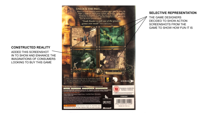
Tomb raider is both reactionary and radical. The way Lara Croft is presented on the front cover is reactionary as you normally wouldn’t expect a female to be on the cover of a game that has a majority of male consumers. However, the dramatic scenes Lara Croft is shown in on the back cover would be radical for the genre of a typical action game. This could be the images of her fighting a dinosaur or the image of her using a rope to run across a wall which is what you would expect to see in an action game.

The way the man looks on the front cover sends a message to the consumers about gender. This message is that in order to be a healthier man you must have bigger muscles and a generally fitter appearance. When I’m reality the dominant signifiers arms have probably been photoshopped to appear bigger so it gives the consumer a false hope of thinking they would be able to look like that after buying and reading the magazine. There is a Lexical field of words that have connotations to wanting to be or look like the man on the front, such as: “blast, muscle, arms stronger, body fat, double your metabolism”. These words are used to associate to the health theme of the magazine. 

Both Mens Health and Tomb raider contribute to the negative stereotypes of gender. For Mens Health this is shown by them promoting the idea of having an ideal body type, to look bigger and stronger and that if you do so you will be a better man. In Tomb raider this is shown by Lara Crofts over sexualised body to please typical straight men who will play the game. This is a negative stereotype of woman bile cause it suggests that woman are objectified and should look a certain way that is unrealistic. 

Gender in tomb raider is reactionary as you wouldn’t expect a female to be the protagonist in an action genre. However this attracts the typical male audience as they are interested in females plus the action game.

The dominant signifier of Lara croft and her gender is sexualised. This is mostly shown in the way she is standing on the front cover where she is positioned sideways to expose all of her body that the ideal consumer would be attracted to. The fact that these parts of her body are emphasised sexualises her. I’m terms of gender the way Lara Croft is sexualised in this way supports the dominant ideology of women in video games that is wearing unnecessarily revealing clothes that again expose her body to the audience. This is the complete opposite to men in video games who always have a covered body for example gun belts and capes the cover their behind. There are myths over why this may be such as only boys play video games so if you’re going to show a woman you should make her unrealistically physical attractive so she is more appealing to the boys. 

TOMB RAIDER VS MENS HEALTH

When placing Tomb Raider, a video game and Men’s Health, a magazine, against each other, you can tell that these two pieces of text are very much different from each other due to the codes and conventions we associate them both with when identifying what a product is. What makes these two texts especially different from each other are the representations of gender stereotypes. Men’s Health is a reactionary piece due to it having on the front cover Vin Diesel, a man who is meant radiate masculinity and have the ideal male anatomy in today’s society compared to Tomb Raider who yes, does have the big boobs and big butt which in today’s society, does expect and like but is also a character who is a female excursionist that fights multiple monsters and dinosaurs and goes on adventures raiding multiple tombs, caves and forests etc making Tomb Raider a radical piece.

Lara Croft blew up gaming culture in 1996 with the first instalment of Tomb Raider. But for some reason, her character has been so predominantly defined by her sex appeal that two decades on, we’re still trying to start conversations about her breasts and arse creating a negative stereotype towards women as the game then sets expectations on how women should look then misrepresenting them, even though, Lara crofts body is so artificial that it would be impossible to recreate in real life, hence why it would be such a negative stereotype. Although ironically, Lara’s sex appeal is also what made her one of gaming’s most groundbreaking characters. If she’d been less “sexy”, she arguably couldn’t have gotten away with being the lead of a video game franchise — and that was huge. Aside from 1981’s Ms. Pac-Man and a twist ending of Nintendo’s 1986 game Metroid that revealed the lead character to have been a woman all along, major game franchises basically didn’t have playable female characters as their leads at that point in the medium’s history. So Lara was, in at least one sense, an extraordinary example of female empowerment. It was rare enough that she helmed a franchise in which players can only play as a woman — but that franchise was also a worldwide bestselling cultural phenomenon. 

One of the most characteristic features of Men’s Health is the reiterated exposure of the male anatomy, since it is openly exposed to the readers from front page in order to be observed, admired, and consumed. This way, the body is treated in multiple ways, suggesting different male identities which present two main aspects in common; the cult of the athletic body in one hand and the acquisition of certain products to improve its appearance in the other hand. Taking this into account, the ways in which maleness is represented in MH are explained next through the metaphor of the bodies, due to the importance given to the male anatomy in the publication. Given what has been mentioned before, it is not strange that most experts in the field highlight the connection between the concepts of masculinity depicted in the magazines and the construction of men as consumers. Thus, it could be said that the renewals concerning what is understood as manly are subject to the constant changes taking place not only within fashion industry, but also within the whole market. In this sense, it is essential to note that, as a concept, the term masculinity is not fixed nor natural, but rather socially constructed, multiple, and, consequently, different depending on the culture, time and place. Therefore, from this point of view, the formulations and reformulations of maleness through time respond to a strategy to attract men as new purchasers. This new conception of men as consumers developed during the first half of the 20th century in the United States, where the roots of the current male lifestyle magazines are traced.

This all connects to David Gauntlett’s theories of identity. Gauntlett talks about how identity isn’t fixed and how it is more fluid in some ways. Because mass media today is so focused on being healthy, being slim and fit and being stable, a part of society may feel that these ideals that the magazines are proposing aren’t correct and are in fact, very wrong in some cases leading the people in this part of the society to feel that they should go against these norms and desires that mass media promotes. this leads people on a route of self expression which, most of the time, is very good because it helps others get to know themselves and helps them learn and know what and who they’re comfortable with. But, in very rare cases, some people who disagree with what mass media produces and promotes can take things in such a wrong way that it leads them to let out their anger and disagreement in violent ways, some even turn into extremists. This leaves me with the question, should we filter what we place in and on products of mass media? Would it get rid of these extreme views? Would society become almost robot like due to filtering specific articles out? There are many questions to go with “should we filter what we place in and on products on mass media” which I find great as it causes a discussion and really makes people think. Personally, I don’t feel like we should filter out specific articles as it would prevent people from finding and experimenting with their identity. I feel that society should more or less, learn how to deal with these extremists without bullying or violence although I know this can be very difficult to achieve as its basically human nature to diss something we don’t like, but hey, I’m just a gen z with the so-called Peter Pan syndrome so why should my opinion matter.

THE REPRESENTATIONS of GENDERS In media

Task: Write up a 750-word formal essay (ie beginning, main body and conclusion) that compares the representation of gender in both Men’s Health and Tomb Raider, Use key language and specifically show your knowledge of SEMIOTICS, PRINT LANGUAGE, REPRESENTATION & AUDIENCE THEORY.

The Men’s Health magazine and the Lara Croft Cover are both signifiers of strength and sexualization, a pair to which is regarded as quite commonplace but when paired together can be classified as unique when we consider the gender of the main image of the magazine and gaming front cover, Vin diesel and Lara Croft, which is merely one of the similarities that both forms of signifiers have in common but there are differences as well what I will be discussing further in this essay.

when I use my range of knowledge of Semiotics to break down the two forms of media I discovered that the denotations of the magazine and gaming front cover as well as the connotations were similar. the magazine denotes Vin Diesel as a strong, tanned man which of whom is similar as it’s connotation is of a strong, sexualized, idealistic man which of whom correlates with Lara Croft who is denoted as a rugged explorer also connoted as quite sexual as well as idealistic. To further develop the understanding of Semiotics we must comprehend its meaning which is the interpretation of symbols and signs, in this regard I had identified the interpretation/ signifier to be idealistic and strong as well as sexual which both media forms main image had in common. The page that was taken from Men’s health also has the main signifier of being strong and masculine as it is all quite chunked and blocked together with images of products that will make you stronger and slimmer, to focus on the word I mentioned beforehand I associated masculinity with strength and power and this is considered a myth, stereotype or dominant ideology as universally the thought of strength, power and dominance was seen as a more masculine quality but as time progresses this feature seems to slowly be changed and the best way to emphasise this point is with the media, main image Lara croft as she is a counter type as she has what is considered as masculine qualities like being strong and independent and so to compare the representation of our media’s Men’s Health is more stereotypical as it emphasises typical masculine men must be strong types whereas Lara croft is a counter type as I mentioned previously.

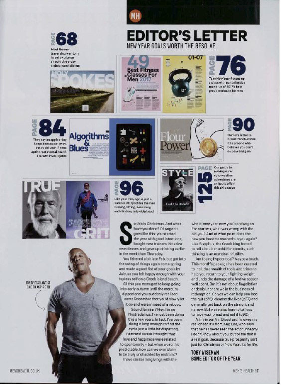
to enhance our understanding of gender representation of Semiotics we need to consider Representation but first, we must understand stand what representation means the portrayal of a certain thing or person. The Men’s Health magazine front cover and inside page both portray a negative stereotype of how men should be strong and independent which in a sense there a not negative qualities but men should also be allowed to have the qualities that women are stereotyped to have like being kind and for the sense of understanding representation the stereotype of women being kind is called a positive stereotype. The main character of Tomb Raider, Lara croft is what I mentioned beforehand a counter type, to give more clarification, a counter type is an opposition and contrast against a stereotype in usually a more positive manner. The counter type is interesting to discuss especially since we are evaluating the representation of genders as we have the more old, dominant ideology of stereotypes like men’s health but then we have a more different New, opposing character like Lara Croft but we can argue that Lara also has the old negative stereotype due to the sexual manner of the character. As I have mentioned As well previously is how the media’s show the signifiers of idealistic views of how a person should be perceived as the main images are selected representation, what is when a certain group or person is specifically chosen to be focused on, as in our media Lara Croft and Vin Diesel were specifically chosen to show strength and sex appeal. These qualities were specifically chosen due to our dominant ideology and constructed reality of how women should be kind and sensual and men should be muscular and strong, constructed society is something I want to focus on as it is argued by sociologists that what they call habitualization where society is created and formed by human interactions and humans themselves, what this has relevance is due to our habitualization of portraying men  as strong and cool who always attract women we have created this stigma and dominant ideology and agree that is how a man should be but as time is progressing this ideology is being changed. Something I also wanted to discuss is how the men’s health magazine page, the editors letter, shows a block of things of stereotypically associated with men, for example, the weights and the “flower power” which emphasises this point that men should be stronger whereas woman it isn’t reinforced or portrayed in that way.

To understand the representation of genders we must understand Audience Theory which mentions how the media consumers will have a specific psychology and physically effect on them when “consuming” media. There is a similarity and difference between how gender is represented in the media in audience positioning, both characters are shown in an attractive and appealing manner, mainly Lara Croft as she is positioned in an unnatural way to emphasise her figure to entice potential consumers to purchase the game front cover Lara is on.  The appeal that Lara is given is unnecessary as most popular games don’t need to rely on the ideology of “Sex sells” for example the very popular game Minecraft doesn’t have any form of sexual content but is still one of the most popular games from even the point of the time where I was young and child and wanted to purchase the game but despite this it’s not like the phrase sex sells is incorrect as a majority of the games sold in this case Tomb Raider Will be sold due to the sexual nature of the main character. Vin Diesel is positioned to be very macho and strong as he is shown to be an idealistic man and his we should be like him and if we use this magazine maybe you will able to learn how to be like him.

To continue the point of how men are represented to be strong we look at Print Language, what are the different types of techniques used in Media. I mainly want to focus on the front cover of men’s health as it’s the most impactful and shows the dominant ideology of how men should be strong as when we look at the sub headings blast body fat and short cuts to t-shirts arms create this idea of how you must be a certain weight that isn’t realistic but is made from a constructed reality where all men are strong as fit and all women are sensual and have unrealistic figures also this an be traced back to the editor’s notes where the image of flour power which once again emphasises the point of how we need to be strong as men and with  the help of the magazine we can be. The impact that the magazine has is negative as it enforces this unrealistic perfect people and with these types of subheadings and images it prays on the self conscious consumers who are manipulated to believe they have to be this perfect human.

To conclude the way genders are represented are negative as we are in an old constructed ideology of how certain genders should be but I believe as we progress in time eventually the dominant ideologies of today will be shaped into a better one which is more accepting and diverse.

Gender representation in Men’s Health and Tomb Raider.

In this essay, I am going to compare the way that gender has been represented in Men’s Health magazine and the cover for the video game Tomb Raider. In particular, I am going to argue that in both media forms the representation of gender is an idealistic stereotype of how males and females should look. However, I am also going to argue that Lara Croft (tomb raider) is an iconic sign that is heavily sexualized for the male gaze whereas the images in Men’s Health aren’t represented sexually or targeted for a female audience. 

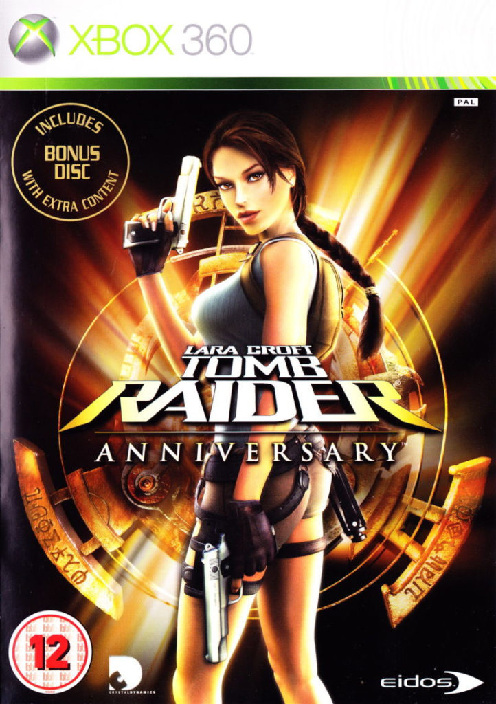
The cover for Tomb Raider features ‘Lara Croft’ who is a character from the game. There are five images of her on the cover where she is repeatedly wearing revealing clothing. Shown through David Gaunlet’s identity theory, this creates a constructed identity around the character, Lara Croft, that she is the only featured as a sexualized image for the audience. However, she is also represented as strong as she has guns and the back round colours of yellow, black and red connote danger and fear. Also, the man on the cover of Men’s Health is represented in the same way as strong and having an idealistic body. For both, the audience positioning helps to create this representation and as the images are both the center of the front page. Although the image of Lara Croft is sexualized for the male audience. This representation is influenced by the socials norms of society that woman is sexualized in media.

However, both Men’s Health and Tomb Raider represent gender very differently. The main image on the cover for Tomb Raider is the iconic sign, Lara Croft. She is represented as a strong female game character as she is carrying guns and breaking the dominant ideology that only men can fight. However, she is wearing minimal clothing and her bottom and breasts are visible which creates anchorage for the target audience that she will be visible the whole game. The stereotypical audience for video games is male which why the cover for tomb raider is a reactionary text as she is only represented sexually to suit the male gaze, however it could also be seen as radical as its a woman fighting which goes against dominant ideology. In contrast to that, the images in Men’s health are represented in a more aspirational way rather than a sexualized way. For example, the image and article of Phillip Howells, a sixty-nine year old man who runs marathons, which is immediately against the dominant ideology of marathon runners. This target audience for Men’s Health is men which is why some images of men are represented as more inspiring rather than sexualized. All together this represents males as having more authority over females as females are sexualized for men and men aren’t sexualized for women. 

The typography in Men’s health is also reactionary. Throughout the pages, the print language supports the dominant ideology of masculinity and fitness. On the front cover, the plugs have a semantic field of fitness and looking good using words and phrases like, ‘muscle’, ‘#slay’, ‘blast body fat!’. These plugs connote that the magazine is about fitness for men which links to the muscular, idealistic image of a stereotypical man on the front cover. Also, the typography in the inside pages uses words that all link to fitness and working out, ‘best fitness classes for men 2017’. Altogether this represents the male gender in a positive manner and that they care about themselves and are trying to become more healthy. The reason behind this representation is to attract the target audience, who are aspiring to be better, to the magazine. The typography on the Tomb Raider cover is facts about the game and the usual title banner, institutional information and age rating. However, the paragraph is on the back page is radical as it states about how Lara Croft has to go on an adventure that challenges the dominant ideology around the fact that men are usually used to fight an go on adventures rather than women. In contrast to how the image of  Lara Croft is sexualized and represents her as a strong and empowered woman. This shows a similarity between both the media forms as both genders are represented as empowered and portray the constructed identity around both the genders featured. The reason for this is that it makes the audiences aspire to be like the personalities they have represented.

In conclusion, I think that the Tomb raider cover is both radical and reactionary as it supports the dominant ideology around how a woman is sexualized in the media but also represents her as strong and independent which goes against the dominant ideology that a woman needs a man. Overall I think that the female gender is represented with negative connotations. Whereas Men’s Health is reactionary and represents the male gender with counter-types as strong and with positive connotations. It also presents a wider demographic of the male gender and represents the audience, male, as self-caring and headstrong. 


REPRESENTATION OF GENDER IN TOMB RAIDER AND MEN’S HEALTH ESSAY

In this essay I am going to be talking about sexual representation in video games and magazines. For example, Tomb Raider the video game represents the female protagonist “Lara Croft” in a sexually appealing manner to straight males as well as Mens mens health because of their criteria to be masculine. 

When evaluating the front cover of the Tomb raider video game cover, we as a viewer we can notice the dominant signifier is an over sexualised cover image and character design with the short shorts and the crop top to show off her figure and reveal her body in a sexually appealing manner to straight males 13 and older buy copies allowing the company to make profit and an income from the product. In the background of the cover image there is a light source emitting through a logo with streaks of light directed to the side of the image to create links to her being similar to an angel being pure, important and something to inspire to be shining positive light on the character. The shot type used by the designer is a medium long shot to fit the majority of the characters sexually appealing assists into frame to increase how she is represented in a sexual manner. Finally the camera is angled from a worms eye view looking upwards towards the waist and upper body to draw further attention and increase sexual representation. The font used in the game cover gradually increases in size from smaller less important words and peaks on the key word or “raider” which is strategically place above her bottom to draw attention and focus to an over sexualised part of her body that isn’t realistic. The tomb raider franchise is a radical movement in the sense that a female follows masculine traits of being strong, brave and adventurous fighting against danger in hostile environments and the fact that a female is doing this re writes how females act and behave in society by giving them another role instead of being the rescued or the viewer instead of the rescuer and performer taking on a whole new role.

In addition, the magazine Mens Health is developing to withstand the issues of modern day society involving men by including sub headings that have connotations to mental health as well as the stereotypical physical strenght. Mental health is an important topic to talk about with men because suicide is the largest cause of death in men from teenagers to the age of 55 making this radical, revolutionary and a new definition of masculinity encouraging men to speak out about there issues  and over come them. This ideology and racial text came from the sub heading “Slay Winter blues”. The sad part is this is one sub heading out of nine that is radical, the others saying how a man should eat, look like and what expectations they have following the Reactionary audience theory. In the illustration of Vin diesel, he is wearing a tight shirt to show off his muscles in such a way that he should be an expectation for males. Disel is also tanned and not very pale which shows he is outside and away from home doing whatever he pleases. Furthermore his facial expression is a strong stare and smoulder to show strength, power and dominance representing him as an alfamale following the stereotype of what a male should follow. His body language is loose and shows lack of care and effort to try look threatening to other males which follows humans’ biological instinct of being attracted to them. Once again we are viewing the illustration from a worms eye view so we concentrate on the arms and shoulders of the man to create a sense of exception and guidelines to follow and compare yourself to with a shot type of another medium long shot to capture the full body and fill the cover image.Lastly, the colour of the writing is in a blue colour which matches with the stereotypical male colour so it stands out to the male audience as a high percentage of them posses that colour as their favourite growing up. To further back up my point, when looking at the front cover of Mens Health you can see that the mast header and smaller key subheadings that the producer want to see first are coloured blue.

In conclusion both examples both over sexualised the included genders one being radical (tomb raider) and the other reactionary (Mens Health) to the benefit of the selling company or brand to make more sales and profit. However, times are changing and words are changing to be more gender neutral and friendly towards both genders.

gender representation in tomb raider and men’s health

  In this essay I will be comparing the representations of gender in Men’s Health and Tomb Raider. I’ll be using an article from Lauren Hill, a video from feminist frequency and the cover to show how gender is represented negatively in Tomb Raider however, on the other hand, I’ll also be using the cover of mens health, contents page and a spread to make a comparison. Furthermore, showing how media uses audience theory to alter the publics view.

Men’s Health magazine portrays a reactionary image. On the cover, Vin Diesel is the main subject also appearing in the contents page showing the audience receiver that he has the perfect form, he represents the idea that men are seen as strong and powerful. He’s portraying what society believe is a desirable body for men. However, his pose is very forced and awkward as he seems to be tensing his arm forward increasing the look of his muscles. Which is a negative representation of what males should look like in todays society. Moreover, he’s surrounded by bold tag lines and headings for example “blast body fat”, “127 ways to build a stronger core”, “103 shortcuts to t-shirt arms” this print language suggest men aren’t good enough and that they should look a certain way which reinforce the idea that men should have muscles and be fit and healthy to be seen as “ a man”. This results in men feeling unmanly and weak. The main reason for the magazine is not to make men feel insecure and preoccupied about their appearance but to be motivated and be healthy so that they can look their best. However it’s pressuring men to do certain things to achieve this. The cover uses the colour blue all over, blue is associated to confidence and is considered beneficial to the mind and body this therefore reinforces the whole idea of the magazine being related to health and exercise. Moving onto the contents page, there are small connotations suggesting that it’s  radical this is shown in “flour power” this pun is ironic as flowers are usually associated with women and their delicateness. Which is the opposite of Vin Diesel who’s there as a powerful, strong man. Moreover, in the spread there are elements of radical in the interview with Phillip Howells, a 69 year old named ‘the marathon man” this is because he doesn’t have a similar form to Vin Diesel, suggesting he’s less of a man.

Moving onto Tomb Raider the dominant signifier is Lara Croft as she’s placed in the center, it can be seen as a radical text due to her unrealistic figure, this then will increase the attention given to her, however she’s presented negatively as she’s heavily sexualised and objectified this is seen in her tight shorts and crop top. This is a negative stereotype as young girls will be influenced to look like her as she plays the role of the hero, therefore will be seen as the norm. The exaggerated, altered features are purposely done to attract the male gaze, furthermore  will increase the chances in selling the game. Within the game the players are directly facing Lara Croft’s behind shown in the video by feminist frequency showing us that the game is concentrated on Lara Croft’s behind compared to when it’s a male character the angle is above his behind and there’s either a cape or the camera is concentrating on different angles to prevent the player from seeing his behind. On the cover itself the attention is towards Lara Croft’s behind and her breast, she’s also holding a gun which has death connotations, women are usually the victim so this uses radical elements seen as here Lara Croft is the hero and by holding the gun it’s showing she’s fierce. Lara Croft challenges dominant ideology as she’s one of the few women lead character.

There are similarities between the two for example there is a main subject in both covers which are directly in the centre. However, there are also differences, the biggest being the CSPs for example in Men’s Health they’ve used a man on the cover whereas in Tomb Raider they’ve used a women which is a fictional character whereas Vin diesel is an actual person which doesn’t construct fake ideology.  

In conclusion, I believe that both Men’s Health and Tomb Raider gender is represented as an ideology of what is the ideal way to look like, for both females and males. However it’s portrayed negatively in Tomb Raider as it’s objectifying and giving the female character an unrealistic body this is shown by increasing her breasts and widening her hips to look desirable making the reader/women feel insecure and leaving less to mens imagination. However, in Men’s Health its also uses elements of negative stereotype as its implying that men should be built a certain way to be “a man”. Moreover, There  are positive stereotypes in mens health as overall the magazine is focusing on health and exercising and not dehumanising nor objectifying the model in this case Vin Diesel,  But making the main focus of the magazine the actual content.  As to Tomb Raider there is also positive stereotypes as Lara Croft is seen fighting off huge dangerous animals showing that she is independent and strong. 

Comparison of the Representation of Gender in both Men’s Health and Tomb Raider Anniversary

In this essay I am going to be explaining to you how gender is represented for males and females in the media; focusing on two examples: the Tomb Raider Anniversary cover for the representation of females, and Men’s Health for how males are represented. 

Firstly, I want to talk about gender as its meaning has changed recently. The dictionary says gender is “Either of the two sexes (male and female), especially when considered with reference to social and cultural differences rather than biological ones,”. This takes into account two genders (male and female), however now people are saying they were born the wrong gender; this creates multiple new genders including: genderqueer, transgender, cisgender, gender expression and gender nonconfirming. This makes it more difficult to analyse gender in the media as now it is harder to distinguish between all of them.

In the cover for the Tomb Raider Anniversary game the protagonist, Lara Croft, is central on the cover. If we were to put a rule of thirds grid on the cover then Lara Croft would take up the entirety of the three central squares; for one sign to take up this much space on the games cover is to show it is the dominant signifier on the cover, which is rare for a female to be as typically males are the protagonist. The text has been strategically placed to draw your attention to her breasts and butt. This over sexualises her and the way she is positioned is unnatural. Along with the unnatural theme her breasts and butt are abnormally big, especially since she is so skinny,(the dominant ideology for women is to be skinny but have big breasts and butt; an hourglass figure) this shows its target audience is straight males. To these straight males it gives a false impression as typical women do not look like that. Another way, Lara Croft is over sexualised is her skin-tight and very revealing clothes this again gives a false impression to the over 12 year old (the age rating symbolic sign that shows it is rated for over 12s) straight males that the game is targeted at as most females do not wear as much makeup as her or wear clothes like that; or they did not when the game was released in 2007. Also she is dressed for an adventure and the fact she is holding guns in each hand shows she does not need a male to protect and take care of her; a radical view. The image of Lara Croft helps to is an iconic (as she is a human) and an indexical sign (as she is from the original game and a well known figure). Going to the back of the cover and we can see that the paradigm of images from the in-game footage show Lara Croft does not look anywhere near as good quality (more pixelated) as she does on the front cover. I think that the gaming cover for Tomb Raider Anniversary represents woman in mostly a reactionary way, however it has some radical signs in it.

On the other hand, men are represented differently in the media as they are pretty much opposites, what would be radical for a female is reactionary for a male and vise-versa. To see how men are represented in the media we are looking at Men’s Health magazine. The layout is pretty similar to the games cover as the iconic sign is the image in the centre that fills at least two of the three central squares on the rule of thirds grid. The iconic sign of Vin Diesel denotes males should be muscular, covered in oil and poorly lit as most of the photo of Vin Diesel is shadow apart from his arms and chest, this signifies that these are the areas the audience should be looking at; this view of males is a reactionary viewpoint. Similarly to Lara Croft, Vin Diesel’s stance is unnatural and uncomfortable as his shoulders and arms are not in the position we are used to seeing, this is done to make him look stronger and to emphasis how men should look. This unusual body position could also be a away to show he is different to the average man as he is special and we can not be like him however we should strive to become as close to being like him as possible. Additionally, words that stand out on the front cover are: blast, stronger, demolish, slay, lose, fast, muscle and six-pack; these connate either destruction or strength as these are words a man should surround himself with as he needs to be strong and needs to show it. A reactionary page in the Men’s Health magazine is the article titled “The Marathon Man” as it shows the dominant signifier as a man running however the photo is staged as it was taken in a studio; this suggests that men should stage and fake things (especially on social media) to give the impression we are someone that is stronger and better than the person we really are. The man in the photo is a radical photo as he is not the strongest male and does not look like the pretty negative stereotype we are used to portraying males as; instead he is an old man that is skinny but is still active. This is strengthened further with the quote on the image “Your only limit is your self belief” which denotes that if you believe you can do it you can. However, I think that this article was selectively included to represent what we should inspire to be like when we are older and to stay ‘in shape’ no matter what. The quote could also be spun to suggest that if we put our mind and have self belief that we will look like Vin Diesel, The Rock or Zac Efron we can, is this a myth? From this I would say that Men’s Health is still more of a radical text than a reactionary one, however it is far closer to being more 50/50 than it was in the games cover.

I conclude that both forms of media are radical and support the dominant ideology, and try to make us want to achieve unrealistic results that the dominant signifiers have. However, they both show ways that support the reactionary viewpoint (Men’s Health shows more reactionary views than in Tomb Raider Anniversary). 

Gender Representation in Tomb Raider and Men’s Health

In this essay I am going to compare the representation of gender in both ‘Men’s Health’ magazine and tomb Raider video game cover, focussing on semiotics and print language, and how the these media examples portray gender and it’s effect on their target audience. I will define the societal idea of gender, and argue the negative connotations of these cover characters, and how they reinforce and challenge social ideologies.  

Firstly we must understand the definition of gender to be able to pick apart how it is represented in media. The Oxford definition of gender is ‘that gender tends to denote the social and cultural role of each sex within a given society’. This states that there are only 2 genders, male and female, however in today’s world the idea of a much more fluid perspective on gender is beginning to be accepted across cultures, separating society from the set ‘norm’ and allowing people to break free from their constructed identity. It’s argued that media now allows people to create and display their own identity in a way where they are free to explore their own identity, and although this is true it can unsafe as gender fluidity is not yet fully understood across all cultures, ideas of which are presented in Davis Gauntletts book ‘Media, Gender and Identity’. The two pieces of media that will be discussed during this essay both portray mostly strong stereotypical aspects of the male and female gender, with Lara Croft displayed in small, skin exposing clothing and a dramatic sexualised figure, and vin diesel on the men’s health cover promoting a specific strong, fit healthy male body type with drastic weight loss tips.

For the gaming cover of Tomb Raider, the protagonist Lara Croft is places in the centre of the cover, illuminated by a golden treasure piece. This along with the strategically placed text in the middle area is designed to highlight Lara’s emphasised cleavage and butt, visibly outlining her figure and drawing immediate attention. This mise-en-scene following the rule of thirds structures the cover in a carefully placed place to create space for judgement at Lara Croft. This is further emphasised by the characters tight short clothing, exposing much of her mid-rift and legs, and also how she is in a structured position that provides for a clear sexualised silhouette of her body, as the dark clothes against the golden light provide. As displayed on the back page of the game cover slip, in the game the view is from third person which places the player being Lara as she goes through the game. This means that Lara’s butt is placed centre screen and is followed by the player throughout the entire game.   In an online video clip by the ‘Feminist Frequency’ they discuss how this small detail is unknowingly extremely gendered, and when comparing video games with female and male characters, they reveal however the females characters always have their behinds visibly shown in the centre, often in right clothing, whereas game designers of the male characters often give an idea of selective representation by having the character viewed above the waist, or have strategically placed cloths and capes, that make it nearly impossible to see their behinds. This careful audience positioning exudes an outlook message to the predominantly younger target teenage audience that it is okay to objectify woman as in video games they are displayed so obviously as a dramatically sexualised being. The game began to challenge gender representation by choosing a female character for the only and main character in a video game, and with a mother daughter plot line, especially when at the time it was hugely predominantly male characters, meaning she was a radical character choice. The fact that she is holding weaponry is also a radical idea as the male gender is more associated with weaponry and violence. However their choice in her design was also reactionary as the designers created her in a way where they were still able to appeal to the dominant ideology, for sales of the game, resulting in her becoming a ‘cyber-sex symbol’. This connotes to the idea that woman should be sexualised and used, according to the Kanz, Gurevitch and Haas media of preference for satisfying needs, this sexualisation and provides the idea that woman need to be sexual and under dressed, with slim bodies and big sexual features, that trough game characters are there for the escapism of the audience. The streaming of these characters through the media can create a negative portrayal of gender representation towards young female audiences as well, as it tells younger woman to aspire to be desirable to men, by being skinny and wearing little clothing; which can easily encourage unhealthy routines including unbalanced diets and expensive precludes, that can create side effects of depression, eating disorders and other health issues.

In the ‘Men’s health’ cover, the iconic sign of Vin Diesel as the cover image also quickly portrays the gender-orientated body image expectations that are put on men. He is placed in the centre of the cover and idolised for his muscular, strong body, accompanied by his publicised fitness routines and diets. Vin diesel is surrounded by plugs which all encourage a fit lifestyle such as ‘Blast body fat’ and ‘Lose 8kgs fast!’. These majorly display society’s idea on men that they must be physically strong and can’t slack otherwise they will lose their ‘masculine qualitys’. Plugs such a ‘double metabolism’ and ‘8kgs fast!’ promote quick ways to get an ‘attractive’ toned body, but they are actually promoting an obsessively unhealthy lifestyle as by doing both of these things you would be harming the natural pace of your body. This displays to the audience an idea that men should do as much as they possibly can to achieve a look similar to Vin Diesels, contrary to whether it is actually healthy for your body or not. However one plug on the cover which exerts a radical idea is the one that reads ‘#slaywinterblues why socials going mental’ which advertises for a page inside the magazine that focuses on mental health which is not often spoke in relation to men, promoting the idea that help should also be given to ensure that men are mentally healthy as well as physically. More evidence of radical ideology from this media example is on one of the example magazine pages that show an old man doing exercise. This helps to make readers aware that there is more to physical health than a six-pack, and that health and fitness should b continued into your older years, but perhaps at a less extreme level. Companies such as DOVE with their Real Beauty campaign are challenging another part of media representation with the phot editing industry, and through their advertisements they represent a variety of woman of all shapes, sizes, races and religions, to show that there is no one kind of ‘right look’ and that the majority, possibly all, celebs and image media is photoshopped, so the ideas that are pitched to younger audiences aren’t even achieved in the first place. Campaigns like this are beginning to change the way gender is represented in the media, and help to show to society that as a woman you don’t need to be thin, but have an hourglass figure or be hyper-sexualised, and as men it is not all about being big and muscular.

To conclude, gender representation in media still contains many reactionary ideas, but slowly more and more radical choices are being made in a variety of different ways across a spread of media forms which are helping to widen the set ideas society has for genders. Also with the fluidity of gender coking into light through celebrity exposure and other articles, the closed expectations of female and male gender is being opened to reveal a comfortable fluidity where each person is able to identify, understand and cultivate their own identity, and through media are able to display themselves to the world as they would like.