Media is a name for various means of visual or audio-based communication for imparting information to many people.
What is media studies?
Media studies is the study of mass communication in the digital age. The point of media studies is to be able to understand and interpret the mass media and other conduits for information in modern society.
What do you hope to develop in media studies?
In media studies I hope to develop a greater understanding of how mass media functions and how to successfully and convincingly analyse it.
Media is an online software for creating digital content for different audiences. Using different platforms to advertise different forms of content. Analysing how media can influence people and effect society.
What is the point of Media Studies?
Learning ways in which different media platforms can influence audiences. Learning how to create different media platforms such as creating magazine covers etc. Learning new skills which are required in future jobs and careers.
2 things you want from this course
I hope that i will learn new skills that will help me with my future and to get a good grade at A-Level.
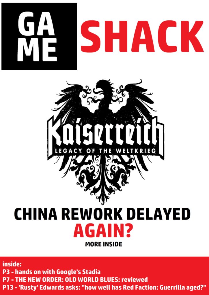
In making my front cover, my main influence was the extremely popular gaming magazine “PC Gamer”, which uses a colour scheme of large white text upon red and black backgrounds for its title. I chose to somewhat invert this, using red text upon a white background and white upon a solid black one, leaving most of the rest of the cover’s unfilled space white to allow these bold colours to stand out. I chose these colours for their boldness – red, in particular, is a very common colour for magazine covers and suchlike, simply because it’s such a striking colour. Red upon white is especially striking, and so I chose to use very large and bold red-on-white text for the magazine’s title. In the centre, I used only one image – the black-and-white logo of “Kaiserreich: Legacy of the Weltkreig”, a popular mod for the PC grand strategy game “Hearts of Iron IV”, with the text “CHINA REWORK DELAYED AGAIN?” written underneath it. Both the use of a single black image on a fully-white background and the use of block capitals in the cover’s headline are, again, striking, as is the use of white-on-red text at the bottom of the cover for three supplementary stories. Kaiserreich is a very well-made and popular mod for a very well-made and popular game, and so I chose it for my front cover because it’s something any self-respecting magazine would certainly concern themselves with. At the bottom, I included other common types of stories found in gaming magazines – thinkpieces, hands-on reviews of new technology, and reviews of the latest games or game modifications, all with page numbers.
Using software to create digital content for different audiences
Using platforms to advertise different forms of content
Media is a form of information that can influence people and affect society
What is media studies:
Show how to analyse the way media can influence people and affect society in positive and negative ways
To teach how to make your own media content and use different digital platforms to display and advertise creative ideas
To learn how to interpret media and asses its legitimacy and influence
What 2 things do you want from this course?
I hope that I learn how to use digital programs to create professional content, and analyse the effects of media on society, both positive and negative
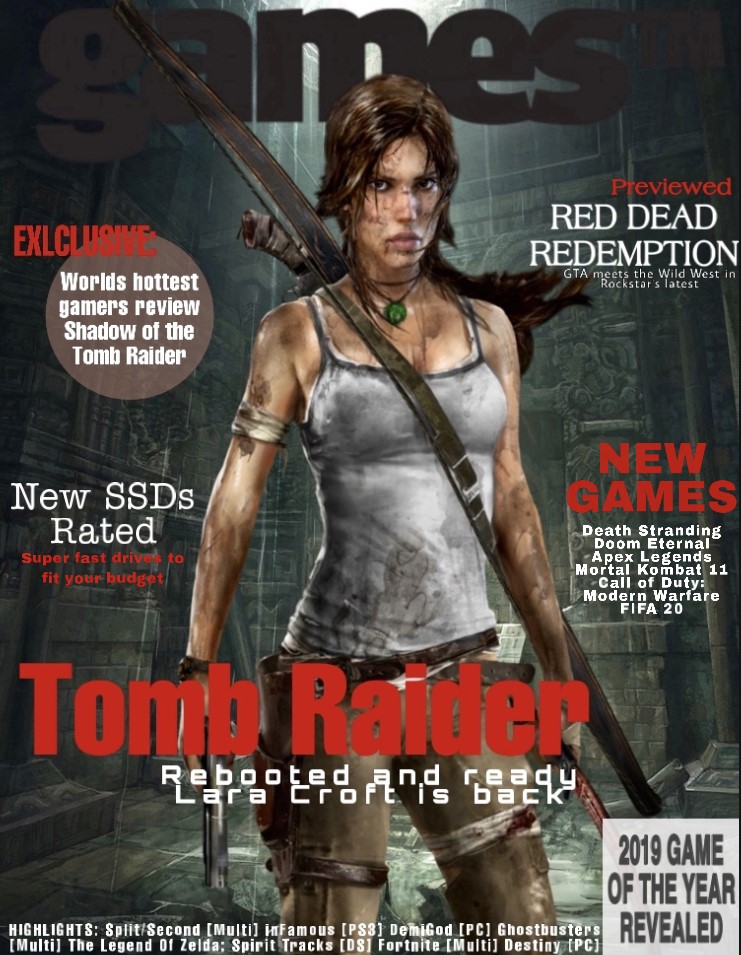
For my gaming magazine cover I firstly researched and found lots of other popular magazines so I could get a feel for what the style is like. I decided to use one gaming character as the image focus for the center, as many others had used characters, and decided on the female protagonist of Tomb Raider – Lara Croft. This is good for a magazine cover, as it attracts the customers attention, and anyone who is a fan of the tomb raiders will immediately be interested. The background I chose is also a scene from one of the Tomb Raider games, which further shows that Tomb Raider would be a focus in the magazine and is much more attractive than a blank background. I chose a dark colour for the magazines title ’Gaming TM’ as I wanted the focus to be the contents of the magazine, as that is what the customer is interested in reading. I thought it was effective to have the character cover some of the title, as it helps the cover to have a smooth finish, that it all blends together; however, I made sure it was still visible. I didn’t want the cover to be too busy so that it was able to be read clearly but tried to include multiple articles that would be inside, including a highlights list of games mentioned at the bottom, so it was still informative. I chose a basic colour scheme of black, red and white. I thought red would be a good choice for a magazine cover, as it is bold and bright, and therefore catches the readers eye. I mostly used it for the titles or headings so that they would be seen first and give a quick brief understanding of what was being advertised. As the background is darker, the white was much clearer to use and enables it to be read easily, I only used darker colours for the texts if they had a lighter background area. I also used different shapes as backgrounds for the two of the texts, a translucent red circle and white square. This adds more graphics to the cover, making it more interesting and covering more space. I also used all capital letters, which further makes those sets of texts stand out. If I were to continue my cover I would of made space and added a bar code to make it look realistic and ready for mass production and sale. I could also include another smaller image on a side piece to add some more graphics than only the center character, but I didn’t want this cover to look overcrowded, as I think a simpler cover with specific bold texts is more attention grabbing towards a customer.
I chose my Borderlands 3 background because it is a game being released soon and a game in a series that I love. Also, I think that the striking character on the cover may draw in readers as they are staring directly forward with glowing blue eyes. My subheadings have different topics which convey other parts of the gaming industry with the newest ideas in the game industry, such as Apple’s new gaming ‘Arcade’ or smaller news on tips of completing harder games. I included this variety so that there are different things that attract different readers with different tastes. The cover includes another big game release news as gamers don’t all just play one game so only placing one game would mean that many are turned away by it so two well-known games mean more people are intrigued. The large bold font for GAMER (as a title) and BORDERLANDS 3 which means they stand out from the background, which is mostly yellow and blue, as red which draws new readers to the magazine as a strong warm colour. The red also matches the roses at the bottom of the colour which makes the poster more ascetically pleasing. I think the cover tells enough to lure a reader but not enough where they don’t have to buy it.