Induction Task

The Finished Product

Intentions and Ideas for The Sunday Gamer – James Rouault

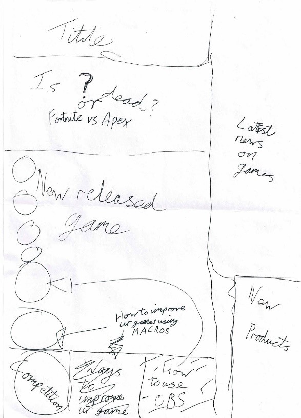
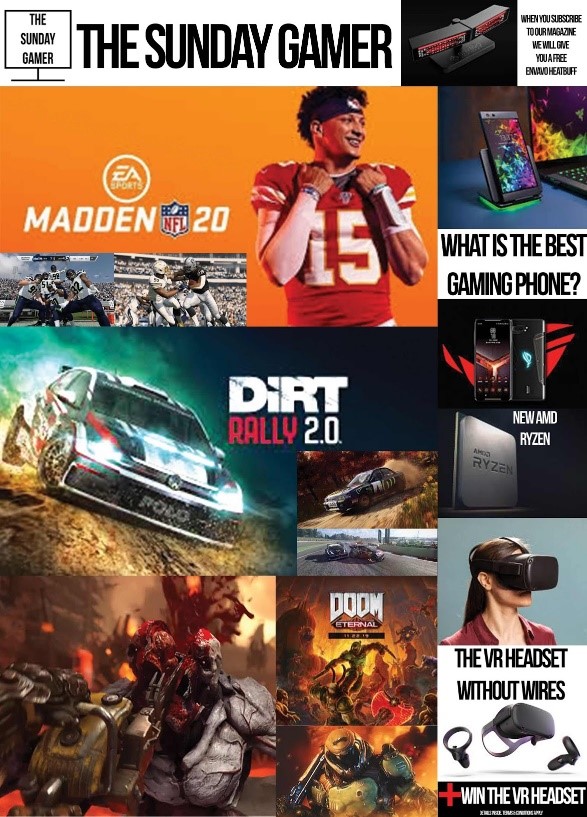
The task of producing a cover of a magazine for gamers suited me as I used to game a lot and have a lot of friends that game. During our induction day we had some time in the lesson to produce a draft on paper. I used this draft to structure my design when I began to create it in Adobe Photoshop. Below is my draft and finished product; as you can see there are some changes, but they are very similar. However, it doesn’t look like a magazine cover.


So, I searched online for gaming magazine covers and this is what came up:

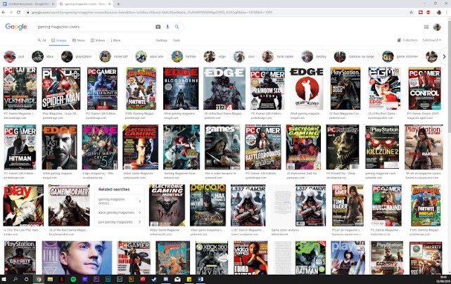
I noticed my cover didn’t look like any of the others; so, I started again having done a bit of research on what the magazine covers should look like.

A game I used to play a lot was Tom Clancy’s Rainbow Six Siege, so I found a portrait image to go as the image on my cover as I had noticed all the others had one larger image that filled the cover.

Then I added the name for my magazine, The Sunday Gamer. I had seen a lot of the covers put the text behind the head of a character if there was one. So, I watched a YouTube tutorial on how to do this.

I then went back to my previous cover and looked at what I put around the sides of the cover to see what I could reuse. So, I kept the free Envavo Heatbuff for when you subscribe to the magazine and the article on what is the best gaming phone. I put these in the red banner at the top of the cover. I then found new images as I didn’t like the old ones and wanted to get rid of the background, so it is just the product on the red banner as this is a clean and professional look.

I then put in the bottom left corner another hint at an article in the magazine that is about the new Oculus Quest which is a VR headset that has no wires.

I then went on the Ubisoft website to find out the latest news on Tom Clancy’s Rainbow Six Siege and there is a new season coming in the next couple of weeks, so I said I was making an article about what is expected of the new series.

I thought of the name for the magazine as I work at M&S St John as my Saturday job so I looked at the papers and saw a lot have daily in the title however no teen would buy a magazine daily, so I thought go weekly, I then saw that the daily papers offer a special Sunday edition. Therefore, I came up with the name ‘The Sunday Gamer’. It could be sold as a separate magazine on Sundays or it could be a supplement in one of the Sunday papers.

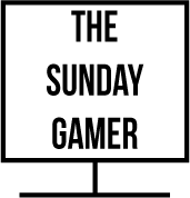
Once I had the name, I decided to make a logo for it using Adobe Illustrator. I came up with the idea to put the name of the magazine into a TV/monitor as to play any games you need a screen.

I chose the font Bebas Neue as it is blocky and chunky as gives a style that is similar to what games often use. 

Boys Life alternative cover

This alternative cover challenges male stereotypes as it isn’t projecting messages thought as ‘masculine’ like being physically strong, adventurous and dangerous. Men aren’t expected to immensely care about how they look or fashion, or embrace their feminine side. In my cover i used James Charles, who is known on YouTube for expressing his femininity through makeup and extreme looks. Often on Boys Life magazines, the cover is of an image of nature, or displaying a large natural background, whereas on girls life they often have a close up shot of a young, attractive girl to show her outfit and makeup, which i have captured in this alternative cover.

Boys Life

For my Boy’s Life magazine I used a image of a chef to challenge the stereotypical magazines cover targeted at men as typical men magazines are shown are adventurous, dangerous and has this whole aspect of strength and danger but in mine I made it more tranquil and my cover is a chef because cooking is normally seen as a domestic woman job to do but I wanted to show you can do want you want to do and it doesn’t limited to a man or a woman.

For my colour scheme I put a blue as it is quite calm and relaxing also it works with my image of the chef as he has a dark strip of blue on his jacket and the name on the jacket is of this colour as well. I wanted a not so bold choice of colour as I didn’t want it to be “attacking” to our eyes but it is still noticeable also the chef himself has a nice, calm but warm smile.

Statement of Intent: Summer Task

My thoughts and ideas behind my magazine front cover

My ideology behind the design of the cover was to make it as educational and informative as possible. It is a subject I have very strong knowledge involving the topic. I also consider the game a hobby of mine as I pursue dreams of a possible esports appearance in coming years, considering I have the talent and ability meaning I am educated enough with all the changes and improvements to the game. There are still areas to improve on which I can talk about so I can make the review balanced and fair.  My brief reviews will accurate coming from a racer with experience. If i was to make a series on the topic in future there would be many topics to talk about meaning there would be no issues expanding. For example, changes to career mode with cutscenes and drama with the newly introduced Formula 2, as well as the development tree to upgrade your car and make it faster. In addition, you could talk about the game physics including the handling model, and the changes in downforce and grip from previous games. Furthermore, creating your own car setup to change the suspension, angle of attack for the wings, transmission, tyre pressure, brake bias and brake bias is another topic to talk about. Another copy of the magazine could be about what each option in the setup menu does and how to adapt to the car. The magazine could also turn into a tip guide to beginners on how to improve their actual ability.

If I was to improve on this task in the future, or change anything, my main priority would be making the presentation more flashy and eye catching with more designs and colour to attract the reader however designing is a weak point so I need to improve. I would also like to change the written layout, instead of it being in column so it is more interesting to the reader. The lack of colour is another problem I can fix. If I did the project on paper it may of been more intriguing to the reader as the finished product would be less bland and would have more design. I would also like to make the piece more authentic and realistic so I feel a greater sense of achievement and success which is at a high standard. A perk of making the piece on computer is that if you run out of space on the page you can go back and make changes so it fits like changing the font size.

From this conclusion, I have self evaluated the flaws in my work and how I can improve for future tasks by learning and developing skills. This self criticism has also worked as a brainstorming session to write future ideas on paper if I was to continue and make progress in my work.