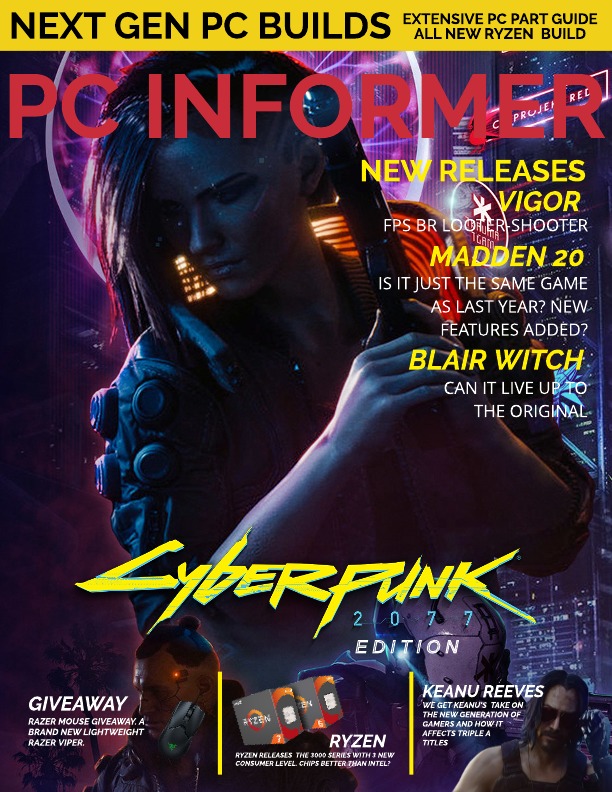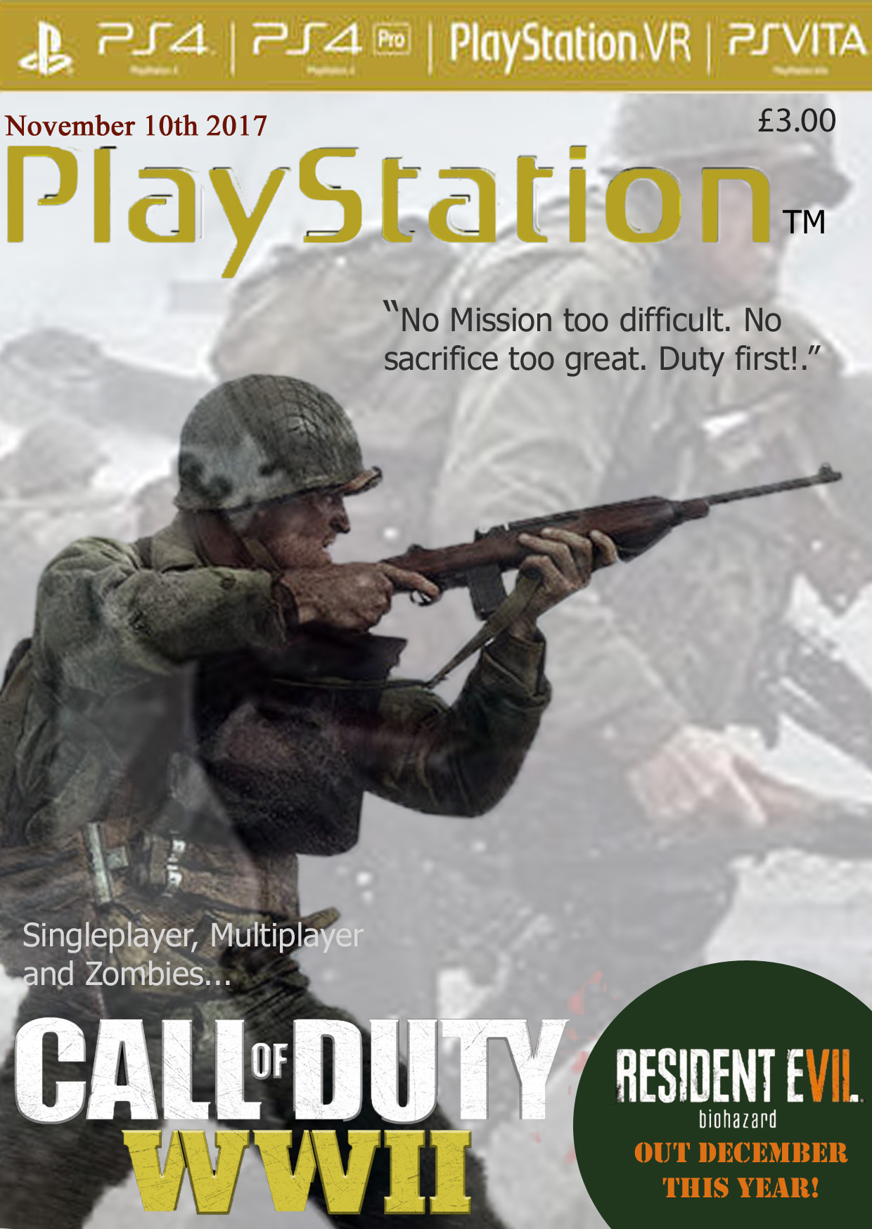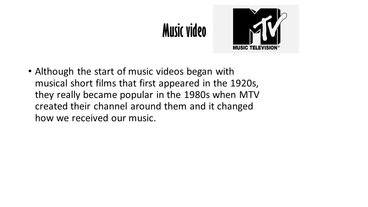
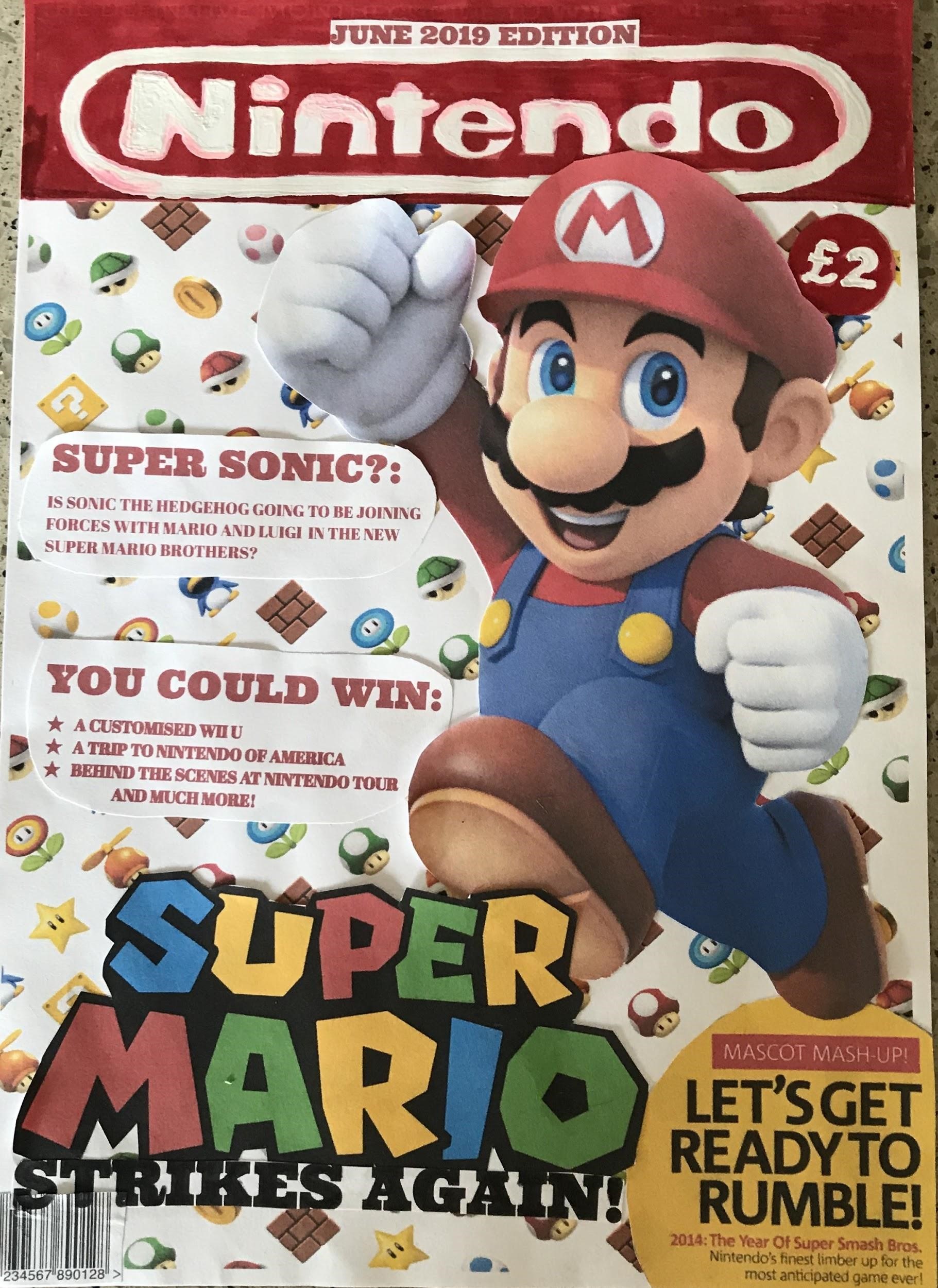
My Chosen Magazine Cover
Prior to designing this magazine cover, I looked at the covers of many Gaming magazines. After many attempts of creating magazine covers, this one I decided was my favourite. I decided to design the magazine cover for the Nintendo Magazine. This cover is aimed at Older Children and Teenager (between the ages of 10-24). I have designed the logo free-handed, with all other features of this magazine being printed off. I have gone with a red and white theme as they are the main colours of the Nintendo branding. Red and white also I find looks quite appealing together because the red is quite dark, and the white colouring used for the title makes it stand out from a distance. I have included a date line, which is written in red to fit in with the colour scheme of the magazine and I have also included it on top of the masthead because I feel with its placement there, people will take notice of it.
The masthead is the name of the magazine. I have used it against a predominantly white background so that it stands out. The masthead also matches the colours on the main image. I have used red and white for the masthead as they are quite bright colours and will stand out from a distance, thus attracting the consumer’s attention. The Masthead is the Nintendo logo to inform the consumer that the magazine is associated with the Nintendo branding and franchise. It also is large to stand out and used on every magazine issue so the consumers instantly know this is the Nintendo magazine. I have used Mario as the central image on my magazine because Mario is the most famous Nintendo Character and I find his red overalls make him stand out over my predominantly white Mario themed background. I also used symbols associated with Mario (ie coins and the power-up items) as my background behind the large image of Mario, so the consumer instantly knows that this magazine edition is all about the Super Mario franchise.
As my magazine is based on the Super Mario Bros Franchise, I have used the Super Mario logo as my central image’s caption. This is so that everyone knows the magazine is all about Super Mario Brothers. I have even included a yellow bubble with an article that will appear in the magazine. I have chosen yellow because it stands out as it is bright, it also quite closely opposite to red on the colour wheel and yellow is a colour used within the Super Mario Franchise (Wario’s hat and shirt). I also included the caption “Mascot Madness” as I find it is quite catchy and the alliteration helps people to remember it, thus allowing them to keep my magazine cover in their minds, making them more likely to buy it and future issues.
Finally, I have included headings of articles. I have written them in red to fit in with the Super Mario colours. I played with words and came up with the heading “Super Sonic” by combining the “Super” of “Super Mario” with the “Sonic” of “Sonic the Hedgehog”. I have also included snippets of competition prizes available throughout the magazine. I used the prizes that are more of a once in a life-time experience in order to entice customers to buy the magazine to try and win amazing prizes in future competitions held in future issues.