Media Banner
To help you look at this post from my blog:
http://mymediacreative.com/blog/2019/04/18/semiotics/
When you study any form of communication (Art, Music, English, Maths, French etc) you need to recognise that there is a LANGUAGE that is full of signs, codes and conventions, organised around a grammar (a set of organising principles).
TASK 1: To investigate Language, let’s try to create one of our own! In one big group create a new sign that represents a new meaning – in other words, a single element of a possibly new complex language. Then in small groups develop 3 more signs (EACH PERSON IN THE GROUP) so that you then have about 15 new signs that form the basis of your new language. Make sure some of your signs are command signs (signs that get people to do things – sit, stand, greet, wave, nod etc)
TASK 2: Once you have developed some basic units of your new language, you will need to teach this new language to another group. Then let’s test the acquisition of this new language as a demonstration – ie communicating to each other in this new language (that is way command signs may be a good basis as we can see students responding based on the use of this new Language).
When we have created a new language through these practical activities we can then start to think about some of the theoretical ideas that underpin our knowledge of LANGUAGE.
My new gaming magazine is aimed at all ages and genders. I did this so everyoneis included and it is not stereotypically pointed at a certain age or gender. I didthis by making it gender neutral colours, like the colours white, black and a bit ofred. My intention of this magazine was to give it a clean, strong look so it is eyecatching for everyone. I decided to use Mario as the main focus of this magazinebecause this character is one of the most popular for all ages and also all thegames are a classic to play with family, allowing all ages to be included. As wellas Mario i included other well known characters on the front,this is so people canrelate to some of the most popular characters in gaming and may even be theirfavourites. By having someone’s favourite character on the front of the magazineit will make them want to buy it more.I made the text of this magazine in bold and all black to make it stand out topeople. I especially made the most important information bigger so people canread it a lot more easily. Such as the key intention of the magazine in this casemine was the top 10 games of the month and the official date of future games. Iput this information on the front because i thought it will make the audienceintrigued and make them want to buy it and find out more. I also included asection on the front about a competition, by doing this if gives the audiencesomething to get involved in and have the chance to win something. I made thename of the magazine “High Score” in bold and the biggest size so people canremember the title so they can buy the next issue. I named my magazine thisbecause it gives the message that this magazine will allow you to achieve a highscore and even the best score when gaming. By naming this it makes peoplewant to buy it and want to know how to achieve this by the tips included as I saidon the front cover. The title of my magazine explains exactly what people’sintentions are for gaming. Also I input a section about what the magazineinvolves on the cover so people know what they may be interested in or may notbe. In that section I included about that there will be tips for beginner andadvanced in the magazine which is important as it shows it that it doesn’t matterhow skilled you are there are tips for everyone who likes to game.In conclusion my intentions for this magazine is for it to be for everyone nomatter the age or gender, also for it to be bold and eye catching so people cannotice it. I wanted to have big bold statements on the front showing what isincluded so readers can know what is included and get involved withcompetitions and other interactions.
What is media ?
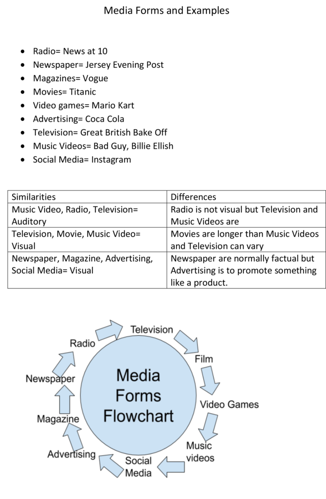
Media is a form of mass communication and is used to inform and influence people’s actions. Forms of media include : songs, videos, photos, magazines, newspapers, these could be used for persuasion.
What is media studies?
Media studies is the study of different types of media. It also shows you how to use editing software, such as photoshop or video editing software.
What is the point of media studies?
The point of media studies is to teach students how to use editing software. Media also teaches students to appreciate the work and effort put into media, such as advertising and music videos.
What am I interested in?
During my time of study media, I am interested in learning how to use editing software properly such as photoshop. I am also interested in learning more about how music videos are produced. During this course I also want to learn how media affects businesses and how they can persuade people to but their products.

Iconic signs:
Indexical signs:
Symbolic signs:
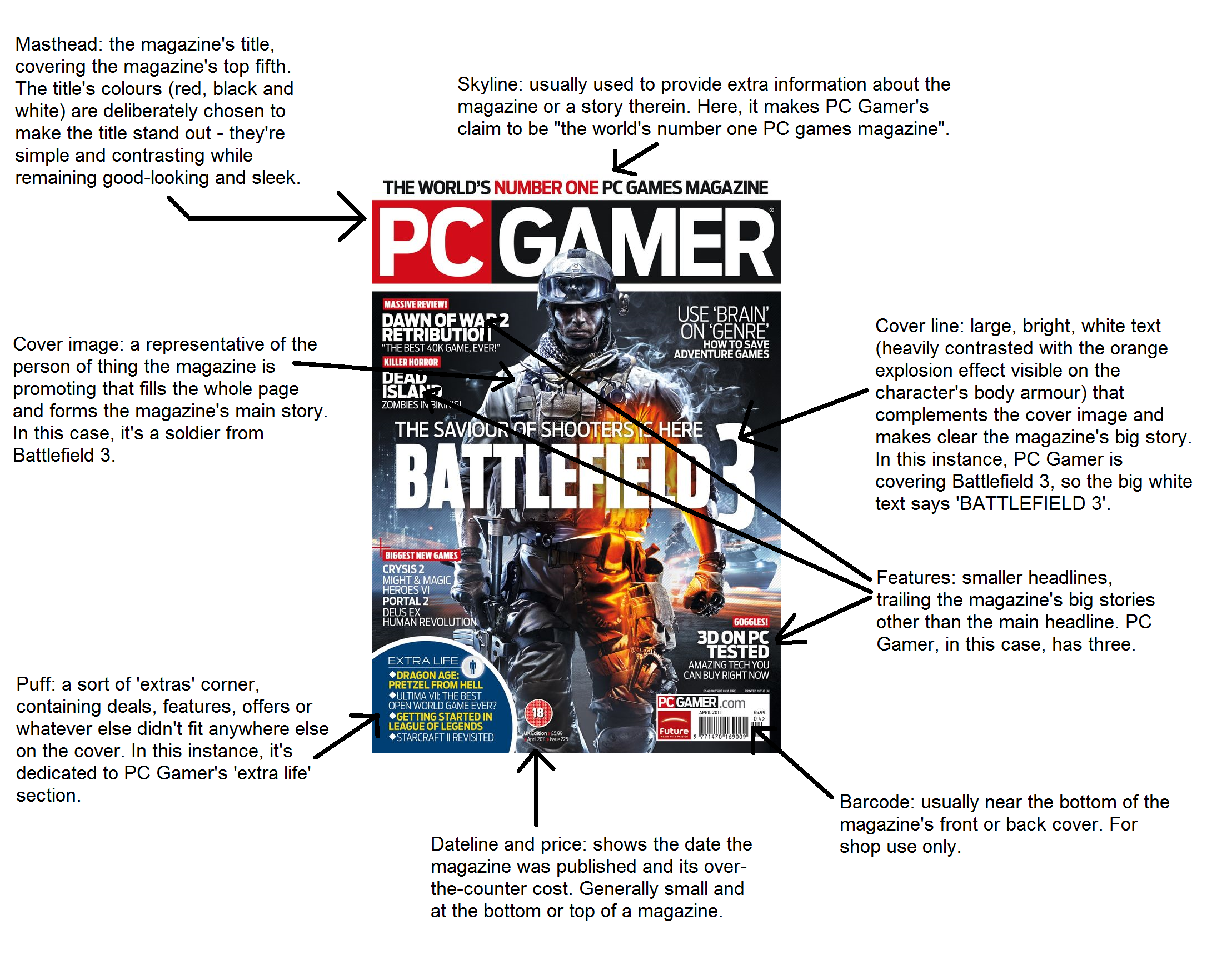
After receiving this task, the first thing I considered was which platform (PC or console), I would make my magazine cover for, I decided to go for a PC magazine. To convey this idea, I found an image saying, ‘PC GAMER’ and an image of the, ‘WASD’ keys, these two things make it obvious to the people looking at this magazine exactly what they’re looking at so they can decide if it’s right for them. The next thing I decided to do was to come up with a slogan to try to draw in the buyer’s attention and really capture the theme for the magazine, this slogan was ‘Get your game on’, I chose this because I believe that It can help to encourage people and motivate them to pick up gaming or re-connect with it if they have lost touch with it.
The next thing I did was think about the layout for the magazine cover, I decided that putting lighter colours such as white and orange over a darker base (black/grey). I chose this because I thought it would make the colours on the magazine pop and help to catch the buyer’s eye. After deciding on the initial layout and colour scheme, I then decided which games to show on the front cover of the magazine, to do this I thought about whether I wanted the magazine to be about a specific type of game, or whether I wanted it to showcase a variety of different games and different genres of games, I decided to include a variety of different genre of games in the magazine cover because I wanted to be inclusive and try to catch as many people’s interests as possible, the genres in the magazine are, shooting games (COD,battlefield, CSGO), battle royale (PUBG), and horror (Left 4 dead 2, Dead by daylight).
When composing the magazine cover, I wanted to show a character shooting across the page, however this wasn’t possible to convey the way I wanted to, so instead I then decided to put the logos of the games. I didn’t want the magazine cover to look too digital (rows of pictures), because people want to see originality, and I wanted to be more artistic and less boring, so I decided that making some of the pictures/logos overlap with each other was a good idea to show this.
To summarise, I made a list of different things I could include in this magazine cover to see what things I could come up with, in order to get inspiration for this I went online and looked at other gaming magazine’s to see what they did and I tried to make it look as professional as I could without making it look like I just copied someone else’s work. I tried my best to make an eye catching magazine cover that wasn’t boring and turn it into something that someone would actually buy and look at if they were interested in gaming.

I decided to select FIFA as the theme of my magazine as it’s a very popular game worldwide and I’m extremely familiar with it. It’s a game involving 11 players on each opposing side and the objective is to score as many goals as you can within the duration of the 90 minutes. The intention players have who play the game have is, to keep possession throughout the game, try not to gain a booking from the referee and produce ridiculous skills to perform against the opponent to confuse them.
Firstly, in my magazine cover, my title is FIFA Global which is an eye-catching title. Why? Well, it addresses this magazine worldwide to grab the attention of more people to gain a greater audience. Therefore, the more people buying the product, then the more sales made. Due to FIFA being known extremely well worldwide, people will want to buy this specific magazine as the content contained inside will be relevant to players. For instance, new skills you can learn and practice to perform at a more advanced level. This will enable them to get better and become more experienced at the game.
Next, the font. The fonts used in my magazine cover are, contrail one and bebas nue. Contrail one for the title and subheading and bebas nue for the rest. I decided to select these two fonts because an element of them stood out to me. They consist of all the characters being capital letters so, this will immediately draw the customer in as the title will be very easily noticeable. The font size all around the magazine is quite big because I want people to detect that it will be beneficial to helping gamers become better at the game.
The three colours that consist within this cover are red, white and blue. These colours were selected because it makes the magazine look more interesting, stands out and makes it look exotic in the way the colours are presented. If all the cover was the same colour then it wouldn’t be attractive and not as many sales would be made. The product itself would not be very successful. The colours add initial flare to the magazine allowing more attraction. Bold colour is one of the simplest and most effective ways to grab a reader’s attention. It’s a fantastic element that needs to be included because it really emphasises the point you are trying to get across and lures the reader into examining the product.
Finally, the background cover will fulfill the entire page which is very key. So, a good photo needs to be there otherwise no attention will be brought to it and no sales will be made. In my magazine cover, my background cover is a photo of Neymar Jr in game in FIFA. He’s a world class footballer so easily recognisable within the picture. The Paris stadium is featured behind Neymar to give the reader an idea of what the game looks like if they are wanting to learn or haven’t played it before. The background consists of Neymar performing a skill which can be done in game also giving the reader a feel for how the skill will look once performed.
Gaming Front Cover and Statement of intent
ICONIC SIGNS:
– Image of gaming character
-image of game logo
INDEXICAL SINGS:
-Magazine title
-World of Warcraft logo
-GTA VI logo
-Xbox logo
SYMBOLIC SIGNS:
-Titles
-Subheadings
-Puffs
-Cover Line
– Buzz words
– Colour
Media Studies Summer Task – gaming front cover
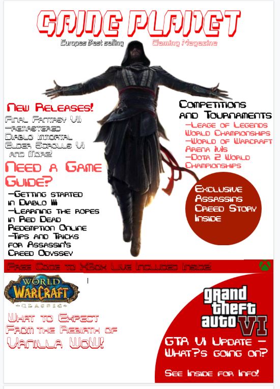
The gaming magazine will be called ‘’Game Planet’’ as I am trying to make the magazine come off as well known and retro styled. For the masthead I intend to use 3D fonts that will look similar old school arcade game titles.For my front cover for a gaming magazine I plan to target the role playing games community as it is a broad audience which would perfectly suit a gaming magazine.To target the role playing games community, I have decided to use an image from the game ‘’Assassins Creed’’ as my main image in the front cover.The image will show a main protagonist from one of the many games that have been released by Ubisoft in a ‘’Leap of Faith’’ position.I am using this image because the exclusive story will be about the ‘’Assassins Creed’’ series and its new and upcoming games .This will allow me to include other conventions around the image as it wont take up much space on the cover. I intend to make the front cover predominantly red and white as it will compliment the character shown in the main image as he is wearing darker clothing. In the bottom corners of the front cover I plan to include multiple puffs and teasers in order to affect a broader audience, for example I will include a second image with a game title saying ‘’World of Warcraft Classic’’ and a buzz word underneath it saying ‘’What to expect from the rebirth of Vanilla WoW’’.This will interest many people from the role playing games community as the re-release of the 2004 ‘’World of Warcraft’’ is a highly anticipated event happening this year in summer 2019.In the other bottom corner of the magazine cover I intend to use a buzz word saying ‘GTA VI Update, What’s going on?’. This will interest a large amount of people as GTA has an enormous community Rockstars 2013s ‘GTA V’ has been expecting a sequel for a long time. I also intend to include a banner mentioning other gift codes for games, goodies and contests.The banner will say something along the lines of ‘free code to xbox live included inside!’’ . Along the sides of the front cover I plan to include conventions such as cover lines to feature what is inside the magazine. The cover lines will mention other new game releases such as ‘’Final Fantasy VII remastered,Diablo Immortal,Elder Scrolls VI etc’’, gaming competition and tournament stories such as ‘’Leage of Legends World Championships,World of Warcraft Arena 1v1,Dota 2 world championships’’ and guides to games like ‘’Getting started in Diablo III, Learning the ropes in Red Dead Redemption Online, Tips and Tricks for Assassin’s Creed – Odyssey’’