SECOND MEDIA MAGAZINE FRONT COVER DESIGN
Title of Magazine – ‘Player One’
Statement of Intent –
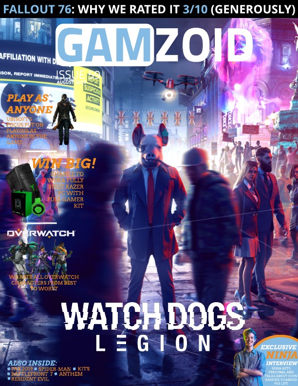
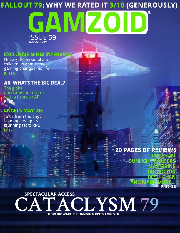
For my magazine, unlike my summer task, which was based solely on one game, I have decided to have a more general focus; on a specific genre of game – Retro. By centring the magazine on one genre, filled with numerous games, there are multiple possibilities which will allow me to combine/ advertise many things such as different consoles which support the games.
The title of my Magazine – ‘Player One’ – represents and includes the target audience as many people prefer being that player as it is considered more important/ superior. In addition, it also acts as an anchorage for the whole magazine as many of the games are/ will be single player.
As well as this, in order to fill up the overall page more I decided to order the plugs/ advertisements in this order as they will be more prevalent and visible.
Ideal Consumer –
Age – Teenager – 14
Gender – Male
Hobbies – Gaming – retro
Appearance – Scruffy Hair, Thick glasses, Bright red top, dark jeans, baggy jumper


NRS – E, D, C2 as aim my audience to be 16-20+ so some may still be in school (further education = A Levels, Community College and University) without a job but still get pocket money, some may have a Saturday job or even a part time job earning minimum wage on a 9am-5/8pm shift. My magazine is priced at £2.50 as it will be a thick textured cover magazine, I feel like this is a realistic price range for a magazine like that and is a decent price for those in the E, D and C2 social grade range.
Young and Rubicam’s 4 C’s – The Struggler, The Mainstream and The Aspirer as I feel that this sums up the majority of those in their late teens/early twenties
7 New Class Types – Precariat, traditional working class and technical working class