Daily Archives: 09/27/2019
Filters
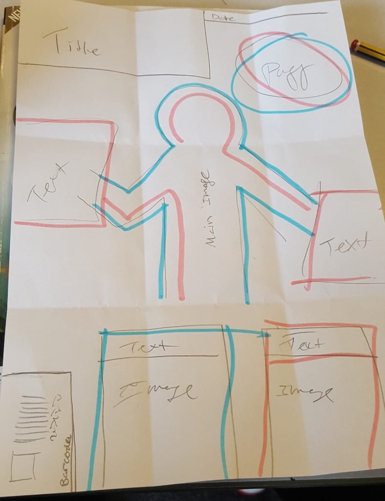
Magazine Sketch

For my magazine I wanted it to be lay out compartmentally so that it would be bold and easily to read. I want 2 main images, one large one small for the centre, and then the rest split up into different focuses. The title will be bold along the top, with it deprecated from the other parts. Along the bottom their will be 3 short reviews on games, some plugging inner pages, and then there will b a puff and list on the left centre.
Tommy, young white poor boy, UK, just saved up to buy it. GameTime magazine
Sketch front cover
For my front cover I wanted to make the main image the main point of focus in my front common as that is common place and is the first thing potential customers will see

For the game magazine name it is called: Oh my, gamer!
My idea for who bought my magazine was a slender white boy around the age of 19 with short brown hair with a hoodie and jean jacket
Media flowchart

nea initial idea for some reason lol

For my cover, I want a title presented in an stylish way, a game character or person to be the central focus with writing along the side and the bottom. Also include a barcode and the price at the bottom. Maybe a triangle at the top left corner telling the reader how new the magazine is.
My ideal audience would be a young adult male in his twenties. He would speak English and be wealthy due to his parents. This means that he has access to the latest new consoles and games. Also it would mean he is quite posh, classy and plays games in an elaborate way. Because of this, he would be interested in gaming books and upper-class, expensive magazines.
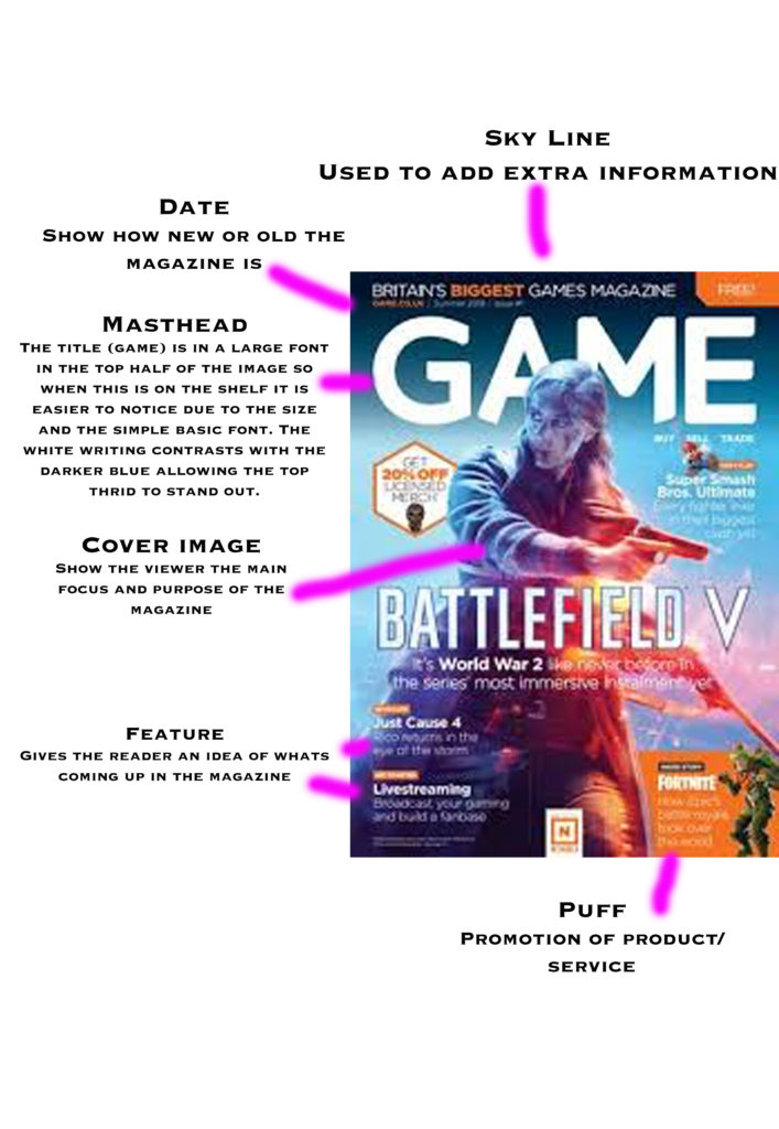
Analysis of front cover

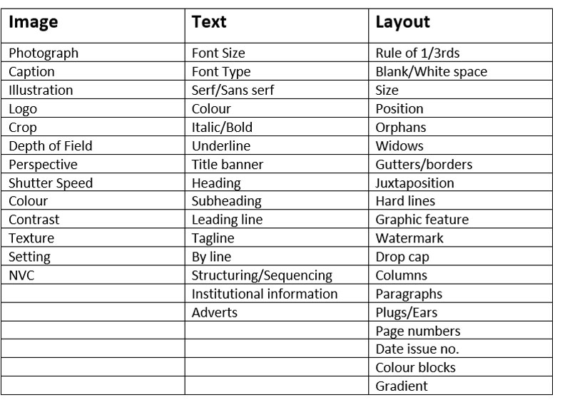
Media language


Title For Coursework

Magazine masthead

NEA Masthead

