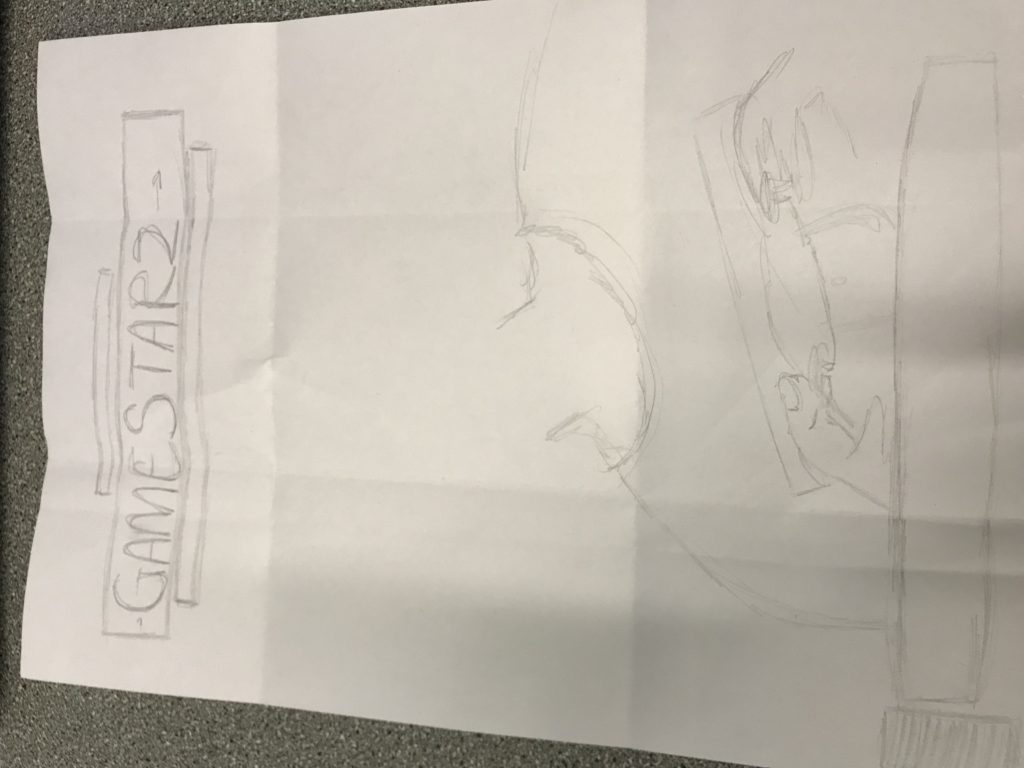
I have decided to sketch my front cover lightly so that I can add more details as I go and add the necessary changes. I also used a very similar layout to my induction task front cover as I am want to use a similar style and colors that are bold and eye-catching, like blues and reds. The heading needs to be obvious without detracting attention from the main image.
My ideal consumer would probably be a young to middle-aged adult. This is because there is a photograph of a child on the front of the cover; which then may prompt a parent to apply the cover article to their own child. Also, young-adults may also be intrigued because of the sleek style of magazine and the other possible articles within.
